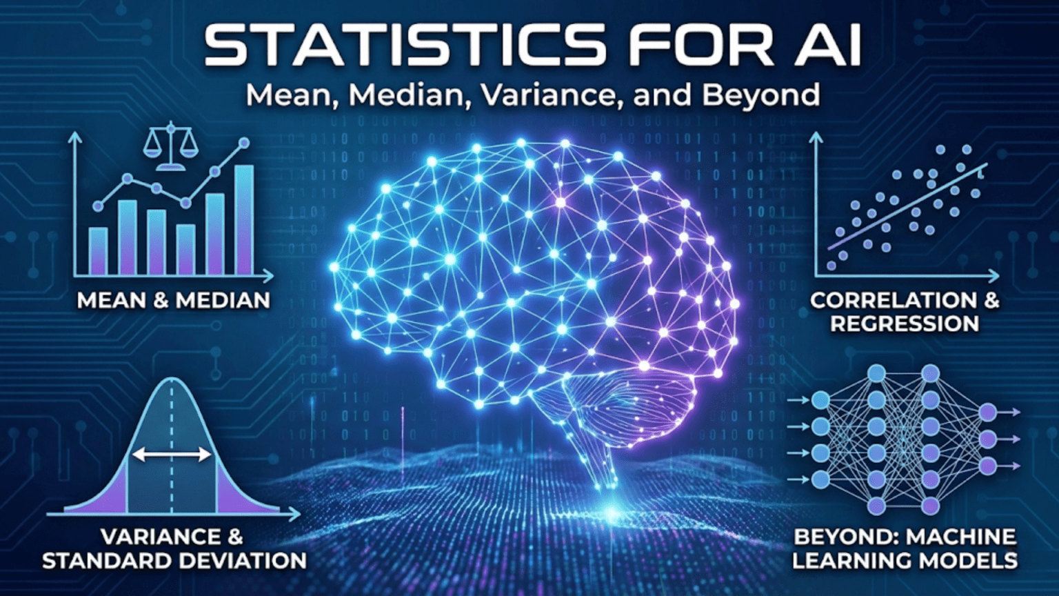
Introduction: Statistics as the Foundation of Data Science
Statistics is the science of collecting, analyzing, and interpreting data. Every machine learning project begins with data, and before you can build models, train algorithms, or make predictions, you need to understand what your data looks like. This is where statistics becomes essential. Statistical measures help you summarize thousands or millions of data points into meaningful numbers, detect patterns, identify outliers, and make informed decisions about which algorithms and approaches will work best for your problem.
The field of machine learning relies heavily on statistical thinking. When you split your data into training and test sets, you’re applying statistical sampling principles. When you evaluate model performance, you’re using statistical metrics. When you normalize features or handle missing values, you’re leveraging statistical techniques. Understanding statistics isn’t just helpful for machine learning—it’s absolutely fundamental.
This article covers the core statistical concepts you need to know as an AI practitioner. We’ll explore measures of central tendency that describe the typical or average value in your data. We’ll examine measures of spread that quantify how much your data varies. We’ll investigate correlation and covariance to understand relationships between variables. Throughout, we’ll use Python to calculate these statistics and visualize what they mean, connecting each concept directly to machine learning applications.
By the end of this guide, you’ll have a solid grasp of descriptive statistics and know how to apply these tools to real datasets. You’ll understand when to use mean versus median, how to interpret standard deviation, what correlation coefficients tell you, and how these concepts inform feature engineering, data preprocessing, and model evaluation decisions.
Measures of Central Tendency: Finding the Center of Your Data
When you first encounter a dataset, one of the most basic questions you’ll ask is: what’s a typical value? Measures of central tendency answer this question by identifying a single value that represents the center or middle of your data distribution. The three primary measures are mean, median, and mode.
The Mean: Arithmetic Average
The mean, also called the arithmetic average, is the sum of all values divided by the number of values. For a dataset with n observations x₁, x₂, …, xₙ, the mean is calculated as:
Mean = (x₁ + x₂ + ... + xₙ) / n = (1/n) × Σxᵢ
The mean is denoted by x̄ (x-bar) for sample data or μ (mu) for population data. Consider a simple dataset of test scores: 85, 90, 78, 92, 88. The mean is (85 + 90 + 78 + 92 + 88) / 5 = 433 / 5 = 86.6.
The mean has several important properties. It uses all values in the dataset, making it sensitive to every observation. This sensitivity is both a strength and a weakness. The mean provides a precise measure that incorporates all information, but it’s also highly affected by extreme values called outliers. If one student scored 20 instead of 78, the new mean would be (85 + 90 + 20 + 92 + 88) / 5 = 75, a dramatic drop of 11.6 points caused by a single outlier.
In machine learning, the mean appears constantly. When you normalize features by subtracting the mean, you’re centering your data around zero. When you calculate mean squared error as a loss function, you’re averaging the squared differences between predictions and actual values. The mean is also the expected value in probability theory, connecting statistics to the mathematical foundations of machine learning.
The Median: The Middle Value
The median is the middle value when data is sorted in order. If you have an odd number of observations, the median is the center value. If you have an even number, the median is the average of the two middle values. For our test scores [85, 90, 78, 92, 88], we first sort them: [78, 85, 88, 90, 92]. With five values, the median is the third one: 88.
The median’s key advantage is robustness to outliers. Using our earlier example where one score was 20, the sorted list becomes [20, 85, 88, 90, 92], and the median remains 88. The extreme value doesn’t affect the median at all, making it a more reliable measure of central tendency for skewed distributions or data with outliers.
To calculate the median position for n sorted values, use the formula (n + 1) / 2. For n = 5, this gives position 3, which matches our result. For even numbers of values, you average the values at positions n/2 and (n/2) + 1.
The median is particularly important when dealing with real-world datasets that often contain skewed distributions. Income data, for instance, is typically right-skewed with a few very high earners pulling the mean upward. The median income provides a better representation of what a typical person earns. In machine learning, you might use median values for imputing missing data, especially when outliers are present.
The Mode: The Most Frequent Value
The mode is the value that appears most frequently in your dataset. Unlike mean and median, which always produce a single number, a dataset can have no mode (all values unique), one mode (unimodal), two modes (bimodal), or multiple modes (multimodal).
Consider a dataset of favorite colors: [red, blue, red, green, blue, red, yellow, red]. The mode is red, appearing four times. For continuous numerical data, finding the mode often requires binning values into ranges since exact repeats are rare.
The mode is most useful for categorical data where mean and median don’t make sense. What’s the average favorite color? The question is meaningless, but the mode tells you which color is most popular. In machine learning, mode is useful for imputing missing categorical values and for understanding the distribution of class labels in classification problems.
Let’s implement these measures in Python and examine their behavior:
import numpy as np
import matplotlib.pyplot as plt
from scipy import stats

# Create a sample dataset
data = np.array([85, 90, 78, 92, 88, 85, 95, 82, 89, 85])

# Calculate measures of central tendency
mean_value = np.mean(data)
median_value = np.median(data)
mode_result = stats.mode(data, keepdims=True)
mode_value = mode_result.mode[0]

print("Measures of Central Tendency")
print("=" * 50)
print(f"Data: {data}")
print(f"Mean: {mean_value:.2f}")
print(f"Median: {median_value:.2f}")
print(f"Mode: {mode_value:.2f}")
print("\n")

# Demonstrate effect of outliers
data_with_outlier = np.append(data, 20)
mean_with_outlier = np.mean(data_with_outlier)
median_with_outlier = np.median(data_with_outlier)

print("Effect of Outliers")
print("=" * 50)
print(f"Original mean: {mean_value:.2f}")
print(f"Mean with outlier (20): {mean_with_outlier:.2f}")
print(f"Change in mean: {mean_with_outlier - mean_value:.2f}")
print(f"\nOriginal median: {median_value:.2f}")
print(f"Median with outlier: {median_with_outlier:.2f}")
print(f"Change in median: {median_with_outlier - median_value:.2f}")
print("\n")

# Visualize the difference
fig, axes = plt.subplots(1, 2, figsize=(14, 5))

# Plot 1: Original data
axes[0].hist(data, bins=10, alpha=0.7, edgecolor='black', color='skyblue')
axes[0].axvline(mean_value, color='red', linestyle='--', linewidth=2, label=f'Mean: {mean_value:.2f}')
axes[0].axvline(median_value, color='green', linestyle='--', linewidth=2, label=f'Median: {median_value:.2f}')
axes[0].set_xlabel('Value')
axes[0].set_ylabel('Frequency')
axes[0].set_title('Original Data')
axes[0].legend()
axes[0].grid(True, alpha=0.3)

# Plot 2: Data with outlier
axes[1].hist(data_with_outlier, bins=15, alpha=0.7, edgecolor='black', color='lightcoral')
axes[1].axvline(mean_with_outlier, color='red', linestyle='--', linewidth=2,
                label=f'Mean: {mean_with_outlier:.2f}')
axes[1].axvline(median_with_outlier, color='green', linestyle='--', linewidth=2,
                label=f'Median: {median_with_outlier:.2f}')
axes[1].set_xlabel('Value')
axes[1].set_ylabel('Frequency')
axes[1].set_title('Data with Outlier')
axes[1].legend()
axes[1].grid(True, alpha=0.3)

plt.tight_layout()
plt.show()This code clearly demonstrates how outliers affect the mean much more than the median. When choosing between these measures for your machine learning pipeline, consider whether your data contains outliers and whether they represent meaningful extreme values or errors that should be ignored.
Measures of Spread: Quantifying Variability
Knowing the center of your data is only half the story. Two datasets can have identical means but completely different characteristics if one varies widely while the other clusters tightly around the mean. Measures of spread quantify this variability, telling you how much your data points differ from each other.
Range: The Simplest Measure
The range is the difference between the maximum and minimum values in your dataset:
Range = Maximum - Minimum
For our test scores [78, 85, 88, 90, 92], the range is 92 – 78 = 14. The range is easy to calculate and understand, but it has a significant limitation: it only uses two values and ignores everything in between. A single outlier can make the range misleadingly large, and the range tells you nothing about how the data is distributed within that span.
Despite these limitations, range is useful for quick checks and understanding the scale of your data. When normalizing features to a specific range (min-max scaling), you’re directly using the range to transform your data.
Variance: Average Squared Deviation
Variance measures how far each value deviates from the mean on average. It’s calculated by taking the squared difference between each value and the mean, then averaging these squared differences:
Sample Variance (s²) = Σ(xᵢ - x̄)² / (n - 1)
Population Variance (σ²) = Σ(xᵢ - μ)² / n
The distinction between sample and population variance matters. When working with a sample that represents a larger population, we divide by n – 1 rather than n. This correction, called Bessel’s correction, makes the sample variance an unbiased estimator of the population variance.
Let’s calculate variance step by step for our test scores. The mean is 86.6:
Score  | Deviation from Mean | Squared Deviation
-------|--------------------|-----------------
  85   |    85 - 86.6 = -1.6  |     2.56
  90   |    90 - 86.6 = 3.4   |    11.56
  78   |    78 - 86.6 = -8.6  |    73.96
  92   |    92 - 86.6 = 5.4   |    29.16
  88   |    88 - 86.6 = 1.4   |     1.96
-------|--------------------|-----------------
Sum of squared deviations = 119.20
Variance = 119.20 / 4 = 29.80
We divide by 4 (not 5) because we’re treating this as a sample. The variance is 29.80, but what does this number mean? Variance has squared units—if our scores are in points, variance is in points-squared, which isn’t intuitive. This is where standard deviation comes in.
Standard Deviation: Interpretable Spread
Standard deviation is simply the square root of variance:
Standard Deviation = √Variance
For our test scores, the standard deviation is √29.80 ≈ 5.46 points. Unlike variance, standard deviation has the same units as the original data, making it much more interpretable. A standard deviation of 5.46 points tells us that scores typically vary by about 5 to 6 points from the mean.
Standard deviation is crucial in machine learning. When you standardize features (z-score normalization), you subtract the mean and divide by the standard deviation, transforming data to have mean 0 and standard deviation 1. The empirical rule states that for roughly normal distributions, approximately 68% of values fall within one standard deviation of the mean, 95% within two standard deviations, and 99.7% within three standard deviations.
Interquartile Range: Robust to Outliers
The interquartile range (IQR) measures the spread of the middle 50% of your data. It’s calculated as the difference between the 75th percentile (third quartile, Q3) and the 25th percentile (first quartile, Q1):
IQR = Q3 - Q1
Quartiles divide your sorted data into four equal parts. Q1 is the value below which 25% of data falls, Q2 is the median (50%), and Q3 is the value below which 75% of data falls. The IQR focuses on the middle half of the data, ignoring potential outliers in the extreme tails.
The IQR is commonly used in box plots and for outlier detection. A common rule identifies outliers as values below Q1 – 1.5 × IQR or above Q3 + 1.5 × IQR.
Here’s a comprehensive implementation showing all measures of spread:
import numpy as np
import matplotlib.pyplot as plt

# Generate sample data with controlled properties
np.random.seed(42)
data_normal = np.random.normal(100, 15, 1000)  # Mean=100, SD=15
data_uniform = np.random.uniform(50, 150, 1000)  # Range 50-150

def calculate_spread_measures(data, name):
    """Calculate and display all measures of spread"""
    range_val = np.max(data) - np.min(data)
    variance = np.var(data, ddof=1)  # Sample variance
    std_dev = np.std(data, ddof=1)   # Sample standard deviation
    q1 = np.percentile(data, 25)
    q3 = np.percentile(data, 75)
    iqr = q3 - q1

    print(f"\nMeasures of Spread for {name}")
    print("=" * 50)
    print(f"Range: {range_val:.2f}")
    print(f"Variance: {variance:.2f}")
    print(f"Standard Deviation: {std_dev:.2f}")
    print(f"Q1 (25th percentile): {q1:.2f}")
    print(f"Q3 (75th percentile): {q3:.2f}")
    print(f"Interquartile Range (IQR): {iqr:.2f}")

    return {
        'range': range_val,
        'variance': variance,
        'std': std_dev,
        'q1': q1,
        'q3': q3,
        'iqr': iqr
    }

# Calculate for both distributions
stats_normal = calculate_spread_measures(data_normal, "Normal Distribution")
stats_uniform = calculate_spread_measures(data_uniform, "Uniform Distribution")

# Visualization
fig, axes = plt.subplots(2, 2, figsize=(14, 10))

# Histogram: Normal distribution
axes[0, 0].hist(data_normal, bins=50, alpha=0.7, edgecolor='black', color='skyblue')
mean_normal = np.mean(data_normal)
axes[0, 0].axvline(mean_normal, color='red', linestyle='--', linewidth=2, label='Mean')
axes[0, 0].axvline(mean_normal - stats_normal['std'], color='orange',
                   linestyle='--', linewidth=2, label='±1 SD')
axes[0, 0].axvline(mean_normal + stats_normal['std'], color='orange',
                   linestyle='--', linewidth=2)
axes[0, 0].set_xlabel('Value')
axes[0, 0].set_ylabel('Frequency')
axes[0, 0].set_title('Normal Distribution')
axes[0, 0].legend()
axes[0, 0].grid(True, alpha=0.3)

# Histogram: Uniform distribution
axes[0, 1].hist(data_uniform, bins=50, alpha=0.7, edgecolor='black', color='lightcoral')
mean_uniform = np.mean(data_uniform)
axes[0, 1].axvline(mean_uniform, color='red', linestyle='--', linewidth=2, label='Mean')
axes[0, 1].axvline(mean_uniform - stats_uniform['std'], color='orange',
                   linestyle='--', linewidth=2, label='±1 SD')
axes[0, 1].axvline(mean_uniform + stats_uniform['std'], color='orange',
                   linestyle='--', linewidth=2)
axes[0, 1].set_xlabel('Value')
axes[0, 1].set_ylabel('Frequency')
axes[0, 1].set_title('Uniform Distribution')
axes[0, 1].legend()
axes[0, 1].grid(True, alpha=0.3)

# Box plot: Normal distribution
axes[1, 0].boxplot(data_normal, vert=True, patch_artist=True,
                   boxprops=dict(facecolor='skyblue', alpha=0.7),
                   medianprops=dict(color='red', linewidth=2))
axes[1, 0].set_ylabel('Value')
axes[1, 0].set_title('Box Plot: Normal Distribution')
axes[1, 0].grid(True, alpha=0.3)

# Box plot: Uniform distribution
axes[1, 1].boxplot(data_uniform, vert=True, patch_artist=True,
                   boxprops=dict(facecolor='lightcoral', alpha=0.7),
                   medianprops=dict(color='red', linewidth=2))
axes[1, 1].set_ylabel('Value')
axes[1, 1].set_title('Box Plot: Uniform Distribution')
axes[1, 1].grid(True, alpha=0.3)

plt.tight_layout()
plt.show()

# Demonstrate effect on machine learning: feature scaling
print("\n\nFeature Scaling Example")
print("=" * 50)
print("Original data statistics:")
print(f"Mean: {np.mean(data_normal):.2f}")
print(f"Std Dev: {np.std(data_normal, ddof=1):.2f}")

# Standardization (z-score normalization)
data_standardized = (data_normal - np.mean(data_normal)) / np.std(data_normal, ddof=1)
print(f"\nAfter standardization:")
print(f"Mean: {np.mean(data_standardized):.6f}")
print(f"Std Dev: {np.std(data_standardized, ddof=1):.6f}")

# Min-max normalization
data_minmax = (data_normal - np.min(data_normal)) / (np.max(data_normal) - np.min(data_normal))
print(f"\nAfter min-max normalization:")
print(f"Min: {np.min(data_minmax):.6f}")
print(f"Max: {np.max(data_minmax):.6f}")
print(f"Mean: {np.mean(data_minmax):.6f}")This comprehensive example shows how different distributions have different spread characteristics and demonstrates how these statistics directly apply to common machine learning preprocessing tasks like feature scaling.
Percentiles and Quantiles: Dividing Your Distribution
Percentiles provide a way to understand the distribution of your data beyond just center and spread. The pth percentile is the value below which p percent of the data falls. For example, if you scored in the 90th percentile on a test, you performed better than 90% of test-takers.
Quantiles are a generalization of percentiles. The most common quantiles are quartiles (dividing data into 4 parts), quintiles (5 parts), deciles (10 parts), and percentiles (100 parts). The median is both the 50th percentile and the second quartile.
Calculating percentiles involves sorting your data and finding the value at the appropriate position. For the pth percentile with n data points, the position is calculated as:
Position = (p / 100) × (n + 1)
If this position isn’t a whole number, you interpolate between the two nearest values. For 1000 data points, the 75th percentile position is (75/100) × 1001 = 750.75, so you’d take a weighted average of the 750th and 751st values.
Percentiles are extremely useful in machine learning for several applications. In anomaly detection, you might flag values outside the 1st and 99th percentiles as potential outliers. In performance evaluation, you might report not just average model performance but performance at various percentiles. In feature engineering, you might create categorical bins based on percentile ranges.
Here’s a practical implementation:
import numpy as np
import matplotlib.pyplot as plt

# Generate sample data
np.random.seed(42)
data = np.random.exponential(scale=50, size=1000)  # Right-skewed distribution

# Calculate various percentiles
percentiles = [1, 5, 10, 25, 50, 75, 90, 95, 99]
percentile_values = [np.percentile(data, p) for p in percentiles]

print("Percentile Analysis")
print("=" * 50)
for p, v in zip(percentiles, percentile_values):
    print(f"{p}th percentile: {v:.2f}")
print("\n")

# Quartile analysis
q1, q2, q3 = np.percentile(data, [25, 50, 75])
print("Quartile Analysis")
print("=" * 50)
print(f"Q1 (25th percentile): {q1:.2f}")
print(f"Q2 (50th percentile/Median): {q2:.2f}")
print(f"Q3 (75th percentile): {q3:.2f}")
print(f"IQR (Q3 - Q1): {q3 - q1:.2f}")
print("\n")

# Outlier detection using IQR method
iqr = q3 - q1
lower_bound = q1 - 1.5 * iqr
upper_bound = q3 + 1.5 * iqr
outliers = data[(data < lower_bound) | (data > upper_bound)]

print("Outlier Detection")
print("=" * 50)
print(f"Lower bound: {lower_bound:.2f}")
print(f"Upper bound: {upper_bound:.2f}")
print(f"Number of outliers: {len(outliers)}")
print(f"Percentage of outliers: {100 * len(outliers) / len(data):.2f}%")
print("\n")

# Visualization
fig, axes = plt.subplots(2, 1, figsize=(12, 10))

# Histogram with percentile markers
axes[0].hist(data, bins=50, alpha=0.7, edgecolor='black', color='skyblue')
colors = plt.cm.rainbow(np.linspace(0, 1, len(percentiles)))
for p, v, c in zip(percentiles, percentile_values, colors):
    axes[0].axvline(v, color=c, linestyle='--', linewidth=2, label=f'{p}th: {v:.1f}')
axes[0].set_xlabel('Value')
axes[0].set_ylabel('Frequency')
axes[0].set_title('Distribution with Percentile Markers')
axes[0].legend(loc='upper right', fontsize=8)
axes[0].grid(True, alpha=0.3)

# Box plot with outliers highlighted
bp = axes[1].boxplot(data, vert=False, patch_artist=True,
                     boxprops=dict(facecolor='lightgreen', alpha=0.7),
                     medianprops=dict(color='red', linewidth=2),
                     flierprops=dict(marker='o', markerfacecolor='red', markersize=5))
axes[1].axvline(lower_bound, color='orange', linestyle='--', linewidth=2,
                label=f'Lower bound: {lower_bound:.1f}')
axes[1].axvline(upper_bound, color='orange', linestyle='--', linewidth=2,
                label=f'Upper bound: {upper_bound:.1f}')
axes[1].set_xlabel('Value')
axes[1].set_title('Box Plot with Outlier Boundaries')
axes[1].legend()
axes[1].grid(True, alpha=0.3)

plt.tight_layout()
plt.show()

# Practical ML application: creating percentile-based bins for feature engineering
print("Feature Engineering: Percentile-based Binning")
print("=" * 50)
bin_edges = np.percentile(data, [0, 20, 40, 60, 80, 100])
bin_labels = ['Very Low', 'Low', 'Medium', 'High', 'Very High']
data_binned = np.digitize(data, bin_edges[1:-1])

print("Bin edges (quintiles):")
for i, edge in enumerate(bin_edges):
    print(f"  {i*20}th percentile: {edge:.2f}")
print("\nValue distribution across bins:")
unique, counts = np.unique(data_binned, return_counts=True)
for label, count in zip(bin_labels, counts):
    percentage = 100 * count / len(data)
print(f" {label}: {count} values ({percentage:.1f}%)")This implementation demonstrates how percentiles provide a complete picture of your distribution and how they enable practical machine learning tasks like outlier detection and feature engineering through binning.
Correlation and Covariance: Measuring Relationships
Understanding relationships between variables is crucial in machine learning. Before building models, you need to know which features are related to your target variable and which features are related to each other. Covariance and correlation quantify these relationships.
Covariance: Direction of Linear Relationship
Covariance measures how two variables change together. If one variable tends to be high when the other is high, the covariance is positive. If one tends to be high when the other is low, the covariance is negative. If there’s no linear relationship, the covariance is close to zero.
For two variables X and Y with n observations, the sample covariance is:
Cov(X, Y) = Σ[(xᵢ - x̄)(yᵢ - ȳ)] / (n - 1)
This formula computes the product of deviations from the mean for each pair of observations, then averages these products. The covariance has units that are the product of the units of X and Y, making it difficult to interpret the magnitude.
Correlation: Standardized Relationship
Correlation solves the interpretability problem by standardizing covariance. The Pearson correlation coefficient is:
r = Cov(X, Y) / (σₓ × σᵧ)
where σₓ and σᵧ are the standard deviations of X and Y. This standardization forces correlation to always fall between -1 and +1:
- r = +1: Perfect positive linear relationship
- r = -1: Perfect negative linear relationship
- r = 0: No linear relationship
- 0 < r < 1: Positive linear relationship
- -1 < r < 0: Negative linear relationship
The strength of the relationship is indicated by the absolute value of r. Values near ±1 indicate strong relationships, while values near 0 indicate weak relationships.
It’s crucial to understand that correlation measures only linear relationships. Two variables can have a strong nonlinear relationship but show correlation near zero. Also, correlation does not imply causation. A strong correlation between X and Y might mean X causes Y, Y causes X, both are caused by a third variable Z, or the relationship is purely coincidental.
Let’s implement and visualize these concepts:
import numpy as np
import matplotlib.pyplot as plt
import seaborn as sns
from scipy import stats

# Generate datasets with different correlation patterns
np.random.seed(42)
n = 100

# Perfect positive correlation
x1 = np.linspace(0, 10, n)
y1 = 2 * x1 + 1

# Strong positive correlation with noise
x2 = np.linspace(0, 10, n)
y2 = 2 * x2 + 1 + np.random.normal(0, 2, n)

# Weak positive correlation
x3 = np.linspace(0, 10, n)
y3 = 0.5 * x3 + np.random.normal(0, 5, n)

# Negative correlation
x4 = np.linspace(0, 10, n)
y4 = -1.5 * x4 + 15 + np.random.normal(0, 1, n)

# No linear correlation (but there is a relationship)
x5 = np.linspace(-5, 5, n)
y5 = x5**2 + np.random.normal(0, 2, n)

# Calculate correlation coefficients
correlations = [
    ('Perfect Positive', x1, y1),
    ('Strong Positive', x2, y2),
    ('Weak Positive', x3, y3),
    ('Negative', x4, y4),
    ('Nonlinear (r≈0)', x5, y5)
]

# Visualize all relationships
fig, axes = plt.subplots(2, 3, figsize=(15, 10))
axes = axes.ravel()

for idx, (name, x, y) in enumerate(correlations):
    # Calculate statistics
    r, p_value = stats.pearsonr(x, y)
    cov = np.cov(x, y)[0, 1]

    # Plot
    axes[idx].scatter(x, y, alpha=0.6, edgecolors='black')

    # Add regression line
    z = np.polyfit(x, y, 1)
    p = np.poly1d(z)
    axes[idx].plot(x, p(x), "r--", linewidth=2, label='Regression line')

    axes[idx].set_xlabel('X')
    axes[idx].set_ylabel('Y')
    axes[idx].set_title(f'{name}\nr = {r:.3f}, p = {p_value:.4f}')
    axes[idx].legend()
    axes[idx].grid(True, alpha=0.3)

    print(f"{name}:")
    print(f"  Correlation coefficient (r): {r:.4f}")
    print(f"  Covariance: {cov:.4f}")
    print(f"  P-value: {p_value:.4f}")
    print()

# Remove extra subplot
fig.delaxes(axes[5])
plt.tight_layout()
plt.show()

# Real-world example: correlation matrix for multiple features
print("\n" + "=" * 60)
print("Real-World Example: Feature Correlation Analysis")
print("=" * 60)

# Generate synthetic dataset with multiple correlated features
np.random.seed(42)
n_samples = 500

# Create features with known correlations
age = np.random.uniform(20, 70, n_samples)
income = 20000 + 800 * age + np.random.normal(0, 10000, n_samples)
education_years = 12 + 0.2 * age + np.random.normal(0, 2, n_samples)
credit_score = 300 + 5 * education_years + 0.01 * income + np.random.normal(0, 50, n_samples)
debt = 0.3 * income + np.random.normal(0, 5000, n_samples)

# Create DataFrame-like structure
data = np.column_stack([age, income, education_years, credit_score, debt])
feature_names = ['Age', 'Income', 'Education Years', 'Credit Score', 'Debt']

# Calculate correlation matrix
correlation_matrix = np.corrcoef(data.T)

# Display correlation matrix
print("\nCorrelation Matrix:")
print("=" * 60)
print("        ", "  ".join(f"{name[:12]:>12}" for name in feature_names))
for i, row_name in enumerate(feature_names):
    values = "  ".join(f"{val:12.3f}" for val in correlation_matrix[i])
    print(f"{row_name[:12]:12}  {values}")

# Visualize correlation matrix
plt.figure(figsize=(10, 8))
sns.heatmap(correlation_matrix, annot=True, fmt='.3f', cmap='coolwarm',
            xticklabels=feature_names, yticklabels=feature_names,
            center=0, vmin=-1, vmax=1, square=True, linewidths=1)
plt.title('Feature Correlation Matrix', fontsize=14, fontweight='bold')
plt.tight_layout()
plt.show()

# Identify highly correlated feature pairs
print("\nHighly Correlated Feature Pairs (|r| > 0.7):")
print("=" * 60)
for i in range(len(feature_names)):
    for j in range(i + 1, len(feature_names)):
        r = correlation_matrix[i, j]
        if abs(r) > 0.7:
print(f"{feature_names[i]} - {feature_names[j]}: r = {r:.3f}")This implementation shows how correlation reveals relationships between features, which is essential for feature selection, multicollinearity detection, and understanding your data before modeling.
Skewness and Kurtosis: Distribution Shape
Beyond central tendency and spread, two additional statistics describe the shape of your distribution: skewness and kurtosis.
Skewness: Asymmetry of Distribution
Skewness measures the asymmetry of a distribution around its mean. A perfectly symmetric distribution like the normal distribution has zero skewness. Positive skewness (right skew) means the distribution has a long tail on the right side, with most values concentrated on the left. Negative skewness (left skew) means the opposite.
The formula for skewness is:
Skewness = (1/n) × Σ[(xᵢ - x̄) / s]³
where s is the standard deviation. Common interpretations:
- Skewness ≈ 0: Symmetric distribution
- Skewness > 0: Right-skewed (positive skew)
- Skewness < 0: Left-skewed (negative skew)
- |Skewness| > 1: Highly skewed
In machine learning, heavily skewed features often benefit from transformation. Log transformation, square root transformation, or Box-Cox transformation can reduce skewness and improve model performance, particularly for algorithms that assume roughly normal distributions.
Kurtosis: Tailedness of Distribution
Kurtosis measures the “tailedness” of a distribution—how much probability mass is in the tails versus the center. The normal distribution has kurtosis of 3 (or 0 for excess kurtosis, which subtracts 3).
Kurtosis = (1/n) × Σ[(xᵢ - x̄) / s]⁴
Excess Kurtosis = Kurtosis - 3
Interpretations for excess kurtosis:
- Excess kurtosis ≈ 0: Normal-like tails (mesokurtic)
- Excess kurtosis > 0: Heavy tails, more outliers (leptokurtic)
- Excess kurtosis < 0: Light tails, fewer outliers (platykurtic)
High kurtosis indicates that outliers are likely, which might require robust methods or outlier handling in your machine learning pipeline.
Here’s an implementation demonstrating these concepts:
import numpy as np
import matplotlib.pyplot as plt
from scipy import stats

# Generate distributions with different skewness and kurtosis
np.random.seed(42)
n = 10000

# Symmetric (normal)
data_normal = np.random.normal(0, 1, n)

# Right-skewed (exponential)
data_right_skew = np.random.exponential(2, n)

# Left-skewed (reflected exponential)
data_left_skew = -np.random.exponential(2, n)

# Heavy tails (t-distribution with low df)
data_heavy_tails = stats.t.rvs(df=3, size=n)

datasets = [
    ('Normal (Symmetric)', data_normal),
    ('Right-Skewed', data_right_skew),
    ('Left-Skewed', data_left_skew),
    ('Heavy Tails', data_heavy_tails)
]

# Calculate and display statistics
print("Skewness and Kurtosis Analysis")
print("=" * 70)
print(f"{'Distribution':<20} {'Skewness':<12} {'Kurtosis':<12} {'Excess Kurtosis':<12}")
print("-" * 70)

for name, data in datasets:
    skew = stats.skew(data)
    kurt = stats.kurtosis(data, fisher=False)  # Pearson's kurtosis
    excess_kurt = stats.kurtosis(data, fisher=True)  # Excess kurtosis
    print(f"{name:<20} {skew:>11.3f} {kurt:>11.3f} {excess_kurt:>15.3f}")

print("\n")

# Visualize all distributions
fig, axes = plt.subplots(2, 2, figsize=(14, 10))
axes = axes.ravel()

for idx, (name, data) in enumerate(datasets):
    skew = stats.skew(data)
    kurt = stats.kurtosis(data, fisher=True)

    # Histogram
    axes[idx].hist(data, bins=50, alpha=0.7, edgecolor='black',
                   color='skyblue', density=True)

    # Add mean line
    mean = np.mean(data)
    axes[idx].axvline(mean, color='red', linestyle='--', linewidth=2, label=f'Mean: {mean:.2f}')

    # Add statistics to title
    axes[idx].set_xlabel('Value')
    axes[idx].set_ylabel('Density')
    axes[idx].set_title(f'{name}\nSkewness: {skew:.3f}, Excess Kurtosis: {kurt:.3f}')
    axes[idx].legend()
    axes[idx].grid(True, alpha=0.3)

plt.tight_layout()
plt.show()

# Demonstrate transformation to reduce skewness
print("Skewness Reduction Through Transformation")
print("=" * 70)

# Create highly skewed data
skewed_data = np.random.exponential(2, 1000)
print(f"Original data - Skewness: {stats.skew(skewed_data):.3f}")

# Apply transformations
log_transformed = np.log(skewed_data + 1)  # Add 1 to handle zeros
sqrt_transformed = np.sqrt(skewed_data)
boxcox_transformed, lambda_param = stats.boxcox(skewed_data + 0.1)

print(f"Log-transformed - Skewness: {stats.skew(log_transformed):.3f}")
print(f"Square-root transformed - Skewness: {stats.skew(sqrt_transformed):.3f}")
print(f"Box-Cox transformed (λ={lambda_param:.3f}) - Skewness: {stats.skew(boxcox_transformed):.3f}")
print("\n")

# Visualize transformations
fig, axes = plt.subplots(2, 2, figsize=(14, 10))

transformations = [
    ('Original (Highly Skewed)', skewed_data),
    ('Log Transformation', log_transformed),
    ('Square Root Transformation', sqrt_transformed),
    ('Box-Cox Transformation', boxcox_transformed)
]

for idx, (name, data) in enumerate(transformations):
    axes[idx // 2, idx % 2].hist(data, bins=40, alpha=0.7, edgecolor='black', color='lightgreen')
    axes[idx // 2, idx % 2].set_xlabel('Value')
    axes[idx // 2, idx % 2].set_ylabel('Frequency')
    skew = stats.skew(data)
    axes[idx // 2, idx % 2].set_title(f'{name}\nSkewness: {skew:.3f}')
    axes[idx // 2, idx % 2].grid(True, alpha=0.3)

plt.tight_layout()
plt.show()Understanding and potentially transforming skewed features can significantly improve the performance of many machine learning algorithms, particularly linear models and models that assume normally distributed data.
Practical Applications in Machine Learning
Let’s bring together all these statistical concepts in a complete machine learning workflow using a real dataset:
import numpy as np
import pandas as pd
import matplotlib.pyplot as plt
import seaborn as sns
from scipy import stats
from sklearn.datasets import load_diabetes
from sklearn.preprocessing import StandardScaler
from sklearn.model_selection import train_test_split

# Load a real dataset
diabetes = load_diabetes()
X = diabetes.data
y = diabetes.target
feature_names = diabetes.feature_names

# Create DataFrame for easier manipulation
df = pd.DataFrame(X, columns=feature_names)
df['target'] = y

print("Comprehensive Statistical Analysis of Diabetes Dataset")
print("=" * 70)

# 1. Descriptive Statistics
print("\n1. DESCRIPTIVE STATISTICS")
print("-" * 70)
desc_stats = df.describe()
print(desc_stats)

# 2. Detailed statistics for each feature
print("\n2. DETAILED FEATURE STATISTICS")
print("-" * 70)
for col in feature_names:
    data = df[col]
    print(f"\n{col.upper()}:")
    print(f"  Mean: {np.mean(data):.4f}")
    print(f"  Median: {np.median(data):.4f}")
    print(f"  Std Dev: {np.std(data, ddof=1):.4f}")
    print(f"  Variance: {np.var(data, ddof=1):.4f}")
    print(f"  Skewness: {stats.skew(data):.4f}")
    print(f"  Kurtosis: {stats.kurtosis(data):.4f}")
    print(f"  Range: {np.max(data) - np.min(data):.4f}")
    q1, q3 = np.percentile(data, [25, 75])
    print(f"  IQR: {q3 - q1:.4f}")

# 3. Correlation analysis
print("\n3. CORRELATION WITH TARGET")
print("-" * 70)
correlations_with_target = []
for col in feature_names:
    r, p_value = stats.pearsonr(df[col], df['target'])
    correlations_with_target.append((col, r, p_value))

# Sort by absolute correlation
correlations_with_target.sort(key=lambda x: abs(x[1]), reverse=True)
for col, r, p in correlations_with_target:
    significance = "***" if p < 0.001 else "**" if p < 0.01 else "*" if p < 0.05 else ""
    print(f"  {col:10s}: r = {r:7.4f}, p = {p:.4f} {significance}")

# 4. Identify features needing transformation
print("\n4. FEATURES NEEDING TRANSFORMATION")
print("-" * 70)
for col in feature_names:
    skew = stats.skew(df[col])
    if abs(skew) > 0.5:
        print(f"  {col}: Skewness = {skew:.4f} - Consider transformation")

# 5. Outlier detection
print("\n5. OUTLIER DETECTION (IQR Method)")
print("-" * 70)
for col in feature_names:
    q1, q3 = np.percentile(df[col], [25, 75])
    iqr = q3 - q1
    lower_bound = q1 - 1.5 * iqr
    upper_bound = q3 + 1.5 * iqr
    outliers = df[(df[col] < lower_bound) | (df[col] > upper_bound)]
    if len(outliers) > 0:
        print(f"  {col}: {len(outliers)} outliers ({100*len(outliers)/len(df):.1f}%)")

# Visualizations
fig = plt.figure(figsize=(16, 12))

# Correlation heatmap
ax1 = plt.subplot(2, 2, 1)
corr_matrix = df.corr()
sns.heatmap(corr_matrix, annot=True, fmt='.2f', cmap='coolwarm',
            center=0, square=True, linewidths=1, ax=ax1)
ax1.set_title('Feature Correlation Matrix')

# Distribution of target variable
ax2 = plt.subplot(2, 2, 2)
ax2.hist(df['target'], bins=30, alpha=0.7, edgecolor='black', color='skyblue')
ax2.axvline(np.mean(df['target']), color='red', linestyle='--',
            linewidth=2, label=f"Mean: {np.mean(df['target']):.1f}")
ax2.axvline(np.median(df['target']), color='green', linestyle='--',
            linewidth=2, label=f"Median: {np.median(df['target']):.1f}")
ax2.set_xlabel('Disease Progression')
ax2.set_ylabel('Frequency')
ax2.set_title(f'Target Distribution (Skewness: {stats.skew(df["target"]):.3f})')
ax2.legend()
ax2.grid(True, alpha=0.3)

# Box plots for all features
ax3 = plt.subplot(2, 1, 2)
df[feature_names].boxplot(ax=ax3, vert=False, patch_artist=True)
ax3.set_xlabel('Standardized Value')
ax3.set_title('Box Plots: All Features (Outlier Detection)')
ax3.grid(True, alpha=0.3)

plt.tight_layout()
plt.show()

# 6. Feature scaling comparison
print("\n6. EFFECT OF FEATURE SCALING")
print("-" * 70)
scaler = StandardScaler()
X_scaled = scaler.fit_transform(X)
df_scaled = pd.DataFrame(X_scaled, columns=feature_names)

print("\nBefore scaling:")
print(df[feature_names].describe().loc[['mean', 'std']])
print("\nAfter standardization:")
print(df_scaled.describe().loc[['mean', 'std']])
This comprehensive example demonstrates how statistical analysis guides every step of the machine learning workflow, from initial data exploration to preprocessing decisions.
Conclusion: Statistics as Your Data Analysis Toolkit
Statistics provides the essential tools for understanding data before, during, and after building machine learning models. The concepts covered in this article form the foundation of data analysis and inform critical decisions throughout your machine learning projects.
Measures of central tendency tell you what’s typical in your data. The mean provides a precise average but is sensitive to outliers, while the median offers a robust alternative for skewed distributions. The mode identifies the most common value, particularly useful for categorical data.
Measures of spread quantify variability. Range gives a quick sense of scale, variance and standard deviation provide the standard measures of dispersion, and interquartile range offers robustness against outliers. These measures directly inform preprocessing decisions like feature scaling and normalization.
Percentiles and quantiles divide your distribution into meaningful segments, enabling outlier detection, binning for feature engineering, and performance evaluation at different levels rather than just averages.
Correlation and covariance reveal relationships between variables, guiding feature selection by identifying redundant features with high multicollinearity and highlighting features strongly associated with your target variable.
Skewness and kurtosis describe distribution shape, indicating when transformations might improve model performance and alerting you to potential outliers that could affect learning.
The practical applications are numerous. Before training any model, descriptive statistics help you understand your data’s characteristics, detect quality issues, identify outliers, and make informed preprocessing choices. During feature engineering, statistics guide decisions about scaling methods, transformation techniques, and feature selection strategies. After model training, statistical evaluation metrics assess performance and identify areas for improvement.
Modern machine learning libraries handle many calculations automatically, but understanding the underlying statistics enables you to make better decisions, diagnose problems effectively, and build more robust models. When you see unexpected model behavior, statistical analysis often reveals the root cause in your data’s characteristics.
As you continue your machine learning journey, treat statistics not as abstract mathematics but as practical tools for understanding and improving your models. Every dataset has a story to tell, and statistics provides the language for reading that story clearly and accurately.