
Python offers multiple ways to visualize decision trees: sklearn.tree.plot_tree() renders the tree directly in matplotlib with colored nodes; export_graphviz() produces publication-quality Graphviz diagrams; export_text() generates human-readable rule text; and decision boundary plots show how the tree partitions 2D feature space into rectangular regions. Each method reveals a different aspect of what the tree has learned.
Introduction
One of the defining advantages of decision trees over most machine learning models is that their logic is completely transparent — every prediction follows a path of explicit rules that can be read, explained, and critiqued. But this transparency only becomes useful when it is presented in a form that humans can actually process. A tree with 500 nodes printed as a Python dictionary is technically complete but practically useless.
Visualization transforms the decision tree’s formal structure into something comprehensible. A well-designed visualization lets you immediately see which features matter most (they appear high in the tree), how the model partitions the feature space (through decision boundary plots), which nodes contain the most impurity (revealed by node coloring), and where the tree makes confident versus uncertain predictions (leaf node class distributions).
This article covers every major visualization technique for decision trees in Python: the built-in matplotlib rendering, Graphviz for publication-quality output, text-based rule extraction for non-technical audiences, decision boundary visualization for 2D datasets, feature importance charts, path tracing for individual predictions, and tree complexity analysis. Every example includes complete, runnable code.
Setup and Data Preparation
All examples in this article use three datasets that highlight different aspects of visualization:
import numpy as np
import matplotlib.pyplot as plt
import matplotlib.patches as mpatches
from matplotlib.colors import ListedColormap
from sklearn.tree import (DecisionTreeClassifier, DecisionTreeRegressor,
                           plot_tree, export_text, export_graphviz)
from sklearn.datasets import (load_iris, load_wine, load_breast_cancer,
                               make_classification, make_moons, make_circles)
from sklearn.model_selection import train_test_split
from sklearn.preprocessing import StandardScaler
import warnings
warnings.filterwarnings('ignore')

# ── Dataset 1: Iris (classic, small, 4 features, 3 classes) ───────────────
iris  = load_iris()
X_ir, y_ir = iris.data, iris.target
X_tr_ir, X_te_ir, y_tr_ir, y_te_ir = train_test_split(
    X_ir, y_ir, test_size=0.25, random_state=42, stratify=y_ir
)

# ── Dataset 2: Breast Cancer (30 features, binary, medical context) ────────
cancer = load_breast_cancer()
X_ca, y_ca = cancer.data, cancer.target
X_tr_ca, X_te_ca, y_tr_ca, y_te_ca = train_test_split(
    X_ca, y_ca, test_size=0.25, random_state=42, stratify=y_ca
)

# ── Dataset 3: Wine (13 features, 3 classes) ───────────────────────────────
wine  = load_wine()
X_wi, y_wi = wine.data, wine.target
X_tr_wi, X_te_wi, y_tr_wi, y_te_wi = train_test_split(
    X_wi, y_wi, test_size=0.25, random_state=42, stratify=y_wi
)

# Train trees at different complexities
dt_ir_d3 = DecisionTreeClassifier(max_depth=3, random_state=42).fit(X_tr_ir, y_tr_ir)
dt_ir_d5 = DecisionTreeClassifier(max_depth=5, random_state=42).fit(X_tr_ir, y_tr_ir)
dt_ca_d4 = DecisionTreeClassifier(max_depth=4, criterion='gini', random_state=42).fit(X_tr_ca, y_tr_ca)
dt_wi_d4 = DecisionTreeClassifier(max_depth=4, random_state=42).fit(X_tr_wi, y_tr_wi)

print("Trees trained:")
for name, dt in [("Iris d=3", dt_ir_d3), ("Iris d=5", dt_ir_d5),
                  ("Cancer d=4", dt_ca_d4), ("Wine d=4", dt_wi_d4)]:
    print(f"  {name:<12}: {dt.get_n_leaves()} leaves, "
          f"depth={dt.get_depth()}, "
f"test acc={dt.score(X_te_ir if 'Iris' in name else (X_te_ca if 'Cancer' in name else X_te_wi), y_te_ir if 'Iris' in name else (y_te_ca if 'Cancer' in name else y_te_wi)):.4f}")Method 1: plot_tree() — Inline Matplotlib Visualization
sklearn.tree.plot_tree() renders the tree directly as a matplotlib figure. It is the fastest way to visualize a tree without any external dependencies.
from sklearn.tree import plot_tree

def visualize_with_plot_tree(dt, feature_names, class_names, title,
                               figsize=(20, 10), fontsize=11, max_depth=None):
    """
    Render a decision tree inline using matplotlib's plot_tree.

    Args:
        dt:            Fitted DecisionTreeClassifier or Regressor
        feature_names: List of feature name strings
        class_names:   List of class name strings (None for regression)
        title:         Plot title
        figsize:       Figure dimensions in inches
        fontsize:      Font size for node text
        max_depth:     Limit displayed depth (None = full tree)

    Returns:
        Figure object
    """
    fig, ax = plt.subplots(figsize=figsize)

    plot_tree(
        dt,
        max_depth=max_depth,        # Limit displayed levels
        feature_names=feature_names,
        class_names=class_names,
        filled=True,                # Color nodes by majority class
        rounded=True,               # Rounded node boxes
        impurity=True,              # Show Gini/entropy at each node
        proportion=False,           # Show counts, not proportions
        precision=3,                # Decimal places for thresholds
        fontsize=fontsize,
        ax=ax,
    )

    ax.set_title(title, fontsize=14, fontweight='bold', pad=20)
    plt.tight_layout()
    return fig


# Visualization 1: Iris, depth 3 — the classic readable tree
fig1 = visualize_with_plot_tree(
    dt_ir_d3,
    feature_names=iris.feature_names,
    class_names=iris.target_names,
    title='Decision Tree: Iris Classification (max_depth=3)\n'
          'Color intensity indicates class purity; deeper blue/orange/green = purer node',
    figsize=(18, 9), fontsize=11
)
fig1.savefig('dt_iris_depth3.png', dpi=150, bbox_inches='tight')
plt.show()
print("Saved: dt_iris_depth3.png")


# Visualization 2: Breast Cancer, depth 4 — medical context
fig2 = visualize_with_plot_tree(
    dt_ca_d4,
    feature_names=cancer.feature_names,
    class_names=cancer.target_names,
    title='Decision Tree: Breast Cancer Diagnosis (max_depth=4)\n'
          'Binary classification: Malignant vs Benign',
    figsize=(22, 10), fontsize=9
)
fig2.savefig('dt_cancer_depth4.png', dpi=150, bbox_inches='tight')
plt.show()
print("Saved: dt_cancer_depth4.png")
Understanding the Node Information
Each node in a plot_tree visualization contains four pieces of information:
- Splitting condition (internal nodes only): The feature name and threshold used for this split, e.g., “petal length (cm) <= 2.45”
- Impurity: The Gini or entropy value at this node — lower means purer
- Samples: Number of training samples that reached this node
- Value: Array of sample counts per class at this node, e.g., [50, 0, 0] means all 50 samples are class 0
- Class (leaf nodes): The majority class label at this node — the prediction for any sample reaching this leaf
The color intensity encodes purity: a deeply colored node is nearly or completely pure (one dominant class), while a nearly white node has mixed class representation.
def annotate_node_statistics(dt, X_train, y_train, class_names):
    """
    Print detailed statistics for each node in the tree.
    Useful for understanding what each node captures.
    """
    tree = dt.tree_
    n_nodes = tree.node_count

    print(f"=== Node-Level Statistics ===\n")
    print(f"  Total nodes: {n_nodes}")
    print(f"  Leaf nodes:  {dt.get_n_leaves()}")
    print(f"  Internal:    {n_nodes - dt.get_n_leaves()}\n")

    # Traverse nodes
    feature = tree.feature
    threshold = tree.threshold

    print(f"  {'Node':>5} | {'Type':>8} | {'Depth':>6} | {'Samples':>8} | "
          f"{'Impurity':>9} | {'Majority':>15} | {'Purity %':>9}")
    print("  " + "-" * 72)

    # DFS traversal using a stack
    stack = [(0, 0)]  # (node_id, depth)
    while stack:
        node_id, depth = stack.pop()

        is_leaf    = (tree.children_left[node_id] == -1)
        n_samples  = tree.n_node_samples[node_id]
        impurity   = tree.impurity[node_id]
        class_counts = tree.value[node_id][0]  # Shape: (n_classes,)
        majority_cls = class_names[np.argmax(class_counts)]
        purity_pct   = class_counts.max() / class_counts.sum() * 100
        node_type    = "Leaf" if is_leaf else "Split"

        print(f"  {node_id:>5} | {node_type:>8} | {depth:>6} | {n_samples:>8} | "
              f"{impurity:>9.4f} | {majority_cls:>15} | {purity_pct:>9.1f}%")

        if not is_leaf:
            stack.append((tree.children_right[node_id], depth + 1))
            stack.append((tree.children_left[node_id],  depth + 1))

annotate_node_statistics(dt_ir_d3, X_tr_ir, y_tr_ir, iris.target_names)Method 2: export_text() — Human-Readable Rule Text
For non-technical audiences or when you need to embed tree logic in documentation, export_text() produces a clean indented text representation that reads as a series of if-then conditions.
from sklearn.tree import export_text

def print_tree_rules(dt, feature_names, class_names=None,
                      max_depth=None, spacing=3):
    """
    Print decision tree as human-readable if-then rules.

    Args:
        dt:            Fitted decision tree
        feature_names: Feature name strings
        class_names:   Class name strings (None for regression)
        max_depth:     Maximum depth to display
        spacing:       Indentation spacing per level
    """
    rules = export_text(
        dt,
        feature_names=list(feature_names),
        max_depth=max_depth,
        spacing=spacing,
        show_weights=True,     # Show sample counts at each node
        decimals=3,
    )
    print(rules)


# Iris tree: easy to read for any audience
print("=== Iris Decision Tree Rules (depth=3) ===\n")
print_tree_rules(dt_ir_d3, iris.feature_names,
                  class_names=iris.target_names)


def extract_decision_rules(dt, feature_names, class_names):
    """
    Extract all root-to-leaf paths as explicit if-then rules.

    Returns a list of (conditions, prediction, n_samples, confidence)
    tuples representing each complete decision path.
    """
    tree = dt.tree_

    rules = []

    def recurse(node_id, conditions):
        """DFS to collect all root-to-leaf paths."""
        is_leaf = (tree.children_left[node_id] == -1)

        if is_leaf:
            class_counts = tree.value[node_id][0]
            n_samples    = int(tree.n_node_samples[node_id])
            majority_idx = np.argmax(class_counts)
            confidence   = class_counts[majority_idx] / class_counts.sum()

            rules.append({
                'conditions':  list(conditions),
                'prediction':  class_names[majority_idx],
                'n_samples':   n_samples,
                'confidence':  confidence,
                'class_dist':  {class_names[i]: int(c)
                                for i, c in enumerate(class_counts)},
            })
            return

        feat  = feature_names[tree.feature[node_id]]
        thresh = tree.threshold[node_id]

        # Left branch: condition is True
        recurse(tree.children_left[node_id],
                conditions + [f"{feat} <= {thresh:.3f}"])

        # Right branch: condition is False
        recurse(tree.children_right[node_id],
                conditions + [f"{feat} > {thresh:.3f}"])

    recurse(0, [])
    return rules


# Extract and display all rules
print("\n=== All Decision Rules: Iris (depth=3) ===\n")
rules_list = extract_decision_rules(
    dt_ir_d3, iris.feature_names, iris.target_names
)

for i, rule in enumerate(rules_list, 1):
    print(f"  Rule {i}: Predict '{rule['prediction']}' "
          f"(confidence={rule['confidence']*100:.1f}%, n={rule['n_samples']})")
    for cond in rule['conditions']:
        print(f"    IF {cond}")
    dist = rule['class_dist']
    print(f"    Distribution: {dist}")
    print()


def rules_to_python_function(dt, feature_names, class_names, func_name="predict"):
    """
    Convert a decision tree to a standalone Python function.

    Useful for deploying the tree without sklearn dependency,
    or for embedding in microservices, SQL, or other environments.
    """
    rules = extract_decision_rules(dt, feature_names, class_names)

    lines = [
        f"def {func_name}({', '.join(f.replace(' ', '_').replace('(', '').replace(')', '').replace('/', '_') for f in feature_names)}):",
        f'    """Auto-generated decision tree classifier."""',
    ]

    indent = "    "
    for rule in rules:
        if rule['conditions']:
            cond_parts = []
            for cond in rule['conditions']:
                # Clean feature names for Python variable syntax
                parts   = cond.split(' ')
                feat    = parts[0].replace(' ', '_').replace('(', '').replace(')', '').replace('/', '_')
                op      = parts[1]
                thresh  = parts[2]
                cond_parts.append(f"{feat} {op} {thresh}")

            lines.append(f"{indent}if ({' and '.join(cond_parts)}):")
            lines.append(f"{indent}    return '{rule['prediction']}'")

    # Final else (shouldn't be reached if tree is complete)
    lines.append(f"{indent}return '{rules[-1]['prediction']}'  # default")

    code = "\n".join(lines)
    print("=== Auto-generated Python Function ===\n")
    print(code[:800] + "\n  ..." if len(code) > 800 else code)
    return code


rules_to_python_function(dt_ir_d3, iris.feature_names, iris.target_names)Method 3: export_graphviz() — Publication-Quality Diagrams
For reports, papers, or presentations, Graphviz produces the highest-quality decision tree visualizations. The output is a .dot file that can be rendered to SVG, PNG, or PDF.
from sklearn.tree import export_graphviz
import os

def export_to_graphviz(dt, feature_names, class_names, filename,
                         filled=True, rounded=True, special_characters=True):
    """
    Export tree to Graphviz .dot format and render to PNG.

    Requires graphviz to be installed:
        pip install graphviz
        brew install graphviz  (macOS)
        apt-get install graphviz  (Ubuntu)

    Args:
        dt:            Fitted decision tree
        feature_names: Feature names list
        class_names:   Class names list
        filename:      Base filename (without extension)
    """
    dot_data = export_graphviz(
        dt,
        out_file=None,
        feature_names=feature_names,
        class_names=class_names,
        filled=filled,
        rounded=rounded,
        special_characters=special_characters,
        impurity=True,
        proportion=False,
        max_depth=None,
        precision=3,
    )

    # Save .dot file
    dot_filename = f"{filename}.dot"
    with open(dot_filename, 'w') as f:
        f.write(dot_data)
    print(f"Saved DOT file: {dot_filename}")

    # Try to render using graphviz Python package
    try:
        import graphviz
        graph = graphviz.Source(dot_data)
        graph.render(filename, format='png', cleanup=True)
        print(f"Rendered: {filename}.png")
    except ImportError:
        print("graphviz package not installed.")
        print(f"To render: run `dot -Tpng {dot_filename} -o {filename}.png`")
    except Exception as e:
        print(f"Rendering failed: {e}")
        print(f"DOT file saved — render manually with Graphviz CLI")

    return dot_data


# Export trees
dot_iris = export_to_graphviz(
    dt_ir_d3, iris.feature_names, iris.target_names,
    filename='dt_iris_graphviz'
)

# Show what the DOT format looks like
print("\n=== First 30 lines of DOT file ===\n")
for line in dot_iris.split('\n')[:30]:
print(f" {line}")Customizing Graphviz Output
def custom_graphviz_colors(dt, feature_names, class_names,
                             class_colors=None, filename="dt_custom"):
    """
    Create a Graphviz diagram with custom node colors.

    Default sklearn coloring uses a fixed palette.
    This function allows custom colors per class.
    """
    tree = dt.tree_

    if class_colors is None:
        # Default: blue palette for a medical/professional look
        class_colors = ['#2196F3', '#FF5722', '#4CAF50', '#9C27B0']

    def node_color(node_id):
        """Compute node color based on class distribution."""
        counts = tree.value[node_id][0].astype(float)
        total  = counts.sum()
        if total == 0:
            return '#FFFFFF'
        probs      = counts / total
        majority   = np.argmax(probs)
        purity     = probs[majority]
        # Interpolate between white and class color by purity
        base_color = class_colors[majority % len(class_colors)]
        # Parse hex color
        r = int(base_color[1:3], 16)
        g = int(base_color[3:5], 16)
        b = int(base_color[5:7], 16)
        # Interpolate with white (255, 255, 255)
        alpha = purity
        r2 = int(r * alpha + 255 * (1 - alpha))
        g2 = int(g * alpha + 255 * (1 - alpha))
        b2 = int(b * alpha + 255 * (1 - alpha))
        return f'#{r2:02X}{g2:02X}{b2:02X}'

    lines = ['digraph Tree {']
    lines.append('  node [shape=box, style="filled,rounded", '
                 'fontname="Helvetica"];')
    lines.append('  edge [fontname="Helvetica"];')

    def add_node(node_id, depth=0):
        feat    = tree.feature[node_id]
        thresh  = tree.threshold[node_id]
        is_leaf = (tree.children_left[node_id] == -1)
        counts  = tree.value[node_id][0].astype(int)
        n_samp  = int(tree.n_node_samples[node_id])
        impurity = tree.impurity[node_id]
        color    = node_color(node_id)

        if is_leaf:
            majority = class_names[np.argmax(counts)]
            label    = (f"{majority}\\nn={n_samp}\\n"
                        f"gini={impurity:.3f}\\n"
                        f"[{', '.join(map(str, counts))}]")
        else:
            feat_name = feature_names[feat]
            label     = (f"{feat_name}\\n≤ {thresh:.3f}\\n"
                         f"n={n_samp}, gini={impurity:.3f}")

        lines.append(f'  {node_id} [label="{label}", fillcolor="{color}"];')

        if not is_leaf:
            left_id  = tree.children_left[node_id]
            right_id = tree.children_right[node_id]
            lines.append(f'  {node_id} -> {left_id} [label="True"];')
            lines.append(f'  {node_id} -> {right_id} [label="False"];')
            add_node(left_id,  depth + 1)
            add_node(right_id, depth + 1)

    add_node(0)
    lines.append('}')

    dot_str = '\n'.join(lines)
    with open(f"{filename}.dot", 'w') as f:
        f.write(dot_str)
    print(f"Custom DOT saved: {filename}.dot")
    return dot_str


custom_dot = custom_graphviz_colors(
    dt_ir_d3, iris.feature_names, iris.target_names,
    class_colors=['#1565C0', '#C62828', '#2E7D32'],
    filename='dt_iris_custom_colors'
)Method 4: Decision Boundary Visualization
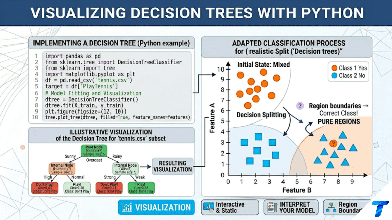
Decision boundary plots reveal how the tree partitions 2D feature space into rectangular prediction regions. Since trees split on one feature at a time, these boundaries are always axis-aligned.
import numpy as np
import matplotlib.pyplot as plt
from matplotlib.colors import ListedColormap
from sklearn.tree import DecisionTreeClassifier


def plot_decision_boundary(dt, X, y, feature_idx=(0, 1),
                             feature_names=None, class_names=None,
                             title="Decision Tree Boundary",
                             resolution=300, margin=0.5, figsize=(10, 7)):
    """
    Visualize decision tree boundary in a 2D feature subspace.

    Args:
        dt:          Fitted decision tree (uses all features)
        X:           Full feature matrix
        y:           Class labels
        feature_idx: Tuple of two feature indices to plot
        resolution:  Grid resolution for boundary
        margin:      Extra margin around data range
    """
    f1, f2 = feature_idx
    X2     = X[:, [f1, f2]]   # 2D subspace for plotting

    x_min, x_max = X2[:, 0].min() - margin, X2[:, 0].max() + margin
    y_min, y_max = X2[:, 1].min() - margin, X2[:, 1].max() + margin

    xx, yy = np.meshgrid(np.linspace(x_min, x_max, resolution),
                          np.linspace(y_min, y_max, resolution))

    # Build full-feature grid (using mean for non-plotted features)
    X_means = X.mean(axis=0)
    grid_full = np.tile(X_means, (resolution * resolution, 1))
    grid_full[:, f1] = xx.ravel()
    grid_full[:, f2] = yy.ravel()

    Z = dt.predict(grid_full).reshape(xx.shape)

    # Colors
    n_classes = len(np.unique(y))
    palette_bg  = ['#d0e8f8', '#f8d0d0', '#d0f8d0', '#f8f0d0', '#e8d0f8'][:n_classes]
    palette_pts = ['steelblue', 'coral', 'mediumseagreen', 'goldenrod', 'mediumpurple'][:n_classes]

    cmap_bg = ListedColormap(palette_bg)

    fig, ax = plt.subplots(figsize=figsize)

    ax.contourf(xx, yy, Z, alpha=0.4, cmap=cmap_bg)
    ax.contour(xx, yy, Z, colors='black', linewidths=0.8, alpha=0.4)

    classes = np.unique(y)
    for cls, color in zip(classes, palette_pts):
        mask = y == cls
        label = (class_names[cls] if class_names is not None
                 else f"Class {cls}")
        ax.scatter(X2[mask, 0], X2[mask, 1], c=color,
                   edgecolors='white', s=55, linewidth=0.5,
                   label=label, alpha=0.85, zorder=3)

    f1_name = (feature_names[f1] if feature_names is not None
               else f"Feature {f1}")
    f2_name = (feature_names[f2] if feature_names is not None
               else f"Feature {f2}")

    ax.set_xlabel(f1_name, fontsize=12)
    ax.set_ylabel(f2_name, fontsize=12)
    ax.set_title(title, fontsize=12, fontweight='bold')
    ax.legend(fontsize=10, loc='upper right')
    ax.grid(True, alpha=0.2)

    plt.tight_layout()
    return fig, ax


# 2D: Iris with petal features (most discriminative pair)
fig_ir, _ = plot_decision_boundary(
    DecisionTreeClassifier(max_depth=4, random_state=42).fit(X_ir[:, 2:], y_ir),
    X_ir[:, 2:], y_ir,
    feature_idx=(0, 1),
    feature_names=['Petal Length (cm)', 'Petal Width (cm)'],
    class_names=iris.target_names,
    title='Decision Tree Boundary: Iris (Petal Features, depth=4)\n'
          'Axis-aligned splits create rectangular prediction regions',
)
fig_ir.savefig('dt_boundary_iris_petal.png', dpi=150)
plt.show()
print("Saved: dt_boundary_iris_petal.png")


# Boundary comparison: different depths
def plot_depth_comparison(X, y, depths, feature_names=None,
                           class_names=None, title="Depth Comparison"):
    """
    Side-by-side decision boundary plots for different max_depth values.
    Shows how depth controls the complexity of the decision surface.
    """
    n_cols = len(depths)
    fig, axes = plt.subplots(1, n_cols, figsize=(5 * n_cols, 5), sharey=True)

    x_min, x_max = X[:, 0].min() - 0.5, X[:, 0].max() + 0.5
    y_min, y_max = X[:, 1].min() - 0.5, X[:, 1].max() + 0.5
    xx, yy = np.meshgrid(np.linspace(x_min, x_max, 250),
                          np.linspace(y_min, y_max, 250))
    grid = np.c_[xx.ravel(), yy.ravel()]

    palette_bg  = ['#d0e8f8', '#f8d0d0']
    palette_pts = ['steelblue', 'coral']
    cmap_bg     = ListedColormap(palette_bg)

    for ax, d in zip(axes, depths):
        dt_d = DecisionTreeClassifier(max_depth=d, random_state=42)
        dt_d.fit(X, y)

        Z = dt_d.predict(grid).reshape(xx.shape)

        ax.contourf(xx, yy, Z, alpha=0.35, cmap=cmap_bg)
        ax.contour(xx, yy, Z, colors='black', linewidths=0.8, alpha=0.4)

        for cls, color in zip(np.unique(y), palette_pts):
            mask = y == cls
            ax.scatter(X[mask, 0], X[mask, 1], c=color, edgecolors='white',
                       s=35, linewidth=0.4, alpha=0.85)

        train_acc = dt_d.score(X, y)
        n_leaves  = dt_d.get_n_leaves()

        depth_str = str(d) if d is not None else "∞"
        ax.set_title(f"depth = {depth_str}\n"
                     f"{n_leaves} leaves | Train acc = {train_acc:.3f}",
                     fontsize=10, fontweight='bold')
        ax.set_xlabel(feature_names[0] if feature_names else "X1", fontsize=9)
        if ax == axes[0]:
            ax.set_ylabel(feature_names[1] if feature_names else "X2", fontsize=9)
        ax.grid(True, alpha=0.2)

    plt.suptitle(title, fontsize=12, fontweight='bold', y=1.02)
    plt.tight_layout()
    return fig


np.random.seed(42)
X_moons, y_moons = make_moons(n_samples=300, noise=0.25, random_state=42)

fig_d_comp = plot_depth_comparison(
    X_moons, y_moons,
    depths=[1, 3, 5, 10, None],
    feature_names=['Feature 1', 'Feature 2'],
    title='Decision Tree Boundary: Two Moons Dataset\n'
          '(Note: straight axis-aligned cuts approximating a curved boundary)'
)
fig_d_comp.savefig('dt_boundary_depth_comparison.png', dpi=150, bbox_inches='tight')
plt.show()
print("Saved: dt_boundary_depth_comparison.png")Method 5: Feature Importance Visualization
Feature importances summarize which features the tree relied on most across all splits. Visualizing them reveals both feature relevance and which features were ignored entirely.
import numpy as np
import matplotlib.pyplot as plt
from sklearn.tree import DecisionTreeClassifier
from sklearn.inspection import permutation_importance
from sklearn.datasets import load_breast_cancer
from sklearn.model_selection import train_test_split


def plot_feature_importances(dt, feature_names, X_test=None, y_test=None,
                               top_n=20, title="Feature Importances"):
    """
    Plot decision tree feature importances with optional permutation importance.

    Two types of importance:
    1. MDI (Mean Decrease in Impurity): built-in, fast, can be biased
    2. Permutation Importance: unbiased but slower, requires test data

    Args:
        dt:           Fitted decision tree
        feature_names: Feature name strings
        X_test, y_test: Test data for permutation importance (optional)
        top_n:        Number of top features to display
    """
    importances_mdi = dt.feature_importances_
    sorted_idx_mdi  = np.argsort(importances_mdi)[::-1][:top_n]

    if X_test is not None and y_test is not None:
        fig, axes = plt.subplots(1, 2, figsize=(16, max(6, top_n * 0.4)))
    else:
        fig, axes = plt.subplots(1, 1, figsize=(10, max(6, top_n * 0.4)))
        axes = [axes]

    # MDI Importances
    ax = axes[0]
    colors = plt.cm.Blues(np.linspace(0.4, 0.9, top_n))[::-1]
    bars = ax.barh(range(top_n),
                   importances_mdi[sorted_idx_mdi],
                   color=colors, edgecolor='white', linewidth=0.5)
    ax.set_yticks(range(top_n))
    ax.set_yticklabels([feature_names[i] for i in sorted_idx_mdi], fontsize=9)
    ax.set_xlabel('Mean Decrease in Impurity', fontsize=11)
    ax.set_title(f'{title}\nMDI Feature Importances', fontsize=11, fontweight='bold')
    ax.grid(True, alpha=0.3, axis='x')
    ax.invert_yaxis()  # Highest importance at top

    # Add value labels on bars
    for bar, idx in zip(bars, sorted_idx_mdi):
        width = bar.get_width()
        if width > 0.01:
            ax.text(width + 0.003, bar.get_y() + bar.get_height() / 2,
                    f'{width:.3f}', va='center', fontsize=7)

    # Permutation Importances (if test data provided)
    if X_test is not None and y_test is not None:
        perm_imp = permutation_importance(
            dt, X_test, y_test, n_repeats=30, random_state=42, n_jobs=-1
        )
        sorted_idx_perm = np.argsort(perm_imp.importances_mean)[::-1][:top_n]

        ax2 = axes[1]
        for rank, feat_idx in enumerate(sorted_idx_perm):
            mean_imp = perm_imp.importances_mean[feat_idx]
            std_imp  = perm_imp.importances_std[feat_idx]
            ax2.barh(rank, mean_imp, xerr=std_imp,
                     color=plt.cm.Oranges(0.5 + 0.5 * mean_imp / perm_imp.importances_mean.max()),
                     edgecolor='white', linewidth=0.5,
                     error_kw={'linewidth': 1.5, 'ecolor': 'gray'})

        ax2.set_yticks(range(top_n))
        ax2.set_yticklabels([feature_names[i] for i in sorted_idx_perm], fontsize=9)
        ax2.set_xlabel('Accuracy Decrease (mean ± std)', fontsize=11)
        ax2.set_title(f'Permutation Importances\n(More reliable, unbiased)',
                      fontsize=11, fontweight='bold')
        ax2.grid(True, alpha=0.3, axis='x')
        ax2.invert_yaxis()

    plt.tight_layout()
    return fig


cancer = load_breast_cancer()
X_ca, y_ca = cancer.data, cancer.target
X_tr_ca, X_te_ca, y_tr_ca, y_te_ca = train_test_split(
    X_ca, y_ca, test_size=0.25, random_state=42
)
dt_ca_full = DecisionTreeClassifier(max_depth=5, random_state=42).fit(X_tr_ca, y_tr_ca)

fig_imp = plot_feature_importances(
    dt_ca_full,
    feature_names=cancer.feature_names,
    X_test=X_te_ca, y_test=y_te_ca,
    top_n=15,
    title="Breast Cancer Decision Tree"
)
fig_imp.savefig('dt_feature_importances.png', dpi=150, bbox_inches='tight')
plt.show()
print("Saved: dt_feature_importances.png")Method 6: Tracing Individual Predictions
When explaining a specific prediction to a stakeholder — “why did the model classify this patient as high risk?” — you need to trace the exact path from root to leaf for that sample.
import numpy as np


def trace_prediction_path(dt, x, feature_names, class_names):
    """
    Trace the decision path for a single sample through the tree.

    Prints each decision made from root to leaf in plain language,
    suitable for explaining individual predictions to non-technical users.

    Args:
        dt:            Fitted decision tree
        x:             Single sample (1D array of features)
        feature_names: Feature name strings
        class_names:   Class name strings

    Returns:
        Predicted class, confidence, list of decision steps
    """
    tree    = dt.tree_
    x       = np.array(x).ravel()
    node_id = 0
    steps   = []
    depth   = 0

    while True:
        is_leaf = (tree.children_left[node_id] == -1)

        if is_leaf:
            counts     = tree.value[node_id][0].astype(int)
            majority   = np.argmax(counts)
            confidence = counts[majority] / counts.sum()
            prediction = class_names[majority]

            steps.append({
                'type':       'leaf',
                'depth':      depth,
                'prediction': prediction,
                'confidence': confidence,
                'counts':     {class_names[i]: int(c) for i, c in enumerate(counts)},
                'n_samples':  int(counts.sum()),
            })
            break

        feat   = tree.feature[node_id]
        thresh = tree.threshold[node_id]
        val    = x[feat]

        goes_left = val <= thresh
        direction = "Yes (≤)" if goes_left else "No (>)"

        steps.append({
            'type':      'split',
            'depth':     depth,
            'feature':   feature_names[feat],
            'threshold': thresh,
            'value':     val,
            'direction': direction,
            'node_id':   node_id,
        })

        node_id = (tree.children_left[node_id] if goes_left
                   else tree.children_right[node_id])
        depth += 1

    # Print the path
    leaf = steps[-1]
    splits = steps[:-1]

    print(f"=== Prediction Path ===\n")
    print(f"  Prediction: '{leaf['prediction']}' "
          f"(confidence: {leaf['confidence']*100:.1f}%)")
    print(f"  Training samples at this leaf: {leaf['n_samples']}")
    print(f"  Class distribution: {leaf['counts']}\n")
    print(f"  Decision path ({len(splits)} splits):")

    for step in splits:
        indent = "    " * (step['depth'] + 1)
        print(f"{indent}[Depth {step['depth']}] "
              f"{step['feature']} = {step['value']:.4f}  "
              f"→ Is ≤ {step['threshold']:.4f}? → {step['direction']}")

    return leaf['prediction'], leaf['confidence'], steps


# Example: trace a specific iris sample
sample_idx = 75
x_sample = X_ir[sample_idx]
true_label = iris.target_names[y_ir[sample_idx]]

print(f"Sample #{sample_idx} | True class: '{true_label}'\n")
pred, conf, path = trace_prediction_path(
    dt_ir_d3, x_sample, iris.feature_names, iris.target_names
)

# Visualize the path on the tree
def highlight_prediction_path(dt, x, feature_names, class_names, figsize=(18, 9)):
    """
    Visualize the full tree with the prediction path for sample x highlighted.
    """
    from sklearn.tree import plot_tree

    # Get node path
    decision_path = dt.decision_path([x])
    node_indicator = decision_path.toarray()[0].astype(bool)
    nodes_on_path  = np.where(node_indicator)[0]

    fig, ax = plt.subplots(figsize=figsize)

    plot_tree(
        dt,
        feature_names=feature_names,
        class_names=class_names,
        filled=True,
        rounded=True,
        impurity=True,
        precision=3,
        fontsize=10,
        ax=ax,
    )

    ax.set_title(
        f"Prediction Path Highlighted (sample #{sample_idx})\n"
        f"True: '{true_label}' | Predicted: '{pred}' ({conf*100:.1f}% confidence)\n"
        f"Path visits {len(nodes_on_path)} nodes (nodes on path = depth + 1)",
        fontsize=11, fontweight='bold'
    )

    plt.tight_layout()
    plt.savefig('dt_prediction_path.png', dpi=150, bbox_inches='tight')
    plt.show()
    print("Saved: dt_prediction_path.png")

    print(f"\n  Nodes visited: {nodes_on_path}")
    print(f"  Total nodes in tree: {dt.tree_.node_count}")
    print(f"  Path efficiency: {len(nodes_on_path)}/{dt.tree_.node_count} nodes visited")


highlight_prediction_path(dt_ir_d3, x_sample, iris.feature_names, iris.target_names)Method 7: Tree Complexity Analysis Plots
Understanding how tree complexity evolves with depth helps you make principled decisions about regularization. The following visualization suite provides a comprehensive complexity dashboard.
import numpy as np
import matplotlib.pyplot as plt
from sklearn.tree import DecisionTreeClassifier
from sklearn.datasets import load_wine
from sklearn.model_selection import train_test_split, cross_val_score


def tree_complexity_dashboard(X_train, y_train, X_test, y_test,
                                feature_names, class_names,
                                max_depth_range=range(1, 25),
                                cv_folds=5, figsize=(16, 12)):
    """
    Comprehensive dashboard showing tree complexity metrics vs max_depth.

    Panels:
    1. Train vs test accuracy (bias-variance tradeoff)
    2. Number of leaves vs depth
    3. Number of nodes vs depth
    4. Mean depth of leaves (how deep is the average prediction path?)
    5. Feature coverage (fraction of features used)
    6. Cross-validation accuracy with confidence band
    """
    depths      = list(max_depth_range)
    train_accs  = []
    test_accs   = []
    n_leaves    = []
    n_nodes     = []
    mean_depths = []
    feat_cov    = []
    cv_means    = []
    cv_stds     = []

    for d in depths:
        dt = DecisionTreeClassifier(max_depth=d, random_state=42)
        dt.fit(X_train, y_train)

        train_accs.append(dt.score(X_train, y_train))
        test_accs.append(dt.score(X_test, y_test))
        n_leaves.append(dt.get_n_leaves())
        n_nodes.append(dt.tree_.node_count)

        # Mean depth of leaf nodes
        tree = dt.tree_
        leaf_depths = []
        stack = [(0, 0)]
        while stack:
            nid, dep = stack.pop()
            if tree.children_left[nid] == -1:
                leaf_depths.append(dep)
            else:
                stack.append((tree.children_right[nid], dep + 1))
                stack.append((tree.children_left[nid],  dep + 1))
        mean_depths.append(np.mean(leaf_depths))

        # Feature coverage
        used = (dt.feature_importances_ > 0).sum()
        feat_cov.append(used / X_train.shape[1] * 100)

        # CV accuracy
        cv_sc = cross_val_score(dt, np.vstack([X_train, X_test]),
                                 np.concatenate([y_train, y_test]),
                                 cv=cv_folds, scoring='accuracy')
        cv_means.append(cv_sc.mean())
        cv_stds.append(cv_sc.std())

    depths      = np.array(depths)
    train_accs  = np.array(train_accs)
    test_accs   = np.array(test_accs)
    cv_means    = np.array(cv_means)
    cv_stds     = np.array(cv_stds)

    best_test_idx = np.argmax(test_accs)
    best_cv_idx   = np.argmax(cv_means)

    fig, axes = plt.subplots(2, 3, figsize=figsize)
    axes = axes.flatten()

    # Panel 1: Accuracy
    ax = axes[0]
    ax.plot(depths, train_accs, 'o-', color='steelblue', lw=2, label='Train')
    ax.plot(depths, test_accs,  's-', color='coral',     lw=2, label='Test')
    ax.axvline(depths[best_test_idx], color='green', linestyle='--', lw=1.5,
               label=f'Best test depth={depths[best_test_idx]}')
    ax.set_xlabel('max_depth'); ax.set_ylabel('Accuracy')
    ax.set_title('Train vs Test Accuracy', fontweight='bold')
    ax.legend(fontsize=9); ax.grid(True, alpha=0.3)

    # Panel 2: Leaves
    ax = axes[1]
    ax.semilogy(depths, n_leaves, 'o-', color='mediumpurple', lw=2)
    ax.axvline(depths[best_test_idx], color='green', linestyle='--', lw=1.5)
    ax.set_xlabel('max_depth'); ax.set_ylabel('Number of Leaves (log)')
    ax.set_title('Leaf Count vs Depth\n(Exponential growth!)', fontweight='bold')
    ax.grid(True, alpha=0.3)

    # Panel 3: Nodes
    ax = axes[2]
    ax.semilogy(depths, n_nodes, 'o-', color='goldenrod', lw=2)
    ax.axvline(depths[best_test_idx], color='green', linestyle='--', lw=1.5)
    ax.set_xlabel('max_depth'); ax.set_ylabel('Total Nodes (log)')
    ax.set_title('Node Count vs Depth', fontweight='bold')
    ax.grid(True, alpha=0.3)

    # Panel 4: Mean leaf depth
    ax = axes[3]
    ax.plot(depths, mean_depths, 'o-', color='teal', lw=2)
    ax.plot(depths, depths, 'k--', lw=1, alpha=0.4, label='Max possible')
    ax.axvline(depths[best_test_idx], color='green', linestyle='--', lw=1.5)
    ax.set_xlabel('max_depth'); ax.set_ylabel('Mean Leaf Depth')
    ax.set_title('Mean Prediction Path Length\n(Actual vs maximum possible)',
                 fontweight='bold')
    ax.legend(fontsize=8); ax.grid(True, alpha=0.3)

    # Panel 5: Feature coverage
    ax = axes[4]
    ax.plot(depths, feat_cov, 'o-', color='darkorange', lw=2)
    ax.axhline(y=100, color='gray', linestyle=':', lw=1, alpha=0.5,
               label='100% coverage')
    ax.set_xlabel('max_depth'); ax.set_ylabel('Features Used (%)')
    ax.set_title('Feature Coverage vs Depth\n(% of features appearing in tree)',
                 fontweight='bold')
    ax.set_ylim([0, 105]); ax.legend(fontsize=8); ax.grid(True, alpha=0.3)

    # Panel 6: CV accuracy
    ax = axes[5]
    ax.plot(depths, cv_means, 'o-', color='mediumseagreen', lw=2, label='CV mean')
    ax.fill_between(depths, cv_means - cv_stds, cv_means + cv_stds,
                    alpha=0.2, color='mediumseagreen', label='±1 std')
    ax.axvline(depths[best_cv_idx], color='coral', linestyle='--', lw=2,
               label=f'Best CV depth={depths[best_cv_idx]}')
    ax.set_xlabel('max_depth'); ax.set_ylabel('CV Accuracy')
    ax.set_title(f'{cv_folds}-Fold CV Accuracy', fontweight='bold')
    ax.legend(fontsize=9); ax.grid(True, alpha=0.3)

    plt.suptitle(f'Decision Tree Complexity Dashboard\n'
                 f'(Best test depth={depths[best_test_idx]}, '
                 f'Best CV depth={depths[best_cv_idx]})',
                 fontsize=13, fontweight='bold', y=1.01)
    plt.tight_layout()
    plt.savefig('dt_complexity_dashboard.png', dpi=150, bbox_inches='tight')
    plt.show()
    print("Saved: dt_complexity_dashboard.png")

    return {
        'best_test_depth': depths[best_test_idx],
        'best_cv_depth':   depths[best_cv_idx],
        'best_test_acc':   test_accs[best_test_idx],
        'best_cv_acc':     cv_means[best_cv_idx],
    }


wine = load_wine()
X_wi_full, y_wi_full = wine.data, wine.target
X_tr_w2, X_te_w2, y_tr_w2, y_te_w2 = train_test_split(
    X_wi_full, y_wi_full, test_size=0.25, random_state=42, stratify=y_wi_full
)

results = tree_complexity_dashboard(
    X_tr_w2, y_tr_w2, X_te_w2, y_te_w2,
    feature_names=wine.feature_names,
    class_names=wine.target_names,
    max_depth_range=range(1, 20)
)
print(f"\n  Best test depth: {results['best_test_depth']} "
      f"(acc={results['best_test_acc']:.4f})")
print(f"  Best CV depth:   {results['best_cv_depth']} "
f"(acc={results['best_cv_acc']:.4f})")Method 8: Visualizing Regression Trees
Regression trees predict continuous values rather than class labels. Visualizing them requires a different lens — instead of class purity, we care about the mean and variance of target values at each node.
import numpy as np
import matplotlib.pyplot as plt
from sklearn.tree import DecisionTreeRegressor, plot_tree

# 1D regression: piecewise constant predictions with split markers
np.random.seed(42)
X_1d = np.sort(np.random.uniform(0, 4 * np.pi, 200)).reshape(-1, 1)
y_1d = np.sin(X_1d.ravel()) + 0.5 * np.cos(2 * X_1d.ravel()) + \
       np.random.normal(0, 0.15, 200)

fig, axes = plt.subplots(2, 3, figsize=(18, 10))
x_plot = np.linspace(0, 4 * np.pi, 1000).reshape(-1, 1)
y_true_plot = np.sin(x_plot.ravel()) + 0.5 * np.cos(2 * x_plot.ravel())

for ax, d in zip(axes.flatten(), [1, 2, 3, 5, 8, 15]):
    dtr = DecisionTreeRegressor(max_depth=d, random_state=42)
    dtr.fit(X_1d, y_1d)
    y_pred = dtr.predict(x_plot)

    ax.scatter(X_1d, y_1d, color='steelblue', s=12, alpha=0.5, label='Data')
    ax.plot(x_plot, y_true_plot, 'k--', lw=1.5, alpha=0.5, label='True f(x)')
    ax.plot(x_plot, y_pred, 'coral', lw=2.5, label=f'DT (depth={d})')

    # Mark split thresholds as vertical dotted lines
    tree = dtr.tree_
    stack = [0]
    while stack:
        nid = stack.pop()
        if tree.children_left[nid] != -1:
            ax.axvline(x=tree.threshold[nid], color='gray',
                       linestyle=':', lw=0.8, alpha=0.4)
            stack.append(tree.children_left[nid])
            stack.append(tree.children_right[nid])

    r2 = dtr.score(X_1d, y_1d)
    ax.set_title(f'Depth={d} | {dtr.get_n_leaves()} leaves | R²={r2:.3f}',
                 fontsize=10, fontweight='bold')
    ax.set_xlabel('X', fontsize=9); ax.set_ylabel('y', fontsize=9)
    ax.legend(fontsize=7, loc='upper right'); ax.grid(True, alpha=0.2)

plt.suptitle('Regression Tree: Piecewise Constant Approximation\n'
             'Gray dotted lines = split thresholds; deeper trees = more steps',
             fontsize=13, fontweight='bold', y=1.01)
plt.tight_layout()
plt.savefig('dt_regression_piecewise.png', dpi=150, bbox_inches='tight')
plt.show()
print("Saved: dt_regression_piecewise.png")


def visualize_regression_leaf_distributions(dt_reg, X_train, y_train, n_cols=4):
    """
    Show the distribution of target values at each leaf node.
    The leaf's mean is the prediction; spread shows unexplained variance.
    """
    leaf_ids      = dt_reg.apply(X_train)
    unique_leaves = np.unique(leaf_ids)
    n_leaves      = len(unique_leaves)
    n_rows        = int(np.ceil(n_leaves / n_cols))

    fig, axes = plt.subplots(n_rows, n_cols, figsize=(4 * n_cols, 3 * n_rows))
    axes = axes.flatten()

    for ax, leaf_id in zip(axes, unique_leaves):
        mask   = leaf_ids == leaf_id
        y_leaf = y_train[mask]

        ax.hist(y_leaf, bins=min(15, max(5, len(y_leaf))),
                color='steelblue', edgecolor='white', alpha=0.8)
        ax.axvline(y_leaf.mean(), color='coral', lw=2.5,
                   label=f'μ={y_leaf.mean():.2f}')
        ax.set_title(f'Leaf {leaf_id}  n={len(y_leaf)}  σ={y_leaf.std():.2f}',
                     fontsize=8, fontweight='bold')
        ax.legend(fontsize=6); ax.grid(True, alpha=0.3, axis='y')
        ax.tick_params(labelsize=7)

    for ax in axes[n_leaves:]:
        ax.set_visible(False)

    plt.suptitle('Regression Tree: Target Distribution per Leaf\n'
                 '(Each leaf predicts its mean; large σ = poorly fit region)',
                 fontsize=11, fontweight='bold')
    plt.tight_layout()
    plt.savefig('dt_regression_leaf_distributions.png', dpi=150, bbox_inches='tight')
    plt.show()
    print("Saved: dt_regression_leaf_distributions.png")


dtr_shallow = DecisionTreeRegressor(max_depth=3, random_state=42)
dtr_shallow.fit(X_1d, y_1d)
visualize_regression_leaf_distributions(dtr_shallow, X_1d, y_1d, n_cols=4)The regression tree visualization reveals the key limitation of the algorithm: each leaf’s prediction is a flat horizontal line at the mean of its training samples. Even with depth=15 the curve is a staircase, never a smooth line. This directly motivates gradient boosted trees, which sum many shallow trees to approximate smooth functions more efficiently than any single deep tree.
Method 9: Confusion Matrix Per Leaf
For classification trees, computing a confusion matrix for each leaf node reveals which leaves make systematic errors versus which are reliably pure. This is especially useful for diagnosing class imbalance problems or identifying subtrees that would benefit from pruning.
import numpy as np
import matplotlib.pyplot as plt
from sklearn.tree import DecisionTreeClassifier
from sklearn.datasets import load_wine
from sklearn.model_selection import train_test_split
from sklearn.metrics import confusion_matrix


def confusion_matrix_per_leaf(dt, X, y, class_names, n_cols=4):
    """
    Plot a small confusion matrix for every leaf node.

    Impure leaves (high off-diagonal counts) are candidates for:
    - Additional depth (if training data permits)
    - Pruning (if the node is too small to split reliably)
    - Feature engineering (if no existing feature separates them)
    """
    leaf_ids      = dt.apply(X)
    unique_leaves = np.unique(leaf_ids)
    n_leaves      = len(unique_leaves)
    n_classes     = len(class_names)
    y_pred        = dt.predict(X)

    n_rows = int(np.ceil(n_leaves / n_cols))
    fig, axes = plt.subplots(n_rows, n_cols,
                              figsize=(4 * n_cols, 3.5 * n_rows))
    axes = axes.flatten()

    print(f"  {'Leaf':>6} | {'n':>5} | {'Acc %':>7} | {'Majority':>15} | Purity")
    print("  " + "-" * 48)

    for ax, leaf_id in zip(axes, unique_leaves):
        mask        = leaf_ids == leaf_id
        y_true_leaf = y[mask]
        y_pred_leaf = y_pred[mask]
        n_samples   = mask.sum()

        cm  = confusion_matrix(y_true_leaf, y_pred_leaf,
                                labels=np.arange(n_classes))
        acc = (y_true_leaf == y_pred_leaf).mean()
        majority = class_names[np.argmax(np.bincount(y_true_leaf.astype(int),
                                                      minlength=n_classes))]

        cmap = 'Greens' if acc > 0.9 else ('YlOrBr' if acc > 0.7 else 'Reds')
        im = ax.imshow(cm, interpolation='nearest', cmap=cmap)
        ax.set_xticks(np.arange(n_classes))
        ax.set_yticks(np.arange(n_classes))
        ax.set_xticklabels([c[:4] for c in class_names], fontsize=6, rotation=45)
        ax.set_yticklabels([c[:4] for c in class_names], fontsize=6)
        for i in range(n_classes):
            for j in range(n_classes):
                ax.text(j, i, str(cm[i, j]), ha='center', va='center',
                        fontsize=8, color='white' if cm[i, j] > cm.max()/2 else 'black')

        status = "✓" if acc > 0.9 else ("~" if acc > 0.7 else "✗")
        color  = '#22aa22' if acc > 0.9 else ('#aaaa22' if acc > 0.7 else '#aa2222')
        ax.set_title(f'{status} Leaf {leaf_id}  n={n_samples}\nAcc={acc*100:.0f}%',
                     fontsize=8, fontweight='bold', color=color)
        ax.set_xlabel('Pred', fontsize=6); ax.set_ylabel('True', fontsize=6)

        flag = "✓ Pure" if acc > 0.9 else ("~ Mixed" if acc > 0.7 else "✗ Impure")
        print(f"  {leaf_id:>6} | {n_samples:>5} | {acc*100:>6.0f}% | "
              f"{majority:>15} | {flag}")

    for ax in axes[n_leaves:]:
        ax.set_visible(False)

    plt.suptitle('Confusion Matrix per Leaf\n'
                 'Green=pure (>90%), Yellow=mixed, Red=impure (<70%)',
                 fontsize=12, fontweight='bold')
    plt.tight_layout()
    plt.savefig('dt_confusion_per_leaf.png', dpi=150, bbox_inches='tight')
    plt.show()
    print("\nSaved: dt_confusion_per_leaf.png")


wine  = load_wine()
X_wi2, y_wi2 = wine.data, wine.target
X_tr_wi2, X_te_wi2, y_tr_wi2, y_te_wi2 = train_test_split(
    X_wi2, y_wi2, test_size=0.25, random_state=42, stratify=y_wi2
)
dt_wi_vis = DecisionTreeClassifier(max_depth=4, random_state=42).fit(X_tr_wi2, y_tr_wi2)

print("=== Confusion Matrix per Leaf: Wine Dataset ===\n")
confusion_matrix_per_leaf(dt_wi_vis, X_te_wi2, y_te_wi2,
wine.target_names, n_cols=4)The per-leaf confusion matrix immediately highlights which parts of the tree are working well (pure leaves colored green) and which need attention (mixed leaves colored yellow or red). An impure leaf with many samples is a strong candidate for additional depth or feature engineering — it has enough data to support further splitting but lacks a good separating feature in the current tree. A small impure leaf with only a handful of samples may be better pruned entirely, defaulting to the parent’s majority class.
Choosing the Right Visualization
Different visualization needs call for different tools. Here is a practical decision guide:
| Situation | Best Method | Why |
|---|---|---|
| Quick exploratory check | plot_tree() | Instant, no dependencies |
| Understanding node structure | export_text() | Readable, no graphics needed |
| Presentation to management | export_graphviz() | Polished, professional quality |
| Explaining single prediction | trace_prediction_path() | Shows exact logic for one case |
| Understanding feature space | Decision boundary plot | Reveals how space is partitioned |
| Feature selection | Feature importance plot | Shows which features matter |
| Choosing max_depth | Complexity dashboard | Multi-metric view across depths |
| Code deployment | rules_to_python_function() | Sklearn-independent portable rules |
Visualization Best Practices
Limit depth for readability. A tree with more than 5–6 levels becomes impossible to read on screen. For deep trees, visualize only the top levels using max_depth in plot_tree(), then investigate specific subtrees separately.
Use filled=True for faster intuition. Color intensity immediately communicates node purity — you can spot the impure (mixed) nodes before reading any numbers.
Export text rules for stakeholders. Technical visualizations overwhelm most business audiences. The plain-English rules from export_text() or extract_decision_rules() communicate the model’s logic without requiring knowledge of tree diagrams.
Show both MDI and permutation importance. MDI importances are fast but biased toward high-cardinality features. Permutation importances are unbiased but slower and require held-out test data. Showing both and comparing them reveals whether high-cardinality features are artificially inflated.
Trace predictions for debugging. When a prediction seems wrong, the path trace immediately shows which feature value triggered the unexpected branch — far more diagnostic than a simple probability output.
Summary
Visualization is what converts a decision tree from a black box of numbers into an interpretable, communicable, and auditable model. The seven methods covered in this article serve different purposes: plot_tree for exploration, export_text for documentation and stakeholder communication, Graphviz for reports and publications, decision boundary plots for understanding the geometric structure, feature importance charts for variable selection, prediction path tracing for debugging and explanation, and complexity dashboards for hyperparameter selection.
The axis-aligned, rectangular nature of decision tree boundaries — visible immediately in 2D boundary plots — is both the tree’s characteristic fingerprint and its key limitation. It explains why trees can struggle with diagonal boundaries and why ensembles that average many trees (each seeing a different perspective on the data) produce smoother, more generalizable boundaries.
Every visualization in this article serves a practical purpose beyond aesthetics: they make the model’s logic auditable, its failures diagnosable, and its decisions explainable to the humans who must trust and act on its outputs.