Why Understanding Data Types Transforms Your Analysis
Imagine walking into a hardware store looking for tools to build a bookshelf. You would not use a hammer where you need a screwdriver, or try to cut wood with a measuring tape. Each tool has specific purposes, and using the wrong tool makes the job impossible or produces terrible results. Data types work the same way in data science. Understanding what type of data you have determines which analytical techniques you can use, which visualizations make sense, and which insights you can legitimately draw.
Many beginners treat all data as essentially the same, applying techniques randomly without considering whether those techniques are appropriate for their specific data types. They calculate averages of categorical variables that should not be averaged, create scatter plots for data that should be shown as bar charts, or use statistical tests designed for continuous data on discrete counts. These mistakes lead to meaningless results and incorrect conclusions that can have real consequences when decisions are based on flawed analysis.
Understanding data types is not just academic classification for its own sake. It is practical knowledge that guides every decision you make during analysis. When you can look at a dataset and immediately identify which variables are numerical, which are categorical, which are ordinal, and which are nominal, you can quickly determine appropriate analytical approaches. This skill saves time, prevents errors, and enables you to extract valid insights from data. Let me guide you through understanding the fundamental data types you will encounter and how to work with each effectively.
The Fundamental Division: Quantitative Versus Qualitative
At the highest level, data divides into two broad categories based on a fundamental question: does the data represent quantities or qualities? This distinction between quantitative and qualitative data shapes everything about how you approach analysis.
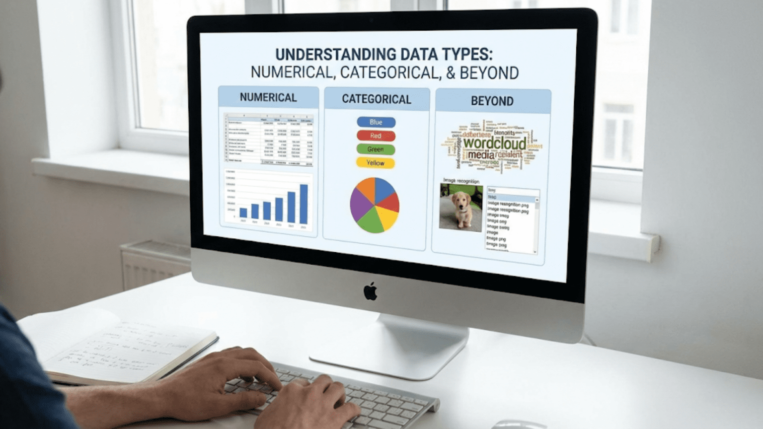
Quantitative data represents numerical measurements or counts of things. These are values you can meaningfully add, subtract, multiply, or divide. Examples include height in centimeters, temperature in degrees, number of sales, account balances, test scores, and speed in kilometers per hour. Quantitative data answers questions like “how much,” “how many,” or “how long.” You can perform mathematical operations on quantitative data and the results have meaning. Adding two people’s heights gives a total height. Calculating an average test score makes sense.
Qualitative data represents categories, labels, or descriptions rather than quantities. These values classify or describe characteristics but do not represent amounts you can mathematically manipulate. Examples include colors, gender categories, country names, product types, yes/no responses, and customer satisfaction ratings like “poor,” “fair,” or “excellent.” Qualitative data answers questions like “what type,” “which category,” or “what kind.” You cannot meaningfully perform arithmetic on qualitative data. Adding “red” plus “blue” has no sensible interpretation. Calculating an average of country names makes no sense.
This fundamental distinction determines your analytical approach immediately. For quantitative data, you can calculate means, standard deviations, correlations, and perform regression analysis. You can create histograms showing distributions, scatter plots showing relationships, and line graphs showing trends over time. Statistical tests designed for numerical data apply.
For qualitative data, you count frequencies in each category, calculate proportions or percentages, and look for associations between categories. You create bar charts showing category frequencies, pie charts showing proportions, and contingency tables showing relationships between categorical variables. Different statistical tests designed for categorical data apply, like chi-square tests.
Recognizing this distinction when you first examine data saves you from fundamental errors. If you see a column labeled “customer_id” containing numbers like 1001, 1002, 1003, you might assume it is quantitative because it contains numbers. However, these numbers are actually qualitative labels identifying specific customers. Averaging customer IDs produces a meaningless number. Understanding that these are categories despite their numerical representation prevents this mistake.
Similarly, zip codes, phone numbers, and social security numbers are qualitative despite being stored as numbers. They identify categories or entities rather than representing quantities. The number 90210 is not “greater than” 10001 in any meaningful sense; they are just different labels for different locations.
Numerical Data: Continuous Versus Discrete
Within quantitative data, an important subdivision exists between continuous and discrete values. This distinction affects which statistical methods are most appropriate and how you visualize and analyze the data.
Continuous data can take any value within a range, including decimals and fractions. These measurements can be infinitely precise in theory, limited only by your measurement instrument. Examples include height, weight, temperature, time, distance, and proportions. If you measure someone’s height precisely enough, it might be 170.3847 centimeters. Temperature could be 23.56 degrees. These values exist on a continuum with no gaps between possible values.
Continuous data typically arises from measuring things. When you use a ruler, scale, thermometer, or stopwatch, you get continuous measurements. The data can be rounded for practical purposes, but conceptually, the underlying variable is continuous. Between any two values, infinite other possible values exist.
Discrete data can only take specific values, usually integers or counts. These are values you count rather than measure. Examples include number of children, number of sales transactions, number of defects, number of emails received, or count of items in inventory. You can have 0, 1, 2, or 3 children, but not 2.5 children. A store made 47 sales yesterday, not 47.3 sales.
Discrete data often involves counting events or items. When you count how many times something happens, how many items exist, or how many people fall into categories, you get discrete data. The values have gaps between them with no intermediate possibilities.
Why does this distinction matter? Several analytical considerations depend on whether data is continuous or discrete. For continuous data, histograms typically use many bins to show smooth distributions. For discrete data with few possible values, bar charts often work better than histograms. Certain probability distributions model continuous data (normal distribution, exponential distribution) while others model discrete data (binomial distribution, Poisson distribution).
Statistical tests sometimes differ based on whether data is continuous or discrete. While many tests work for both types, understanding the nature of your data helps you choose appropriate methods and interpret results correctly. For example, when data has only a few discrete values, nonparametric tests might be more appropriate than tests assuming continuous distributions.
In practice, the boundary can blur. Age could be considered discrete if you count years, or continuous if you consider the exact time since birth down to fractions of a second. What matters is how you use the data in your analysis. If you are analyzing age in years as integers, treat it as discrete. If you are using precise age calculations, treat it as continuous.
Some software and analysis tools require you to specify whether numeric data is continuous or discrete. This specification affects how algorithms process the data and what outputs they produce. Understanding which type you have ensures you configure tools correctly.
Categorical Data: Nominal Versus Ordinal
Within qualitative or categorical data, an important distinction exists between nominal and ordinal categories. This difference affects how you can analyze the data and what statistical methods apply.
Nominal data consists of categories with no inherent order or ranking. The categories are simply different labels or names. Examples include colors (red, blue, green), countries (USA, France, Japan), product types (laptop, phone, tablet), blood types (A, B, AB, O), and gender categories. With nominal data, no category is “greater than” or “comes before” another. They are just different.
Nominal categories are mutually exclusive, meaning each observation belongs to exactly one category. A person’s blood type is A or B or AB or O, not multiple simultaneously. A product is a laptop or a phone or a tablet. The order in which you list nominal categories is arbitrary. You could list colors alphabetically, by frequency in your dataset, or randomly—none of these orderings has inherent meaning.
For nominal data, appropriate analysis includes counting frequencies, calculating proportions, finding the mode (most common category), and testing for associations between variables. You can create bar charts showing category frequencies, pie charts showing proportions, and contingency tables for relationships. Chi-square tests can assess whether nominal variables are independent or associated.
Ordinal data consists of categories that have a meaningful order or ranking, but the distances between categories are not necessarily equal or measurable. Examples include education levels (high school, bachelor’s, master’s, doctorate), satisfaction ratings (very dissatisfied, dissatisfied, neutral, satisfied, very satisfied), t-shirt sizes (small, medium, large, extra large), and economic status categories (low income, middle income, high income).
With ordinal data, you can say one category is higher, lower, better, or worse than another. A master’s degree represents more education than a bachelor’s degree. “Satisfied” indicates more satisfaction than “neutral.” However, you cannot say the difference between satisfied and neutral equals the difference between neutral and dissatisfied. The intervals between ordinal categories may not be equal.
This ordering allows additional analytical techniques beyond those for nominal data. You can calculate medians for ordinal data, finding the middle category. You can use rank-based statistics and tests like Spearman rank correlation or Mann-Whitney U test. You can determine what percentage of observations fall above or below a certain category.
However, means and standard deviations technically should not be calculated for ordinal data because the distances between categories are not defined. Despite this, you will often see researchers calculate means of Likert-scale data (strongly disagree to strongly agree). This is controversial among statisticians. The practice treats ordinal data as if it were interval data (where distances are equal), which may or may not be justified depending on the specific situation.
Recognizing whether categorical data is nominal or ordinal guides your analysis choices. For purely nominal data like country names or product types, ranking-based methods make no sense. For ordinal data like satisfaction ratings or education levels, taking advantage of the ordering provides more analytical power.
Sometimes the distinction is not clear-cut. Consider age groups like “18-25,” “26-35,” “36-45,” etc. These are ordered categories (ordinal), but they also have defined numeric ranges, blurring the line toward interval data. Context and how you plan to use the data should guide your classification.
Special Case: Binary and Boolean Data
Binary data represents a special case of categorical data with exactly two possible values. This simplicity gives binary data unique properties that make it particularly easy to work with while still being categorical.
Binary data can represent yes/no questions, true/false statements, presence/absence of features, success/failure outcomes, or any other two-category classification. Examples include whether a customer made a purchase (yes/no), whether an email is spam (spam/not spam), whether a patient has a disease (positive/negative), or whether equipment failed (failed/operational).
Binary data is inherently nominal because the two categories have no ordering (though in some contexts, one value might be considered “positive” and the other “negative” for analytical purposes). The mathematical simplicity of having only two categories enables special analytical approaches. Binary variables can be encoded as 0 and 1, allowing them to be used in mathematical operations despite being categorical.
This numeric encoding is powerful. When coded as 0 and 1, you can calculate means of binary data, and the result has a meaningful interpretation: it represents the proportion of observations with the value 1. If you encode “purchased” as 1 and “did not purchase” as 0, the mean equals the proportion of customers who purchased. This makes binary data uniquely amenable to mathematical manipulation while still being categorical.
Binary data appears frequently in machine learning as target variables for classification problems. Predicting whether customers will churn, whether emails are spam, or whether loans will default all involve binary outcomes. The simplicity of two classes makes these problems more tractable than multi-class classification.
Boolean data specifically refers to true/false values often used in programming and databases. In data analysis, boolean data functions identically to binary data. You might see boolean columns like “is_active,” “has_subscription,” or “completed_purchase” in datasets. These can be treated as binary categorical variables.
Binary data works with both categorical analysis methods (frequencies, proportions, chi-square tests) and methods that require numeric input (correlation, regression) when appropriately encoded. This flexibility makes binary variables particularly useful as both predictors and outcomes in statistical models.
Time Series and Temporal Data
Time represents a special type of data that combines features of both quantitative and qualitative data depending on how you use it. Understanding temporal data’s unique characteristics helps you analyze time-dependent patterns effectively.
Time as a continuous variable can be measured precisely and meaningfully added or subtracted. The difference between two timestamps gives a duration. Time progresses continuously with no gaps. When you record the exact time an event occurred—down to seconds or milliseconds—you are working with continuous temporal data.
However, time also has cyclical and categorical properties. Days of the week are categorical (Monday, Tuesday, etc.) and repeat in cycles. Months are ordered categories. Seasons represent nominal categories in some contexts or ordinal in others. The year 2024 is a label as much as it is a number.
Time series data consists of observations recorded at regular time intervals. Stock prices recorded daily, temperature measured hourly, or sales tracked monthly all form time series. This type of data has special properties because observations are not independent—values at one time point often depend on previous values. This autocorrelation violates assumptions of many standard statistical tests.
Analyzing time series requires specialized techniques that account for temporal dependencies. Methods like moving averages, exponential smoothing, and ARIMA models specifically address time series characteristics. Standard regression approaches need modification to handle temporal structure properly.
Temporal granularity matters greatly in analysis. Data collected every second behaves differently from data collected monthly. High-frequency data might show patterns invisible in aggregated data, while aggregation can reveal long-term trends obscured by short-term volatility. Choosing appropriate time resolution for your analysis question is critical.
Date-time data often needs feature engineering to be useful in models. Extracting components like year, month, day of week, hour, or minute creates separate features capturing different temporal patterns. A retail dataset might show different patterns on weekends versus weekdays, or different patterns by hour of day. Creating these derived temporal features enables models to learn time-dependent patterns.
Time zones and daylight saving time create complications in temporal data. Data from different time zones needs careful handling to align events correctly. Daylight saving transitions can create one-hour gaps or duplicates in hourly data that need addressing.
Missing time points in time series data require special handling. Unlike cross-sectional data where missing observations simply reduce sample size, missing time points in series can break temporal continuity needed for many analyses. Interpolation or forward-filling might be needed to maintain consistent time intervals.
Structured Versus Unstructured Data
Beyond the types of individual variables, data itself can be classified as structured or unstructured based on its organization and format. This distinction affects what tools and techniques you can apply.
Structured data is organized into defined fields with consistent formats, typically in rows and columns like spreadsheets or database tables. Each row represents an observation, each column represents a variable, and each cell contains a value of a known type. Traditional data analysis tools like SQL, pandas, and statistical software are designed for structured data.
Examples of structured data include customer records in databases, sales transactions, sensor measurements, survey responses, and financial records. Each record has the same fields, making comparison and aggregation straightforward. Structured data is easy to search, filter, aggregate, and analyze because its organization is predictable and consistent.
The data types we have discussed so far—numerical, categorical, temporal—are typically found within structured data. Each column has a defined type, and all values in that column conform to that type. This consistency enables type-specific operations and validations.
Unstructured data lacks this predefined organization. It includes text documents, images, videos, audio files, social media posts, emails, and web pages. This data contains valuable information but not in standardized fields that traditional analysis tools can directly process.
Analyzing unstructured data requires first transforming it into structured forms. Text analysis converts documents into structured representations like word counts, sentiment scores, or topic classifications. Image analysis extracts structured features like color distributions or detected objects. These transformations create structured data from unstructured sources, enabling standard analytical techniques.
Semi-structured data falls between these extremes. JSON files, XML documents, and email messages have some structure (defined tags or fields) but flexible organization that varies between instances. A JSON file might have nested structures of varying depth, or optional fields that appear inconsistently. Semi-structured data requires more sophisticated parsing than structured data but is more organized than completely unstructured text.
The trend in data science increasingly involves working with unstructured or semi-structured data using techniques like natural language processing, computer vision, and deep learning. However, understanding structured data types remains fundamental because these advanced techniques often create structured representations of unstructured inputs, bringing us back to numerical and categorical variables.
Interval and Ratio Scales: Advanced Numerical Distinctions
Within numerical data, statisticians recognize two additional types based on whether a true zero point exists: interval and ratio scales. While this distinction is less commonly discussed in applied data science, understanding it helps with certain analyses.
Interval data has meaningful distances between values but no true zero point. Temperature in Celsius or Fahrenheit is the classic example. The difference between 20°C and 30°C equals the difference between 30°C and 40°C—both are 10-degree differences. However, 0°C does not mean “no temperature”; it is just another point on the scale defined by water’s freezing point. You cannot say 40°C is “twice as hot” as 20°C because the zero is arbitrary.
Ratio data has both meaningful distances and a true zero point representing the complete absence of the measured quantity. Height, weight, age, income, and counts are ratio data. Zero height means no height. Someone who weighs 80 kg weighs twice as much as someone who weighs 40 kg. Ratio statements like “twice as much” or “half as large” make sense with ratio data but not interval data.
This distinction affects what mathematical operations are meaningful. With ratio data, you can calculate ratios meaningfully. With interval data, only differences and sums are truly meaningful. In practice, most numerical data you encounter in data science is ratio data. Temperature in Kelvin (which has a true zero at absolute zero) is ratio data, though Celsius and Fahrenheit are interval data.
For most analytical purposes, you can treat interval and ratio data similarly. Both allow calculations of means, standard deviations, correlations, and regression analysis. The distinction becomes relevant mainly in specialized applications or when interpreting results. Understanding that 0°C is an arbitrary point prevents meaningless ratio interpretations of Celsius temperatures.
How Data Types Affect Your Analysis Choices
Now that you understand different data types, let me make explicit how this knowledge guides your analytical decisions in practical situations.
When exploring data initially, data types determine appropriate summary statistics. For numerical data, calculate means, medians, standard deviations, minimums, and maximums. For categorical data, count frequencies and calculate proportions. For ordinal data, you might include medians but not means. Choosing appropriate summaries ensures you describe your data accurately.
Visualization choices depend critically on data types. Numerical continuous data works well in histograms, density plots, box plots, and scatter plots. Categorical data should be shown in bar charts, pie charts, or stacked bar charts. Ordinal data can use both categorical visualizations and sometimes box plots if the ordering is strong. Mixing these up creates confusing or meaningless visualizations.
Statistical tests have assumptions about data types. T-tests and ANOVA assume numerical data. Chi-square tests work with categorical data. Mann-Whitney and Kruskal-Wallis tests handle ordinal data or numerical data that violates normality assumptions. Using tests designed for different data types than you have invalidates results.
Machine learning algorithms handle data types differently. Some algorithms like linear regression require all numerical inputs. Decision trees handle mixed data types naturally. Many algorithms require you to encode categorical variables numerically through techniques like one-hot encoding or label encoding. Understanding your data types guides proper preprocessing.
Feature engineering differs by data type. Numerical features might be normalized, scaled, or transformed with logarithms. Categorical features might be combined, aggregated by frequency, or encoded in various ways. Temporal features get decomposed into components. Each type has characteristic transformations that help models learn better.
Missing data handling depends on data type. For numerical data, you might impute means or medians. For categorical data, you might create a “missing” category or use mode imputation. The appropriate strategy varies with data type.
Checking and Converting Data Types in Practice
Understanding data types conceptually is important, but you also need practical skills to check what types you have and convert between types when necessary.
In pandas, the dtypes attribute shows column types:
import pandas as pd

df = pd.DataFrame({
    'age': [25, 30, 35],
    'name': ['Alice', 'Bob', 'Charlie'],
    'salary': [70000.0, 80000.0, 75000.0],
    'employed': [True, True, False]
})

print(df.dtypes)This shows each column’s data type as pandas understands it. Common types include int64 (integers), float64 (floating point numbers), object (text/mixed types), bool (boolean), and datetime64 (dates/times).
Sometimes pandas misinterprets types, especially with categorical data stored as numbers or text. You might need to explicitly convert:
# Convert string to numeric
df['salary'] = pd.to_numeric(df['salary'])

# Convert to categorical
df['name'] = df['name'].astype('category')

# Convert string dates to datetime
df['date'] = pd.to_datetime(df['date'])For categorical variables with many unique values, pandas’ category type can save memory and improve performance:
# Regular string column
df['city'] = ['NYC', 'LA', 'Chicago', 'NYC', 'LA']

# Convert to categorical
df['city'] = df['city'].astype('category')When loading data from files, specify column types explicitly to avoid misinterpretation:
df = pd.read_csv('data.csv', dtype={
    'customer_id': str,  # Force to string
    'age': int,
    'category': 'category'
})This ensures pandas interprets types correctly from the start, preventing issues later.
Conclusion
Understanding data types is foundational knowledge that guides every aspect of data analysis. Recognizing whether data is quantitative or qualitative, continuous or discrete, nominal or ordinal, and structured or unstructured determines which analytical techniques apply, which visualizations make sense, and which conclusions you can validly draw.
This knowledge prevents common beginner mistakes like averaging categorical variables, using inappropriate statistical tests, or creating meaningless visualizations. It helps you quickly assess new datasets and identify appropriate analytical strategies. It guides feature engineering and preprocessing in machine learning projects.
Data types are not just abstract classifications but practical tools that make you more effective at every stage of analysis. When you examine a new dataset, your first task should be identifying what types of variables you have. This assessment immediately clarifies what you can do with the data and how to approach analysis.
As you gain experience, recognizing data types becomes automatic. You will glance at a column and immediately know whether it represents continuous measurements, discrete counts, nominal categories, or ordinal rankings. This intuitive understanding, built on the foundation established in this article, makes you efficient and prevents the trial-and-error approaches that waste time and produce errors.
In the next article, we will explore how to read your first CSV file with Python and pandas, putting your understanding of data types into practice as you load real data, examine its structure, and begin basic analysis. This hands-on experience will solidify your understanding of data types by working with actual examples.
Key Takeaways
Data divides fundamentally into quantitative data representing numerical measurements or counts, and qualitative data representing categories or labels, with this distinction determining which analytical techniques and statistical tests are appropriate. Quantitative data can be continuous (any value within a range like height or temperature) or discrete (specific values like counts), affecting which probability distributions and visualizations are most suitable.
Categorical data subdivides into nominal categories with no inherent order like colors or countries, and ordinal categories with meaningful ranking like education levels or satisfaction ratings, with this distinction affecting which statistics and analyses are valid. Binary data represents a special case of categorical data with exactly two values that can be encoded numerically, making it uniquely flexible for both categorical and mathematical analysis.
Time series and temporal data combine features of quantitative and qualitative data with special properties like autocorrelation that require specialized analytical techniques like moving averages and ARIMA models rather than standard statistical methods. Structured data organized in rows and columns differs fundamentally from unstructured data like text and images, with the latter requiring transformation into structured forms before standard analysis techniques can be applied.
Understanding data types guides every analytical decision including which summary statistics to calculate, which visualizations to create, which statistical tests to use, and how to preprocess data for machine learning algorithms. In practice, checking data types using tools like pandas’ dtypes attribute and converting types when necessary ensures your analysis treats data appropriately.
The interval versus ratio distinction within numerical data relates to whether a true zero point exists, affecting which mathematical operations are meaningful, though both types support similar analytical techniques for most practical purposes.