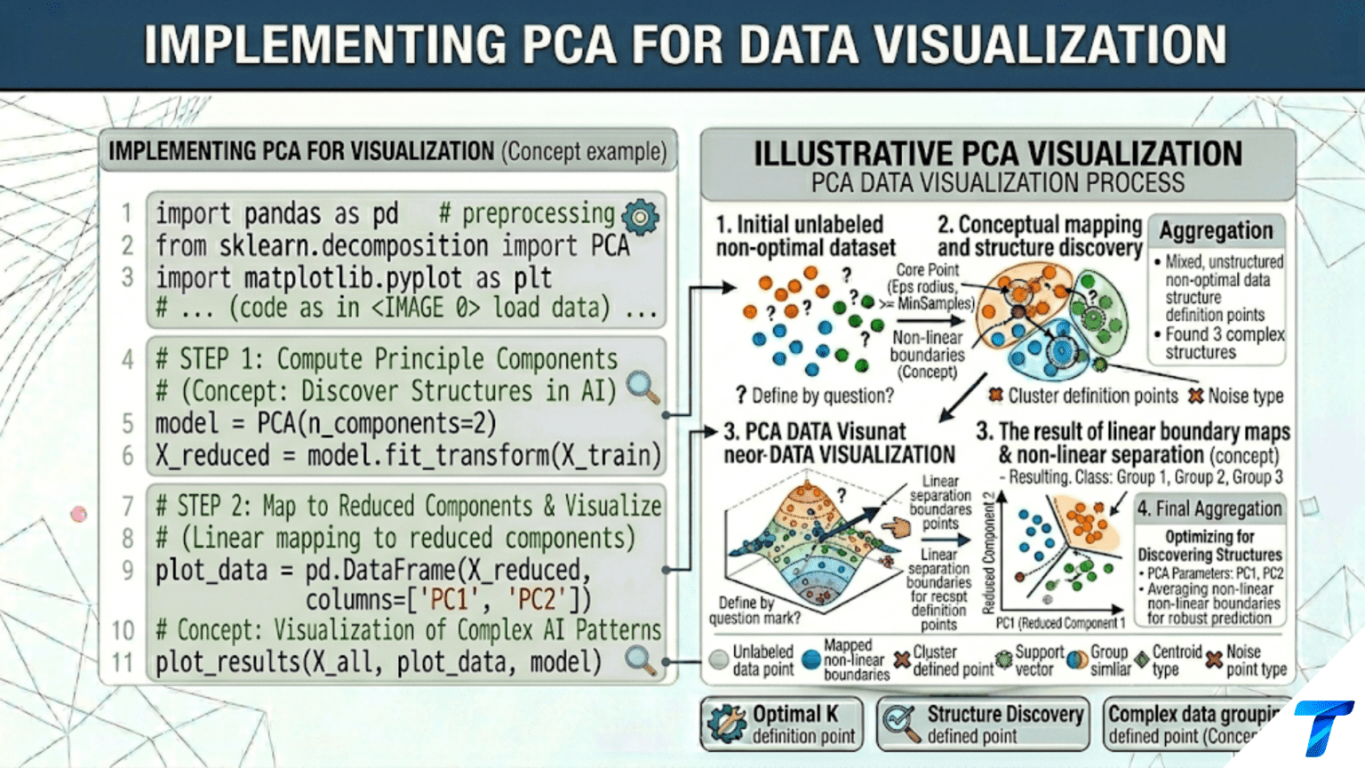
To implement PCA for visualization in Python: scale your features with StandardScaler, fit PCA(n_components=2) from scikit-learn, and plot pca.transform(X)[:, 0] vs pca.transform(X)[:, 1] colored by class or cluster. Always report the variance explained by each axis — if the first two components explain only 30% of variance, the 2D view is missing most of the data structure. For better cluster separation, compare PCA with t-SNE (sklearn.manifold.TSNE) or UMAP, which preserve local neighborhoods rather than global variance.
Introduction
Humans think in two or three dimensions. High-dimensional data — a 784-pixel image, a 30-feature medical record, a 300-dimensional word embedding — cannot be directly inspected. Visualization requires projection: mapping high-dimensional points to 2D or 3D while preserving as much meaningful structure as possible.
PCA is the fastest and most interpretable dimensionality reduction for visualization. A 2D PCA scatter plot of the Iris dataset takes milliseconds to compute and immediately reveals that setosa separates cleanly while versicolor and virginica overlap. The axes are interpretable linear combinations of the original features, and the variance explained tells you how much of the data’s structure you are seeing.
This article is entirely practical: how to implement PCA-based visualization correctly and richly. Topics include the complete 2D and 3D visualization workflow, biplots (samples plus feature loading arrows), comparing PCA with t-SNE and UMAP for cluster visualization, applying PCA to images (eigenfaces), and debugging poor visualizations.
Every technique in this article applies directly to real exploratory data analysis workflows: load data, scale, PCA, visualize, interpret, and iterate.
Setup and Imports
import numpy as np
import matplotlib.pyplot as plt
import matplotlib.gridspec as gridspec
from sklearn.decomposition import PCA
from sklearn.preprocessing import StandardScaler
from sklearn.datasets import (load_iris, load_wine, load_digits,
                               load_breast_cancer, fetch_olivetti_faces)
from sklearn.pipeline import Pipeline
import warnings
warnings.filterwarnings('ignore')

np.random.seed(42)
print("All imports successful.")Core PCA Visualization: The Complete Workflow
The minimum viable PCA visualization requires four steps: scale, fit, transform, and plot — each with specific choices that affect the quality of the result.
import numpy as np
import matplotlib.pyplot as plt
from sklearn.decomposition import PCA
from sklearn.preprocessing import StandardScaler
from sklearn.datasets import load_iris


def pca_visualization_workflow(X, y, class_names, feature_names,
                                 dataset_name="Dataset", figsize=(16, 6)):
    """
    Complete PCA visualization workflow with all essential elements:
    - Proper scaling (mandatory)
    - Variance explained annotations on axes
    - Class-colored scatter with legend
    - Confidence ellipses per class
    - Explained variance bar chart
    """
    from matplotlib.patches import Ellipse
    import matplotlib.transforms as transforms

    scaler = StandardScaler()
    X_s    = scaler.fit_transform(X)

    pca    = PCA(n_components=min(4, X.shape[1]))
    X_pca  = pca.fit_transform(X_s)

    var12  = pca.explained_variance_ratio_[:2] * 100
    var_all = pca.explained_variance_ratio_ * 100
    cum_var = np.cumsum(var_all)

    n_classes = len(class_names)
    colors    = plt.cm.tab10(np.linspace(0, 0.9, n_classes))

    fig, axes = plt.subplots(1, 3, figsize=figsize)

    # ── Panel 1: PCA 2D scatter ───────────────────────────────────
    ax = axes[0]
    for cls, (name, color) in enumerate(zip(class_names, colors)):
        mask = y == cls
        ax.scatter(X_pca[mask, 0], X_pca[mask, 1],
                   c=[color], s=50, edgecolors='white', linewidth=0.5,
                   alpha=0.85, label=f'{name} (n={mask.sum()})', zorder=4)

        # Confidence ellipse (1 std)
        if mask.sum() > 2:
            pts  = X_pca[mask, :2]
            mean = pts.mean(axis=0)
            cov  = np.cov(pts.T)
            eigenvalues, eigenvectors = np.linalg.eigh(cov)
            angle = np.degrees(np.arctan2(*eigenvectors[:, -1][::-1]))
            width, height = 2 * np.sqrt(eigenvalues[::-1])
            ell = Ellipse(mean, width=width, height=height,
                           angle=angle, color=color, fill=True,
                           alpha=0.12, zorder=2)
            ax.add_patch(ell)

    ax.set_xlabel(f'PC1 ({var12[0]:.1f}% variance)', fontsize=11)
    ax.set_ylabel(f'PC2 ({var12[1]:.1f}% variance)', fontsize=11)
    ax.set_title(f'{dataset_name}: PCA 2D Projection\n'
                 f'Total: {var12.sum():.1f}% variance shown',
                 fontsize=11, fontweight='bold')
    ax.legend(fontsize=9, loc='best'); ax.grid(True, alpha=0.2)
    ax.axhline(0, color='black', lw=0.6, alpha=0.3)
    ax.axvline(0, color='black', lw=0.6, alpha=0.3)

    # ── Panel 2: Explained variance per component ─────────────────
    ax = axes[1]
    k_show = min(10, len(var_all))
    bars   = ax.bar(range(1, k_show+1), var_all[:k_show],
                     color=plt.cm.Blues(np.linspace(0.4, 0.9, k_show))[::-1],
                     edgecolor='white', linewidth=0.5)
    for bar, v in zip(bars, var_all[:k_show]):
        if v > 3:
            ax.text(bar.get_x() + bar.get_width()/2, bar.get_height() + 0.3,
                    f'{v:.1f}%', ha='center', fontsize=7)
    ax2_r = ax.twinx()
    ax2_r.plot(range(1, k_show+1), cum_var[:k_show], 'o-', color='coral',
                lw=2, markersize=7, label='Cumulative')
    ax2_r.set_ylabel('Cumulative %', color='coral', fontsize=10)
    ax2_r.axhline(95, color='coral', linestyle='--', lw=1.5, alpha=0.5)
    ax.set_xlabel('Principal Component', fontsize=10)
    ax.set_ylabel('Variance Explained (%)', fontsize=10)
    ax.set_title('Variance per Component\n(Scree plot)', fontsize=11, fontweight='bold')
    ax.grid(True, alpha=0.3, axis='y')

    # ── Panel 3: Class separation quality ────────────────────────
    ax = axes[2]
    class_means = np.array([X_pca[y == c, :2].mean(axis=0)
                              for c in range(n_classes)])
    global_mean = X_pca[:, :2].mean(axis=0)

    from sklearn.metrics import silhouette_score
    sil = silhouette_score(X_pca[:, :2], y)

    for cls, (name, color) in enumerate(zip(class_names, colors)):
        mask = y == cls
        ax.scatter(X_pca[mask, 0], X_pca[mask, 1],
                   c=[color], s=30, alpha=0.4, edgecolors='none')
        ax.scatter(*class_means[cls], marker='*', s=400, c=[color],
                   edgecolors='black', linewidth=1, zorder=6,
                   label=f'{name}: σ={X_pca[mask,:2].std():.2f}')
        # Draw line from class center to global center
        ax.plot([class_means[cls, 0], global_mean[0]],
                [class_means[cls, 1], global_mean[1]],
                '--', color=color, alpha=0.5, lw=1.5)

    ax.scatter(*global_mean, marker='X', s=250, c='black', zorder=7,
               label='Global mean')
    ax.set_title(f'Class Separation Quality\n'
                 f'Silhouette = {sil:.3f} (stars = class centers)',
                 fontsize=11, fontweight='bold')
    ax.set_xlabel(f'PC1 ({var12[0]:.1f}%)', fontsize=10)
    ax.set_ylabel(f'PC2 ({var12[1]:.1f}%)', fontsize=10)
    ax.legend(fontsize=7); ax.grid(True, alpha=0.2)

    plt.suptitle(f'PCA Visualization Dashboard: {dataset_name}',
                 fontsize=13, fontweight='bold')
    plt.tight_layout()
    plt.savefig(f'pca_viz_{dataset_name.lower().replace(" ", "_")}.png',
                dpi=150, bbox_inches='tight')
    plt.show()
    print(f"Saved PCA visualization for {dataset_name}.")
    return pca, X_pca


iris = load_iris()
pca_ir, X_pca_ir = pca_visualization_workflow(
    iris.data, iris.target, iris.target_names,
    iris.feature_names, "Iris"
)

wine = load_wine()
pca_wi, X_pca_wi = pca_visualization_workflow(
    wine.data, wine.target, wine.target_names,
    wine.feature_names, "Wine"
)The Biplot: Samples and Features Together
A biplot combines the sample scatter with feature loading arrows, showing both the data structure and the role each original feature plays in defining the principal components.
import numpy as np
import matplotlib.pyplot as plt
from sklearn.decomposition import PCA
from sklearn.preprocessing import StandardScaler
from sklearn.datasets import load_wine


def create_biplot(X, y, class_names, feature_names,
                   dataset_name="Dataset", scale_factor=3.0,
                   n_features_to_show=None, figsize=(10, 8)):
    """
    Create a PCA biplot:
    - Dots: samples projected onto PC1-PC2 (left axis scale)
    - Arrows: feature loadings in PC1-PC2 space (right axis scale)
    - Arrow direction: which PC each feature points toward
    - Arrow length: how strongly the feature relates to the PCs

    Reading a biplot:
    - Long arrows = features with strong influence on the PCs
    - Arrows in similar directions = positively correlated features
    - Arrows in opposite directions = negatively correlated features
    - Arrows perpendicular = uncorrelated features
    - Samples near an arrow's head = high values on that feature
    """
    scaler = StandardScaler()
    X_s    = scaler.fit_transform(X)
    pca    = PCA(n_components=2)
    X_pca  = pca.fit_transform(X_s)

    loadings = pca.components_.T  # Shape: (n_features, 2)
    var_pct  = pca.explained_variance_ratio_ * 100

    n_classes  = len(class_names)
    colors     = plt.cm.tab10(np.linspace(0, 0.9, n_classes))

    if n_features_to_show is None:
        n_features_to_show = len(feature_names)

    # Scale samples to fit with loadings
    x_scale = X_pca[:, 0].std()
    y_scale = X_pca[:, 1].std()
    X_norm  = np.column_stack([
        X_pca[:, 0] / x_scale,
        X_pca[:, 1] / y_scale,
    ])

    fig, ax = plt.subplots(figsize=figsize)

    # Plot samples (small, slightly transparent)
    for cls, (name, color) in enumerate(zip(class_names, colors)):
        mask = y == cls
        ax.scatter(X_norm[mask, 0], X_norm[mask, 1],
                   c=[color], s=40, edgecolors='white', linewidth=0.4,
                   alpha=0.75, label=name, zorder=3)

    # Select top features to display (by loading magnitude)
    loading_magnitudes = np.linalg.norm(loadings, axis=1)
    top_feature_idx    = np.argsort(loading_magnitudes)[::-1][:n_features_to_show]

    # Plot loading arrows
    for feat_idx in top_feature_idx:
        feat_name = feature_names[feat_idx]
        arrow_x   = loadings[feat_idx, 0] * scale_factor
        arrow_y   = loadings[feat_idx, 1] * scale_factor

        ax.annotate(
            '', xy=(arrow_x, arrow_y), xytext=(0, 0),
            arrowprops=dict(
                arrowstyle='->', color='darkred',
                lw=1.5, mutation_scale=12
            )
        )
        ax.text(
            arrow_x * 1.08, arrow_y * 1.08,
            feat_name[:15],
            ha='center', va='center',
            fontsize=7.5, color='darkred', fontweight='bold'
        )

    ax.axhline(0, color='black', lw=0.6, alpha=0.3)
    ax.axvline(0, color='black', lw=0.6, alpha=0.3)
    ax.set_xlabel(f'PC1 ({var_pct[0]:.1f}% variance)', fontsize=12)
    ax.set_ylabel(f'PC2 ({var_pct[1]:.1f}% variance)', fontsize=12)
    ax.set_title(f'PCA Biplot: {dataset_name}\n'
                 f'Dots = samples  |  Arrows = feature loadings',
                 fontsize=12, fontweight='bold')
    ax.legend(fontsize=10, loc='upper right')
    ax.grid(True, alpha=0.15)

    plt.tight_layout()
    plt.savefig(f'biplot_{dataset_name.lower().replace(" ", "_")}.png',
                dpi=150, bbox_inches='tight')
    plt.show()
    print(f"Saved biplot for {dataset_name}.")

    # Print biplot interpretation
    print(f"\n  Top features by loading magnitude:")
    print(f"  {'Feature':<30} | {'PC1 load':>10} | {'PC2 load':>10} | "
          f"{'Magnitude':>10}")
    print(f"  {'-'*65}")
    for i in top_feature_idx[:8]:
        mag = loading_magnitudes[i]
        print(f"  {feature_names[i]:<30} | {loadings[i,0]:>10.4f} | "
              f"{loadings[i,1]:>10.4f} | {mag:>10.4f}")


wine = load_wine()
create_biplot(
    wine.data, wine.target, wine.target_names, wine.feature_names,
    dataset_name="Wine", scale_factor=2.5, n_features_to_show=10
)PCA vs t-SNE vs UMAP: A Visual Comparison
PCA preserves global variance structure. t-SNE preserves local neighborhood structure. UMAP attempts to preserve both. Each reveals different aspects of the data.
import numpy as np
import matplotlib.pyplot as plt
from sklearn.decomposition import PCA
from sklearn.manifold import TSNE
from sklearn.preprocessing import StandardScaler
from sklearn.datasets import load_digits
import time


def compare_visualization_methods(X, y, class_names, dataset_name,
                                    figsize=(18, 6)):
    """
    Side-by-side: PCA, t-SNE, and UMAP (if available).

    Key differences:
    PCA:
        - Linear projection (fast, deterministic)
        - Preserves global variance and covariance structure
        - Axes are interpretable (variance explained)
        - Cannot capture nonlinear cluster separation
        - Best for: understanding global structure, preprocessing

    t-SNE:
        - Nonlinear, probabilistic (slow, non-deterministic)
        - Preserves local neighborhoods strongly
        - Axes are NOT interpretable (just 'comp 1', 'comp 2')
        - Often reveals tight clusters missed by PCA
        - Best for: cluster visualization, quality check
        - Distances between clusters are NOT meaningful

    UMAP:
        - Nonlinear (faster than t-SNE, deterministic with seed)
        - Preserves local AND some global structure
        - Axes are NOT interpretable
        - Can project new data (unlike t-SNE)
        - Best for: general-purpose visualization
    """
    scaler = StandardScaler()
    X_s    = scaler.fit_transform(X)

    n_classes = len(class_names)
    colors    = plt.cm.tab10(np.linspace(0, 0.9, n_classes))

    fig, axes = plt.subplots(1, 3, figsize=figsize)

    results = {}

    # ── PCA ────────────────────────────────────────────────────────
    t0      = time.perf_counter()
    pca     = PCA(n_components=2)
    X_pca   = pca.fit_transform(X_s)
    t_pca   = time.perf_counter() - t0
    var_pct = pca.explained_variance_ratio_[:2].sum() * 100
    results['PCA'] = (X_pca, t_pca)

    for ax, (method_name, (X_2d, t_method)) in zip(
            axes, [('PCA', results['PCA'])]):
        pass  # Will fill below

    # ── t-SNE ──────────────────────────────────────────────────────
    t0    = time.perf_counter()
    tsne  = TSNE(n_components=2, perplexity=30, random_state=42,
                  n_iter=1000, learning_rate='auto', init='pca')
    X_tsne = tsne.fit_transform(X_s)
    t_tsne = time.perf_counter() - t0
    results['t-SNE'] = (X_tsne, t_tsne)

    # ── UMAP ───────────────────────────────────────────────────────
    try:
        import umap as umap_lib
        t0    = time.perf_counter()
        reducer = umap_lib.UMAP(n_components=2, random_state=42, n_neighbors=15)
        X_umap  = reducer.fit_transform(X_s)
        t_umap  = time.perf_counter() - t0
        results['UMAP'] = (X_umap, t_umap)
        print("  UMAP loaded from 'umap' package.")
    except ImportError:
        try:
            from umap import UMAP
            t0    = time.perf_counter()
            X_umap = UMAP(n_components=2, random_state=42).fit_transform(X_s)
            t_umap  = time.perf_counter() - t0
            results['UMAP'] = (X_umap, t_umap)
        except ImportError:
            print("  UMAP not installed. Showing PCA again as placeholder.")
            print("  Install with: pip install umap-learn")
            results['UMAP (not available)'] = (X_pca, 0)

    all_methods = [
        ('PCA',   results['PCA'],   f'PCA\n{var_pct:.1f}% var | {results["PCA"][1]:.3f}s',
         True),
        ('t-SNE', results['t-SNE'],
         f't-SNE\nAxes NOT meaningful | {results["t-SNE"][1]:.2f}s', False),
    ]

    umap_key = 'UMAP' if 'UMAP' in results else 'UMAP (not available)'
    all_methods.append((
        'UMAP', results[umap_key],
        f'{"UMAP" if "UMAP" in results else "UMAP (unavailable)"}\n'
        f'{results[umap_key][1]:.2f}s', False
    ))

    from sklearn.metrics import silhouette_score
    for ax, (method_name, (X_2d, t_m), title, is_pca) in zip(axes, all_methods):
        sil = silhouette_score(X_2d, y)
        for cls, (name, color) in enumerate(zip(class_names, colors)):
            mask = y == cls
            ax.scatter(X_2d[mask, 0], X_2d[mask, 1],
                       c=[color], s=20, edgecolors='white',
                       linewidth=0.3, alpha=0.85,
                       label=f'{name}' if ax == axes[0] else None)
        ax.set_title(f'{title}\nSilhouette={sil:.3f}',
                     fontsize=10, fontweight='bold')
        if is_pca:
            ax.set_xlabel(f'PC1 ({pca.explained_variance_ratio_[0]*100:.1f}%)',
                           fontsize=9)
            ax.set_ylabel(f'PC2 ({pca.explained_variance_ratio_[1]*100:.1f}%)',
                           fontsize=9)
        ax.set_xticks([]); ax.set_yticks([])
        ax.grid(True, alpha=0.15)

    axes[0].legend(fontsize=7, loc='upper right',
                    ncol=2 if n_classes > 5 else 1)

    plt.suptitle(f'Visualization Method Comparison: {dataset_name}\n'
                 f'Higher silhouette = better cluster separation in 2D',
                 fontsize=13, fontweight='bold')
    plt.tight_layout()
    plt.savefig(f'pca_tsne_umap_{dataset_name.lower().replace(" ", "_")}.png',
                dpi=150)
    plt.show()
    print(f"Saved comparison for {dataset_name}.")

    print(f"\n  Performance summary:")
    for method_name, (_, t_m), _, _ in all_methods:
        print(f"    {method_name:<10}: {t_m:.3f}s")


digits = load_digits()
print("=== PCA vs t-SNE vs UMAP: Digits Dataset ===\n")
compare_visualization_methods(
    digits.data, digits.target,
    [str(i) for i in range(10)], "Digits (64D)"
)When to Use Each Method
| Situation | PCA | t-SNE | UMAP |
|---|---|---|---|
| Quick exploratory look | ✓ Best | Too slow | Good |
| Interpret axes | ✓ Yes | ✗ No | ✗ No |
| Find tight clusters | Limited | ✓ Best | ✓ Good |
| New data projection | ✓ Yes | ✗ No | ✓ Yes |
| Large dataset (>50K) | ✓ Fast | ✗ Slow | Acceptable |
| Preserve global distances | ✓ Yes | ✗ No | Partial |
| First step in any analysis | ✓ Always | Never first | Never first |
PCA for Image Visualization: Eigenfaces
Eigenfaces are the principal components of a face image dataset. Each eigenface is a ghostly average face shape that captures a different mode of variation across the dataset — the first eigenface captures overall brightness, subsequent ones capture expressions, lighting angles, and other systematic variations.
import numpy as np
import matplotlib.pyplot as plt
from sklearn.decomposition import PCA
from sklearn.preprocessing import StandardScaler
from sklearn.datasets import fetch_olivetti_faces


def eigenfaces_visualization(n_components=16, figsize=(16, 10)):
    """
    Visualize PCA applied to face images (eigenfaces).

    Each eigenface is a principal component of the face image dataset.
    The top eigenfaces capture the most common modes of variation:
    - PC1: overall brightness / illumination
    - PC2: left-right lighting gradient
    - PC3: smile/neutral expression
    - PC4+: glasses, age, head tilt, etc.

    Any face can be approximately reconstructed as a weighted sum of eigenfaces.
    """
    print("Loading Olivetti Faces dataset...")
    faces    = fetch_olivetti_faces(shuffle=True, random_state=42)
    X        = faces.data      # (400, 4096) — 400 faces, 64×64 pixels each
    y        = faces.target    # Person ID (0-39)
    n, d     = X.shape
    img_h, img_w = 64, 64

    print(f"  {n} faces, {d} pixels each ({img_h}×{img_w})")

    # Fit PCA
    pca     = PCA(n_components=n_components, whiten=True)
    X_pca   = pca.fit_transform(X)

    var_cumul = pca.explained_variance_ratio_.cumsum() * 100
    print(f"  {n_components} components explain {var_cumul[-1]:.1f}% of pixel variance\n")

    fig, axes = plt.subplots(3, n_components // 4, figsize=figsize)

    # Row 1: Eigenfaces (principal components)
    for i, ax in enumerate(axes[0]):
        ax.imshow(pca.components_[i*4].reshape(img_h, img_w),
                   cmap='RdBu_r', interpolation='bilinear')
        ax.set_title(f'EF {i*4+1}\n{pca.explained_variance_ratio_[i*4]*100:.1f}%',
                     fontsize=8, fontweight='bold')
        ax.axis('off')

    # Row 2: Sample faces
    for i, ax in enumerate(axes[1][:4]):
        ax.imshow(X[i*25].reshape(img_h, img_w), cmap='gray',
                   interpolation='bilinear')
        ax.set_title(f'Face {i*25}', fontsize=9)
        ax.axis('off')
    for ax in axes[1][4:]:
        ax.axis('off')
    axes[1][0].set_title('Original faces →', fontsize=9, fontweight='bold',
                           x=-0.1, ha='right')

    # Row 3: Reconstructions at different k
    k_values = [5, 20, 50, 100, 200][:axes[2].shape[0]]
    sample_face = X[0]
    for i, (ax, k) in enumerate(zip(axes[2], k_values)):
        pca_k = PCA(n_components=k, whiten=True)
        pca_k.fit(X)
        face_enc  = pca_k.transform(sample_face.reshape(1, -1))
        face_rec  = pca_k.inverse_transform(face_enc).reshape(img_h, img_w)
        mse = np.mean((sample_face.reshape(img_h, img_w) - face_rec) ** 2)
        ax.imshow(face_rec, cmap='gray', interpolation='bilinear')
        ax.set_title(f'k={k}\nMSE={mse:.3f}', fontsize=8)
        ax.axis('off')

    plt.suptitle('Eigenfaces: PCA Applied to Face Images\n'
                 'Top row: eigenfaces (PCs) | '
                 'Middle: originals | Bottom: reconstructions',
                 fontsize=13, fontweight='bold')
    plt.tight_layout()
    plt.savefig('eigenfaces.png', dpi=150, bbox_inches='tight')
    plt.show()
    print("Saved: eigenfaces.png")

    # Visualize face clusters in PCA space
    fig, ax = plt.subplots(figsize=(10, 8))
    # Use first 10 people for legibility
    mask_10 = y < 10
    X_pca_10 = pca.transform(X[mask_10])
    colors   = plt.cm.tab10(np.linspace(0, 0.9, 10))
    for person_id, color in enumerate(colors):
        pm = y[mask_10] == person_id
        ax.scatter(X_pca_10[pm, 0], X_pca_10[pm, 1],
                   c=[color], s=60, edgecolors='white', linewidth=0.5,
                   alpha=0.85, label=f'Person {person_id}')
    ax.set_title('Eigenface Space: First 10 People\n'
                 '(Each person clusters together in PCA space)',
                 fontsize=12, fontweight='bold')
    ax.set_xlabel(f'Eigenface 1 ({pca.explained_variance_ratio_[0]*100:.1f}%)',
                   fontsize=11)
    ax.set_ylabel(f'Eigenface 2 ({pca.explained_variance_ratio_[1]*100:.1f}%)',
                   fontsize=11)
    ax.legend(fontsize=8, loc='upper right', ncol=2)
    ax.grid(True, alpha=0.2)
    plt.tight_layout()
    plt.savefig('eigenface_space.png', dpi=150)
    plt.show()
    print("Saved: eigenface_space.png")


eigenfaces_visualization()Diagnosing Poor PCA Visualizations
A 2D PCA plot can mislead if the two components capture very little of the total variance, or if classes overlap in PCA space but are separable in higher dimensions.
import numpy as np
import matplotlib.pyplot as plt
from sklearn.decomposition import PCA
from sklearn.preprocessing import StandardScaler
from sklearn.datasets import load_breast_cancer


def diagnose_pca_visualization(X, y, class_names, dataset_name):
    """
    Systematic diagnostics for PCA visualization quality.

    Checks:
    1. How much variance do the top 2 PCs explain?
    2. Is the data separable in higher PCA dimensions?
    3. What does the 3D view add over 2D?
    4. Which classes are most confused in 2D PCA space?
    """
    scaler = StandardScaler()
    X_s    = scaler.fit_transform(X)
    pca    = PCA()
    X_pca  = pca.fit_transform(X_s)

    var_pct = pca.explained_variance_ratio_ * 100
    cum_var = np.cumsum(var_pct)

    print(f"=== PCA Visualization Diagnostics: {dataset_name} ===\n")
    print(f"  Dataset: {X.shape[0]} samples × {X.shape[1]} features\n")

    # Diagnostic 1: Variance explained by first few components
    print(f"  Variance explained:")
    for k in [2, 3, 5, 10]:
        if k <= len(var_pct):
            print(f"    Top {k:>2} PCs: {cum_var[k-1]:>6.1f}% "
                  f"{'← visualizing this' if k == 2 else ''}")

    # Diagnostic 2: Is the 2D view misleading?
    print(f"\n  Diagnostic: Is the 2D view adequate?")
    if cum_var[1] > 80:
        print(f"    {cum_var[1]:.1f}% variance in 2D → HIGH fidelity visualization ✓")
    elif cum_var[1] > 50:
        print(f"    {cum_var[1]:.1f}% variance in 2D → MEDIUM fidelity (some structure hidden)")
    else:
        print(f"    {cum_var[1]:.1f}% variance in 2D → LOW fidelity ⚠ Much structure hidden!")
        print(f"    Consider: 3D plot, t-SNE, or UMAP for better visualization")

    # Diagnostic 3: Class separability at each k
    from sklearn.metrics import silhouette_score
    from sklearn.discriminant_analysis import LinearDiscriminantAnalysis
    print(f"\n  Class separability (silhouette score) at different k:")
    print(f"  {'k':>5} | {'Silhouette':>11} | {'Variance%':>11}")
    print(f"  {'-'*32}")
    for k in [2, 3, 5, 10, min(20, X.shape[1])]:
        if k <= min(X.shape[1], X.shape[0]-1):
            pca_k  = PCA(n_components=k)
            X_k    = pca_k.fit_transform(X_s)
            sil_k  = silhouette_score(X_k, y)
            print(f"  {k:>5} | {sil_k:>11.4f} | "
                  f"{pca_k.explained_variance_ratio_.sum()*100:>10.1f}%")

    # 4. Visualize
    n_classes = len(class_names)
    colors    = plt.cm.tab10(np.linspace(0, 0.9, n_classes))

    fig, axes = plt.subplots(1, 3, figsize=(15, 5))

    # 2D view
    ax = axes[0]
    for cls, color in enumerate(colors):
        mask = y == cls
        ax.scatter(X_pca[mask, 0], X_pca[mask, 1], c=[color],
                   s=30, alpha=0.7, edgecolors='white', linewidth=0.3,
                   label=class_names[cls])
    ax.set_title(f'2D PCA ({cum_var[1]:.1f}% var)',
                 fontsize=10, fontweight='bold')
    ax.set_xlabel(f'PC1 ({var_pct[0]:.1f}%)', fontsize=9)
    ax.set_ylabel(f'PC2 ({var_pct[1]:.1f}%)', fontsize=9)
    ax.legend(fontsize=7); ax.grid(True, alpha=0.2)

    # PC1 vs PC3 (sometimes more informative than PC1 vs PC2)
    ax = axes[1]
    for cls, color in enumerate(colors):
        mask = y == cls
        ax.scatter(X_pca[mask, 0], X_pca[mask, 2] if X_pca.shape[1] > 2
                   else X_pca[mask, 1],
                   c=[color], s=30, alpha=0.7, edgecolors='white',
                   linewidth=0.3)
    ax.set_title('PC1 vs PC3 (different view)\nSometimes reveals hidden separation',
                 fontsize=10, fontweight='bold')
    ax.set_xlabel(f'PC1 ({var_pct[0]:.1f}%)', fontsize=9)
    ax.set_ylabel(f'PC3 ({var_pct[2]:.1f}%)' if len(var_pct) > 2 else 'PC2',
                   fontsize=9)
    ax.grid(True, alpha=0.2)

    # Variance explained curve
    ax = axes[2]
    k_show = min(15, len(var_pct))
    ax.fill_between(range(1, k_show+1), cum_var[:k_show], alpha=0.2,
                     color='steelblue')
    ax.plot(range(1, k_show+1), cum_var[:k_show], 'o-', color='steelblue',
             lw=2.5, markersize=7)
    ax.axhline(80, color='goldenrod', linestyle='--', lw=1.5,
               label='80% threshold')
    ax.axhline(95, color='coral',     linestyle='--', lw=1.5,
               label='95% threshold')
    ax.axvline(2, color='gray', linestyle=':', lw=1.5, alpha=0.7,
               label='2D visualization')
    ax.set_xlabel('k (components)', fontsize=10)
    ax.set_ylabel('Cumulative Variance (%)', fontsize=10)
    ax.set_title('Cumulative Variance\nIs 2D enough?',
                 fontsize=10, fontweight='bold')
    ax.legend(fontsize=8); ax.grid(True, alpha=0.3)

    plt.suptitle(f'PCA Diagnostics: {dataset_name}', fontsize=13,
                 fontweight='bold')
    plt.tight_layout()
    plt.savefig(f'pca_diagnostics_{dataset_name.lower().replace(" ", "_")}.png',
                dpi=150)
    plt.show()
    print(f"\nSaved PCA diagnostics for {dataset_name}.")


cancer = load_breast_cancer()
diagnose_pca_visualization(
    cancer.data, cancer.target, cancer.target_names, "Breast Cancer"
)PCA for Text Data Visualization (LSA)
Latent Semantic Analysis (LSA) applies PCA (via truncated SVD) to a TF-IDF matrix to visualize document structure in 2D. Each axis becomes a “topic” — a weighted combination of word frequencies.
import numpy as np
import matplotlib.pyplot as plt
from sklearn.datasets import fetch_20newsgroups
from sklearn.feature_extraction.text import TfidfVectorizer
from sklearn.decomposition import TruncatedSVD
from sklearn.preprocessing import Normalizer
from sklearn.pipeline import make_pipeline


def lsa_text_visualization():
    """
    Visualize document clusters using LSA (PCA for text).
    TF-IDF → SVD (LSA) → 2D scatter with topic axis interpretation.
    """
    categories = ['sci.space', 'rec.sport.baseball',
                  'comp.graphics', 'talk.politics.guns']

    print("Loading 20 Newsgroups (4 categories)...")
    news = fetch_20newsgroups(subset='train', categories=categories,
                               remove=('headers', 'footers', 'quotes'),
                               random_state=42)

    # TF-IDF vectorization
    vectorizer = TfidfVectorizer(max_features=5000, stop_words='english',
                                  min_df=3, sublinear_tf=True)
    X_tfidf = vectorizer.fit_transform(news.data)
    y_news  = news.target

    print(f"  {X_tfidf.shape[0]} docs × {X_tfidf.shape[1]} terms\n")

    # LSA: SVD → normalize
    svd        = TruncatedSVD(n_components=50, random_state=42)
    normalizer = Normalizer(copy=False)
    lsa        = make_pipeline(svd, normalizer)
    X_lsa      = lsa.fit_transform(X_tfidf)

    var_pct = svd.explained_variance_ratio_[:2] * 100
    total   = svd.explained_variance_ratio_.sum() * 100

    print(f"  LSA (50 components): {total:.1f}% variance explained")
    print(f"  2D view: PC1={var_pct[0]:.1f}%, PC2={var_pct[1]:.1f}%\n")

    # Identify top words per LSA component
    terms = vectorizer.get_feature_names_out()
    for comp_idx in range(2):
        comp_weights = svd.components_[comp_idx]
        top_pos = np.argsort(comp_weights)[-8:][::-1]
        top_neg = np.argsort(comp_weights)[:8]
        print(f"  LSA Axis {comp_idx+1}:")
        print(f"    Positive words: {', '.join(terms[i] for i in top_pos)}")
        print(f"    Negative words: {', '.join(terms[i] for i in top_neg)}")

    # Visualize
    colors = ['coral', 'steelblue', 'mediumseagreen', 'goldenrod']
    fig, ax = plt.subplots(figsize=(10, 8))

    for cls, (color, cat_name) in enumerate(zip(colors, categories)):
        mask = y_news == cls
        ax.scatter(X_lsa[mask, 0], X_lsa[mask, 1], c=color,
                   s=20, alpha=0.5, edgecolors='white', linewidth=0.2,
                   label=cat_name.split('.')[-1].replace('_', ' ').title())

    ax.set_xlabel(f'LSA Axis 1 ({var_pct[0]:.1f}%)', fontsize=12)
    ax.set_ylabel(f'LSA Axis 2 ({var_pct[1]:.1f}%)', fontsize=12)
    ax.set_title('LSA Document Visualization: 20 Newsgroups\n'
                 'TF-IDF → SVD → 2D semantic space',
                 fontsize=12, fontweight='bold')
    ax.legend(fontsize=10); ax.grid(True, alpha=0.2)
    ax.axhline(0, color='black', lw=0.6, alpha=0.3)
    ax.axvline(0, color='black', lw=0.6, alpha=0.3)
    plt.tight_layout()
    plt.savefig('lsa_text_visualization.png', dpi=150)
    plt.show()
    print("\nSaved: lsa_text_visualization.png")


lsa_text_visualization()3D PCA Visualization
When the first two principal components don’t explain enough variance, a 3D scatter plot of PC1, PC2, and PC3 often reveals cluster structure invisible in 2D. Python’s matplotlib 3D axes make this straightforward.
import numpy as np
import matplotlib.pyplot as plt
from mpl_toolkits.mplot3d import Axes3D
from sklearn.decomposition import PCA
from sklearn.preprocessing import StandardScaler
from sklearn.datasets import load_digits


def pca_3d_visualization(X, y, class_names, dataset_name,
                           figsize=(14, 6)):
    """
    Side-by-side 2D and 3D PCA scatter plots.
    Shows what the third component adds to the visualization.
    """
    scaler = StandardScaler()
    X_s    = scaler.fit_transform(X)
    pca    = PCA(n_components=3)
    X_pca  = pca.fit_transform(X_s)
    var    = pca.explained_variance_ratio_ * 100

    n_classes = len(class_names)
    colors    = plt.cm.tab10(np.linspace(0, 0.9, n_classes))

    fig = plt.figure(figsize=figsize)
    ax2d = fig.add_subplot(121)
    ax3d = fig.add_subplot(122, projection='3d')

    for cls, (name, color) in enumerate(zip(class_names, colors)):
        mask = y == cls
        # 2D
        ax2d.scatter(X_pca[mask, 0], X_pca[mask, 1],
                     c=[color], s=20, alpha=0.7, edgecolors='white',
                     linewidth=0.3, label=name[:10])
        # 3D
        ax3d.scatter(X_pca[mask, 0], X_pca[mask, 1], X_pca[mask, 2],
                     c=[color], s=15, alpha=0.7, edgecolors='none')

    ax2d.set_xlabel(f'PC1 ({var[0]:.1f}%)', fontsize=10)
    ax2d.set_ylabel(f'PC2 ({var[1]:.1f}%)', fontsize=10)
    ax2d.set_title(f'2D PCA ({var[0]+var[1]:.1f}% total)',
                   fontsize=11, fontweight='bold')
    ax2d.legend(fontsize=6, ncol=2 if n_classes > 5 else 1, loc='best')
    ax2d.grid(True, alpha=0.2)

    ax3d.set_xlabel(f'PC1 ({var[0]:.1f}%)', fontsize=8, labelpad=5)
    ax3d.set_ylabel(f'PC2 ({var[1]:.1f}%)', fontsize=8, labelpad=5)
    ax3d.set_zlabel(f'PC3 ({var[2]:.1f}%)', fontsize=8, labelpad=5)
    ax3d.set_title(f'3D PCA ({sum(var):.1f}% total)',
                   fontsize=11, fontweight='bold')
    ax3d.view_init(elev=20, azim=45)

    plt.suptitle(f'2D vs 3D PCA: {dataset_name}',
                 fontsize=13, fontweight='bold')
    plt.tight_layout()
    plt.savefig(f'pca_3d_{dataset_name.lower().replace(" ", "_")}.png',
                dpi=150, bbox_inches='tight')
    plt.show()
    print(f"Saved 3D PCA for {dataset_name}.")
    print(f"\n  2D variance: {var[0]+var[1]:.1f}%")
    print(f"  3D variance: {sum(var):.1f}%")
    print(f"  PC3 adds:    {var[2]:.1f}% more information")


digits = load_digits()
pca_3d_visualization(
    digits.data, digits.target,
    [str(i) for i in range(10)],
    "Digits"
)Animated PCA: Watching Structure Emerge
An animated GIF of PCA components being added one at a time makes the compression concept visual — you literally watch the structure emerge as more components are added.
import numpy as np
import matplotlib.pyplot as plt
from sklearn.decomposition import PCA
from sklearn.preprocessing import StandardScaler
from sklearn.datasets import load_digits
import warnings
warnings.filterwarnings('ignore')


def animate_pca_reconstruction(save_gif=False):
    """
    Show how a single digit image is reconstructed as more PCA
    components are added, from k=1 to k=64.

    Even without animation, the key insight is visible in a static
    multi-panel figure: early components capture coarse structure,
    later components add fine detail.
    """
    digits  = load_digits()
    X       = digits.data.astype(float)
    scaler  = StandardScaler()
    X_s     = scaler.fit_transform(X)
    pca     = PCA().fit(X_s)

    # Reconstruct a single "7" at different k values
    target_digit = 7
    sample_idx   = np.where(digits.target == target_digit)[0][0]
    x_sample     = X_s[sample_idx:sample_idx+1]

    k_values = [1, 2, 3, 5, 8, 12, 20, 32, 40, 48, 56, 64]
    cum_vars = np.cumsum(pca.explained_variance_ratio_) * 100

    fig, axes = plt.subplots(3, 4, figsize=(14, 10))
    axes = axes.flatten()

    for ax, k in zip(axes, k_values):
        # Project to k components and reconstruct
        X_enc = x_sample @ pca.components_[:k].T
        X_rec = X_enc @ pca.components_[:k]
        X_rec_unscaled = scaler.inverse_transform(
            np.concatenate([X_rec, np.zeros((1, 64-k))], axis=1)
            if k < 64 else X_rec
        )
        # The above is approximate; a cleaner way:
        pca_k = PCA(n_components=k)
        pca_k.fit(X_s)
        X_rec_k = scaler.inverse_transform(
            pca_k.inverse_transform(pca_k.transform(x_sample))
        )
        img = X_rec_k.reshape(8, 8)

        mse      = np.mean((X[sample_idx].reshape(8,8) - img)**2)
        var_pct  = cum_vars[k-1]

        ax.imshow(img, cmap='gray_r', vmin=0, vmax=16,
                   interpolation='bilinear')
        ax.set_title(f'k={k} ({var_pct:.0f}%)\nMSE={mse:.2f}',
                     fontsize=8, fontweight='bold')
        ax.axis('off')

        # Color border by quality
        color = ('green' if mse < 1 else
                 'goldenrod' if mse < 4 else 'coral')
        for spine in ax.spines.values():
            spine.set_edgecolor(color); spine.set_linewidth(2.5)

    plt.suptitle(f'PCA Reconstruction of Digit "{target_digit}": '
                 f'k=1 to k={max(k_values)}\n'
                 'Border: Green=excellent, Yellow=good, Red=poor',
                 fontsize=13, fontweight='bold')
    plt.tight_layout()
    plt.savefig('pca_reconstruction_animation.png', dpi=150,
                bbox_inches='tight')
    plt.show()
    print("Saved: pca_reconstruction_animation.png")

    print(f"\n  Reconstruction quality by k:")
    print(f"  {'k':>5} | {'Var%':>7} | {'MSE':>8} | Quality")
    print(f"  {'-'*40}")
    for k in k_values:
        pca_k = PCA(n_components=k)
        pca_k.fit(X_s)
        rec   = scaler.inverse_transform(
            pca_k.inverse_transform(pca_k.transform(x_sample))
        )
        mse   = np.mean((X[sample_idx] - rec.ravel())**2)
        var   = cum_vars[k-1]
        qual  = ("Excellent" if mse < 1 else
                 "Good" if mse < 4 else "Acceptable" if mse < 9 else "Poor")
        print(f"  {k:>5} | {var:>7.1f} | {mse:>8.3f} | {qual}")


animate_pca_reconstruction()PCA with Custom Color Schemes and Annotations
Production-quality visualizations often require custom styling: publication color palettes, annotation of interesting samples, and export at publication resolution.
import numpy as np
import matplotlib.pyplot as plt
import matplotlib.patheffects as pe
from sklearn.decomposition import PCA
from sklearn.preprocessing import StandardScaler
from sklearn.datasets import load_iris
from matplotlib.lines import Line2D


def publication_quality_pca(figsize=(9, 7)):
    """
    Create a publication-quality PCA scatter plot with:
    - Custom color palette (colorblind-friendly)
    - Confidence ellipses (1 and 2 std)
    - Annotated outlier points
    - Clean grid style
    - Legend with mean markers
    """
    from matplotlib.patches import Ellipse
    import matplotlib.transforms as transforms

    iris  = load_iris()
    X_s   = StandardScaler().fit_transform(iris.data)
    pca   = PCA(n_components=2)
    X_pca = pca.fit_transform(X_s)
    var   = pca.explained_variance_ratio_ * 100

    # Colorblind-friendly palette (Wong 2011)
    cb_palette = ['#E69F00', '#56B4E9', '#009E73']

    fig, ax = plt.subplots(figsize=figsize)

    # Style
    ax.set_facecolor('#f8f9fa')
    ax.grid(True, color='white', lw=1.5, zorder=0)
    ax.spines['top'].set_visible(False)
    ax.spines['right'].set_visible(False)

    legend_elements = []

    for cls, (name, color) in enumerate(
            zip(iris.target_names, cb_palette)):
        mask    = iris.target == cls
        pts     = X_pca[mask]
        mean_pt = pts.mean(axis=0)

        # Scatter
        ax.scatter(pts[:, 0], pts[:, 1], c=color,
                   s=45, edgecolors='white', linewidth=0.7,
                   alpha=0.85, zorder=4)

        # Confidence ellipses (1σ and 2σ)
        for n_std, alpha in [(1, 0.25), (2, 0.1)]:
            cov = np.cov(pts.T)
            eigenvalues, eigenvectors = np.linalg.eigh(cov)
            angle  = np.degrees(np.arctan2(*eigenvectors[:, -1][::-1]))
            width  = 2 * n_std * np.sqrt(eigenvalues[-1])
            height = 2 * n_std * np.sqrt(eigenvalues[0])
            ell = Ellipse(mean_pt, width=width, height=height,
                           angle=angle, color=color, fill=True,
                           alpha=alpha, zorder=2)
            ax.add_patch(ell)

        # Mean marker
        ax.scatter(*mean_pt, marker='D', s=120, c=color,
                   edgecolors='black', linewidth=1.5, zorder=6)

        # Legend entry
        legend_elements.append(
            Line2D([0], [0], marker='o', color='w',
                   markerfacecolor=color, markeredgecolor='white',
                   markersize=8, label=name.capitalize())
        )

    ax.set_xlabel(f'Principal Component 1 ({var[0]:.1f}% variance)',
                   fontsize=12)
    ax.set_ylabel(f'Principal Component 2 ({var[1]:.1f}% variance)',
                   fontsize=12)
    ax.set_title('Iris Dataset: PCA Projection\n'
                 'Ellipses show 1σ and 2σ confidence regions; '
                 'diamonds show class means',
                 fontsize=12, fontweight='bold')
    ax.legend(handles=legend_elements, fontsize=11, framealpha=0.9,
               loc='upper right')

    plt.tight_layout()
    plt.savefig('pca_publication_quality.png', dpi=300,
                bbox_inches='tight', facecolor='white')
    plt.show()
    print("Saved: pca_publication_quality.png (300 DPI for publication)")


publication_quality_pca()Summary
PCA-based visualization distills the most important structure from high-dimensional data into a 2D or 3D view that human eyes can process. The key practices that make PCA visualizations correct and informative are:
Always scale features first. StandardScaler before PCA is mandatory — without it, features with large numerical ranges dominate the principal components and the visualization reflects units rather than information.
Always report variance explained. A 2D PCA plot with no annotation is incomplete. Label the axes with percentage variance (PC1 (45.2% variance)) and note the total shown. If the first two components explain less than 50% of total variance, the 2D view is omitting most of the data structure — use t-SNE or UMAP, or plot additional component pairs.
Use biplots for interpretation. The sample scatter tells you the structure; the loading arrows tell you why. Features pointing in the same direction as a cluster explain what makes that cluster distinct.
Compare with t-SNE and UMAP. PCA preserves global variance; t-SNE preserves local neighborhoods. When PCA shows an undifferentiated cloud but t-SNE shows clear clusters, the clusters exist in nonlinear manifolds that linear PCA cannot separate. Always run PCA first (fast, interpretable), then t-SNE for deeper cluster investigation.
Diagnose before publishing. Check cumulative variance, silhouette score at k=2, and whether PC1 vs PC3 reveals structure that PC1 vs PC2 misses. A visualization that looks clean but explains only 30% of variance can be deeply misleading.
Apply to images and text with appropriate preprocessing. For images, PCA produces eigenfaces — basis vectors that span the space of natural face variation. For text, LSA applies truncated SVD to TF-IDF matrices, creating a semantic space where similar documents cluster together and each axis corresponds to a weighted combination of related words.
Quick-Reference Checklist for PCA Visualization
Before publishing any PCA visualization, run through this checklist:
def pca_visualization_checklist(X, y, pca, X_pca):
    """Quick sanity checks for PCA visualizations."""
    import numpy as np
    from sklearn.metrics import silhouette_score

    checks = {}

    # 1. Scaling
    checks['features_scaled'] = abs(X.mean(axis=0)).max() < 0.01
    checks['unit_variance']   = abs(X.std(axis=0) - 1).max() < 0.01

    # 2. Variance explained
    var2 = pca.explained_variance_ratio_[:2].sum() * 100
    checks['var2_adequate']   = var2 > 50
    checks['var2_excellent']  = var2 > 80
    checks['var2_pct']        = var2

    # 3. Axes labeled with variance
    # (manual check — can't automate)

    # 4. Class separability
    if y is not None and len(np.unique(y)) > 1:
        sil = silhouette_score(X_pca[:, :2], y)
        checks['silhouette']      = sil
        checks['good_separation'] = sil > 0.3

    # 5. PC correlations should be ~0
    corr = np.corrcoef(X_pca[:, :min(4, X_pca.shape[1])].T)
    off_diag = corr[np.triu_indices_from(corr, k=1)]
    checks['pcs_decorrelated'] = np.abs(off_diag).max() < 0.01

    print("PCA Visualization Checklist:")
    print(f"  Features scaled:     {'✓' if checks.get('features_scaled') else '✗ — run StandardScaler first!'}")
    print(f"  2D variance:         {checks['var2_pct']:.1f}% "
          f"{'✓ Excellent' if checks.get('var2_excellent') else '~ Adequate' if checks.get('var2_adequate') else '⚠ Low — consider t-SNE'}")
    print(f"  PCs decorrelated:    {'✓' if checks.get('pcs_decorrelated') else '✗'}")
    if 'silhouette' in checks:
        print(f"  Class separation:    {checks['silhouette']:.3f} "
              f"{'✓ Good' if checks.get('good_separation') else '~ Weak'}")

return checksUse this checklist as a final validation step before sharing any PCA plot. The most common mistakes — forgetting to scale, not reporting variance explained, treating PCA and t-SNE axes as equivalent — are all caught by running through these five checks.
Interactive PCA: Exploring Different PC Pairs
A systematic way to explore PCA is to visualize every pair of the top-k components side by side — a “PCA matrix” analogous to a pair plot for raw features.
import numpy as np
import matplotlib.pyplot as plt
from sklearn.decomposition import PCA
from sklearn.preprocessing import StandardScaler
from sklearn.datasets import load_wine


def pca_pair_grid(X, y, class_names, dataset_name, n_components=4,
                   figsize=(12, 10)):
    """
    PCA pair grid: scatter plot of every PC pair combination.
    Diagonal shows the distribution of each PC.
    Off-diagonal shows PC_i vs PC_j scatter (by class).
    """
    scaler  = StandardScaler()
    X_s     = scaler.fit_transform(X)
    pca     = PCA(n_components=n_components)
    X_pca   = pca.fit_transform(X_s)
    var_pct = pca.explained_variance_ratio_ * 100

    n_classes = len(class_names)
    colors    = plt.cm.tab10(np.linspace(0, 0.9, n_classes))

    fig, axes = plt.subplots(n_components, n_components, figsize=figsize)

    for row in range(n_components):
        for col in range(n_components):
            ax = axes[row, col]
            if row == col:
                # Diagonal: distribution of this PC
                for cls, color in enumerate(colors):
                    mask = y == cls
                    ax.hist(X_pca[mask, row], bins=15, alpha=0.55,
                             color=color, density=True, edgecolor='none')
                ax.set_ylabel(f'Density', fontsize=7)
            else:
                # Off-diagonal: scatter
                for cls, color in enumerate(colors):
                    mask = y == cls
                    ax.scatter(X_pca[mask, col], X_pca[mask, row],
                               c=[color], s=10, alpha=0.6, edgecolors='none')

            if row == n_components - 1:
                ax.set_xlabel(f'PC{col+1}\n({var_pct[col]:.1f}%)', fontsize=7)
            if col == 0:
                ax.set_ylabel(f'PC{row+1}\n({var_pct[row]:.1f}%)', fontsize=7)
            ax.tick_params(labelsize=6)
            ax.grid(True, alpha=0.15)

    # Add legend
    from matplotlib.lines import Line2D
    legend_els = [Line2D([0], [0], marker='o', color='w',
                          markerfacecolor=colors[c], markersize=6,
                          label=class_names[c])
                  for c in range(n_classes)]
    fig.legend(handles=legend_els, loc='upper right', fontsize=8,
               bbox_to_anchor=(1.0, 1.0))

    plt.suptitle(f'PCA Pair Grid: {dataset_name}\n'
                 f'(Top {n_components} components)',
                 fontsize=12, fontweight='bold', y=1.01)
    plt.tight_layout()
    plt.savefig(f'pca_pair_grid_{dataset_name.lower().replace(" ", "_")}.png',
                dpi=150, bbox_inches='tight')
    plt.show()
    print(f"Saved PCA pair grid for {dataset_name}.")
    print("\n  Reading the pair grid:")
    print("  - Diagonal: distribution of each PC")
    print("  - Off-diagonal: scatter of PC_row vs PC_col")
    print("  - Look for separation in any off-diagonal panel")
    print("  - If PC1 vs PC2 shows overlap but PC1 vs PC3 separates → PC3 is informative")


wine = load_wine()
pca_pair_grid(wine.data, wine.target, wine.target_names, "Wine")