

Understanding Descriptive Statistics
Descriptive statistics is a fundamental aspect of data analysis that focuses on summarizing and describing the essential features of a dataset. Whether you’re working with a small sample or a large population, descriptive statistics provide a way to make sense of the data by highlighting its key characteristics. For beginners, understanding descriptive statistics is crucial because it forms the foundation for more advanced statistical analysis and data science techniques.
In its simplest form, descriptive statistics involves the use of numerical and graphical methods to summarize data. These summaries can take the form of measures of central tendency, such as the mean or median, or measures of variability, like the range or standard deviation. By providing a snapshot of the data, descriptive statistics help to identify patterns, trends, and outliers that might not be immediately obvious.
The Role of Descriptive Statistics
Before diving into the specific methods used in descriptive statistics, it’s important to understand why these techniques are so valuable. In any data analysis project, the first step is often to explore the data to gain a better understanding of its structure and characteristics. Descriptive statistics serve this purpose by:
- Simplifying Data: Large datasets can be overwhelming and difficult to interpret. Descriptive statistics reduce complexity by summarizing the data in a few key numbers or charts, making it easier to comprehend.
- Identifying Patterns: By summarizing data, descriptive statistics can reveal patterns or trends that may not be apparent from the raw data. For example, calculating the average sales per month can highlight seasonal trends in a retail business.
- Facilitating Comparison: Descriptive statistics allow for easy comparison between different datasets or groups within a dataset. For instance, comparing the average test scores of two different classes can help identify differences in performance.
- Providing Insights: While descriptive statistics do not make inferences about the population beyond the data at hand, they do provide valuable insights that can guide further analysis. For example, identifying a high level of variability in customer satisfaction scores might prompt further investigation into the causes of that variability.
Types of Descriptive Statistics
Descriptive statistics can be broadly categorized into two main types: measures of central tendency and measures of variability. Each type provides different insights into the data and is used in different contexts.
Measures of Central Tendency
Measures of central tendency describe the center or typical value of a dataset. The most common measures include:
Mean (Arithmetic Average): The mean is calculated by summing all the values in a dataset and dividing by the number of observations. It is one of the most commonly used measures of central tendency and provides a quick summary of the data. However, the mean can be sensitive to outliers, which can skew the result.
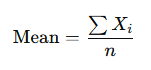
Where Xi represents each value in the dataset, and n is the number of observations.
Median: The median is the middle value in a dataset when the data is ordered from smallest to largest. If there is an even number of observations, the median is the average of the two middle values. The median is particularly useful when the data is skewed or contains outliers, as it is not affected by extreme values.
Mode: The mode is the value that appears most frequently in a dataset. A dataset can have one mode, more than one mode, or no mode at all if no value repeats. The mode is especially useful for categorical data where we want to identify the most common category.
Measures of Variability
While measures of central tendency give an idea of where the data is centered, measures of variability describe the spread or dispersion of the data. Common measures of variability include:
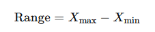
Range: The range is the difference between the maximum and minimum values in a dataset. It provides a simple measure of the spread of the data but can be misleading if the dataset contains outliers.
Variance: Variance measures the average squared deviation of each value from the mean. It provides insight into how much the values in the dataset vary around the mean. A higher variance indicates more spread out data, while a lower variance indicates that the data points are closer to the mean.
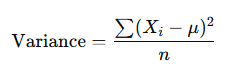
Where μ is the mean of the dataset.
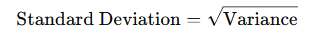
Standard Deviation: The standard deviation is the square root of the variance and provides a measure of the spread of the data in the same units as the data itself. It is one of the most commonly used measures of variability and is particularly useful when comparing the spread of different datasets.
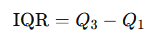
Interquartile Range (IQR): The interquartile range measures the spread of the middle 50% of the data. It is calculated as the difference between the first quartile (25th percentile) and the third quartile (75th percentile). The IQR is useful for identifying the spread of the data while minimizing the influence of outliers.
Graphical Representation of Data
In addition to numerical summaries, descriptive statistics also involve the use of graphical methods to visualize data. Graphs and charts can often reveal insights that might not be immediately obvious from the numbers alone. Some common types of graphs used in descriptive statistics include:
- Histograms: A histogram displays the distribution of a dataset by showing the frequency of values within specified intervals (bins). It provides a visual representation of the data’s shape, central tendency, and variability.
- Box Plots: A box plot (or whisker plot) summarizes a dataset using five key numbers: the minimum, first quartile, median, third quartile, and maximum. Box plots are particularly useful for identifying outliers and comparing distributions between different groups.
- Bar Charts: Bar charts are used to represent categorical data by displaying the frequency of each category. They are a simple yet effective way to compare different categories within a dataset.
- Scatter Plots: Scatter plots are used to examine the relationship between two numerical variables. By plotting one variable on the x-axis and the other on the y-axis, scatter plots can reveal correlations, patterns, and potential outliers.
Descriptive statistics is an essential tool in data analysis, providing a way to summarize and understand the key features of a dataset. By using measures of central tendency and variability, along with graphical representations, descriptive statistics allow us to make sense of data, identify patterns, and communicate insights effectively. For beginners, mastering the basics of descriptive statistics is the first step towards more advanced statistical analysis and data science.
Applying Descriptive Statistics: Practical Examples and Insights
Now that we’ve covered the fundamental concepts of descriptive statistics, it’s time to see how these tools are applied in real-world scenarios. Understanding how to summarize data effectively is crucial for interpreting results and making informed decisions. In this section, we’ll explore practical examples of how descriptive statistics are used in various fields, providing you with a deeper appreciation of their importance and utility.
Example 1: Analyzing Sales Data
Imagine you’re working as a data analyst for a retail company, and you’ve been asked to summarize the sales data for the last quarter. Your goal is to provide insights that can help the company understand its performance and make strategic decisions.
- Mean and Median: The first step might be to calculate the mean and median sales figures for the quarter. If the mean sales per day are significantly higher than the median, it could indicate that a few days with exceptionally high sales are skewing the average. On the other hand, if the mean and median are close, it suggests a more consistent sales performance.
- Standard Deviation: Next, you might calculate the standard deviation of daily sales to understand how much sales figures fluctuate. A high standard deviation would indicate that sales are highly variable, which could suggest that the company experiences peak sales on certain days, like holidays or weekends, while seeing much lower sales on other days.
- Range and IQR: By calculating the range, you can identify the difference between the highest and lowest sales days. However, since the range is sensitive to outliers, the interquartile range (IQR) might provide a better sense of the spread of the middle 50% of sales days, offering insights into typical sales performance without being affected by extreme values.
- Histogram: Creating a histogram of daily sales can help visualize the distribution of sales figures. For instance, if the histogram shows a right-skewed distribution, it suggests that there are many days with low sales and fewer days with very high sales.
- Box Plot: A box plot could be used to compare sales across different regions or stores. This would allow you to quickly see which regions have the highest and lowest sales, as well as identify any outliers that might need further investigation.
Example 2: Summarizing Customer Satisfaction Scores
Suppose you’re working with customer satisfaction data collected from a survey where customers rated their satisfaction on a scale of 1 to 10. Your task is to summarize this data to help the company understand customer sentiment.
- Mode: Start by identifying the mode of the satisfaction scores. If the mode is 8, for instance, it means that the most common rating given by customers is 8, indicating a generally positive experience.
- Median: Calculating the median satisfaction score provides insight into the central tendency of the data. If the median score is close to the mode, it suggests that the majority of customers are relatively satisfied. However, if the median is significantly lower than the mode, it might indicate that while some customers are very satisfied, a significant number are not.
- Standard Deviation and Variance: These measures will help you understand how much customer satisfaction varies. A low standard deviation would indicate that most customers gave similar ratings, while a high standard deviation might suggest polarized opinions, with some customers being very satisfied and others very dissatisfied.
- Bar Chart: A bar chart showing the frequency of each satisfaction score can provide a clear visual representation of customer sentiment. For example, if you see that most customers rated their satisfaction as 7 or 8, you can conclude that overall satisfaction is high, but there might be room for improvement to push those scores higher.
- Box Plot: A box plot could be used to compare satisfaction scores across different product lines or services. This would allow you to identify which products are performing well in terms of customer satisfaction and which ones might need attention.
Example 3: Describing Academic Performance
Let’s say you’re an educator analyzing the test scores of students in a particular course. You want to understand the overall performance of the class and identify any areas where students might need additional support.
- Mean and Median: Calculate the mean and median test scores to get a sense of the overall performance. If the mean score is 75 and the median is 80, this might suggest that while the majority of students performed well, a few low scores are pulling down the average.
- Range and IQR: The range will show you the spread between the highest and lowest scores, but the interquartile range (IQR) will provide a better picture of the typical performance, as it focuses on the middle 50% of students.
- Standard Deviation: A low standard deviation would suggest that most students scored similarly, indicating a consistent understanding of the material. A high standard deviation, however, could suggest that while some students excelled, others struggled, pointing to a possible need for differentiated instruction.
- Histogram: A histogram of test scores can help visualize the distribution. For instance, if the histogram shows a bell-shaped curve, it suggests that most students scored around the mean, with fewer students scoring much higher or lower.
- Box Plot: Using a box plot to compare scores across different tests or sections of the course can reveal whether certain topics were more challenging for students. This insight can guide future instruction and help improve student outcomes.
The Limitations of Descriptive Statistics
While descriptive statistics are powerful tools for summarizing and understanding data, it’s important to recognize their limitations. Descriptive statistics provide a summary of the data at hand but do not allow you to make inferences about a larger population. For example, knowing the average test score of a class tells you about that specific group of students but doesn’t necessarily predict how students in another class might perform.
Furthermore, descriptive statistics can sometimes be misleading, especially if the data contains outliers or is not representative of the population. For example, if a dataset includes a few extreme values, the mean might give a distorted view of the central tendency. In such cases, the median might be a more appropriate measure.
To draw conclusions beyond the data you have, you would need to use inferential statistics, which involve hypothesis testing and confidence intervals. Inferential statistics allow you to make predictions and generalizations about a population based on a sample of data.
Descriptive statistics are an essential part of data analysis, providing a way to summarize and understand the key features of a dataset. By using measures of central tendency and variability, along with graphical methods, you can gain valuable insights into your data and communicate those insights effectively. For beginners, mastering descriptive statistics is the first step toward becoming proficient in data analysis and building a foundation for more advanced statistical techniques.
Whether you’re analyzing sales figures, customer satisfaction, or academic performance, descriptive statistics provide the tools you need to make informed decisions and drive positive outcomes. As you continue to explore the world of data, remember that descriptive statistics are just the beginning—the gateway to a deeper understanding of how data can inform and improve every aspect of our lives.