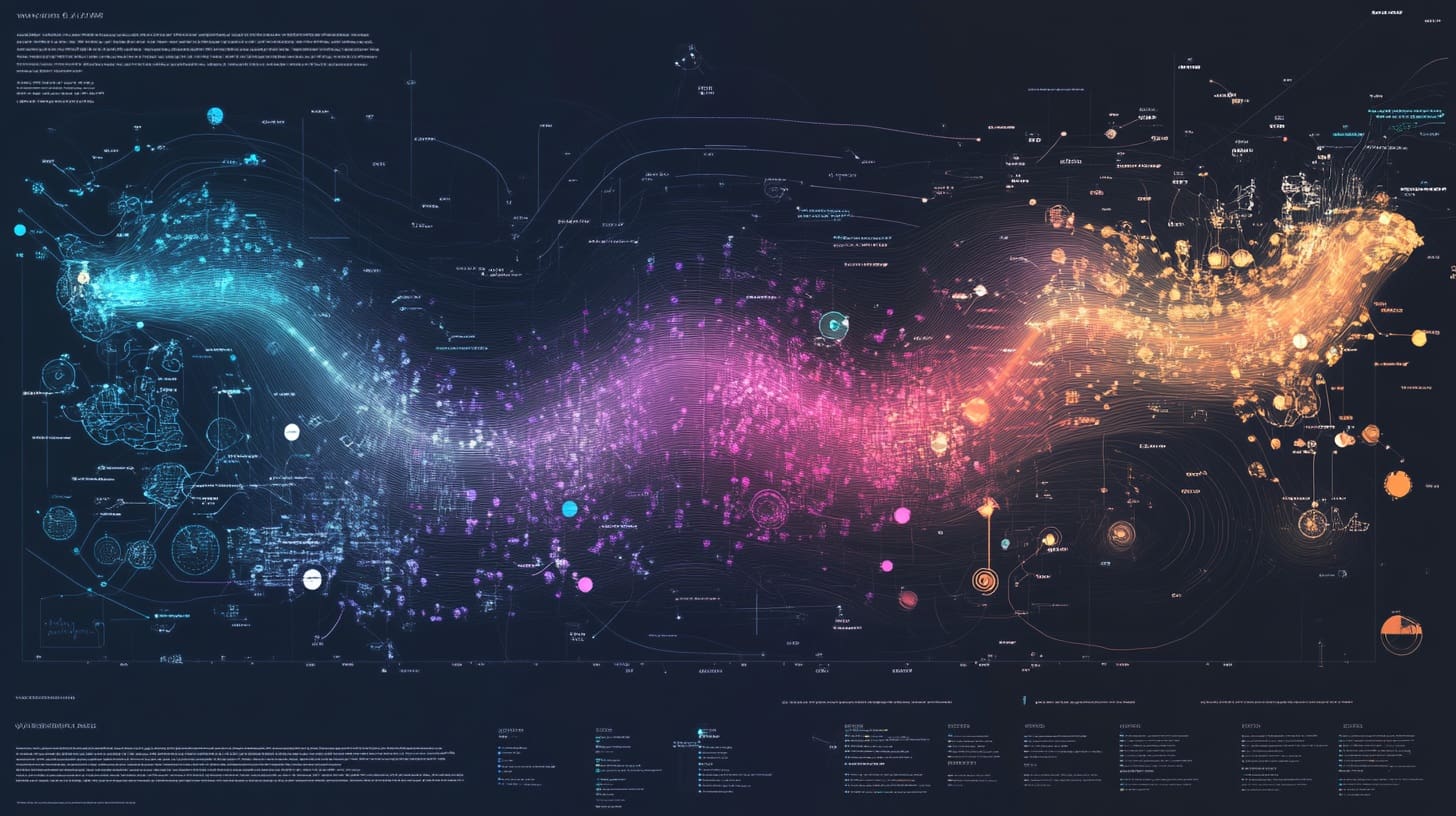
Data visualization has evolved from static charts to dynamic, interactive experiences that allow users to engage directly with the data. Interactive visualizations provide more than just a snapshot—they enable users to filter, explore, and drill down into data, uncovering deeper insights. Adding interactivity and filters to visualizations enhances the user experience, making them an essential tool in data analysis, business intelligence, and storytelling.
This article explores the foundational concepts of interactive data visualization, the benefits of adding filters, and how interactivity transforms data exploration. We will also introduce tools and techniques for creating interactive visualizations, setting the stage for practical implementations.
Why Interactive Visualizations Matter
Static charts, while useful for presenting fixed insights, are limited in their ability to adapt to the viewer’s specific needs. Interactive visualizations, on the other hand, empower users to:
- Explore Data Dynamically: View data from different perspectives by adjusting filters or parameters.
- Focus on Specific Insights: Drill down into subsets of data for granular analysis.
- Enhance Engagement: Engage users with responsive and visually appealing designs.
- Facilitate Decision-Making: Provide actionable insights by allowing stakeholders to interact directly with the data.
For example, an interactive sales dashboard might enable users to filter data by region, product category, or time period, revealing trends and patterns tailored to their business needs.
Core Features of Interactive Visualizations
Adding interactivity involves more than just aesthetic appeal—it is about functionality and usability. Here are the key components:
1. Filters
Filters allow users to narrow down the data displayed based on specific criteria. Common filter types include:
- Dropdowns: Enable users to select from predefined categories (e.g., regions, product lines).
- Sliders: Allow users to adjust numeric ranges (e.g., time periods, price ranges).
- Search Boxes: Provide text-based filtering for quick access to specific items.
Example: In an e-commerce dashboard, users can apply filters to view sales by:
- Category: Electronics, Apparel, or Home Goods.
- Time Period: Last 7 days, last month, or custom dates.
- Region: North America, Europe, or Asia-Pacific.
2. Drill-Downs
Drill-down functionality enables users to click on data points to explore more detailed information. For instance:
- Clicking on a country in a map visualization could reveal city-level data.
- Selecting a product category might display individual product sales.
3. Interactive Highlights
Interactive highlights emphasize specific data points when users hover over or click on them. This feature is particularly useful in scatter plots, heatmaps, or geographic maps.
Example: Hovering over a scatter plot point displays a tooltip showing detailed information about that data point, such as customer name, transaction value, and purchase date.
4. Linked Visualizations
Linked visualizations update dynamically based on user interactions in one chart, affecting others in the same dashboard. For instance:
- Selecting a region in a bar chart filters a line chart to show sales trends for that region.
- Highlighting a category in a pie chart updates a table displaying related metrics.
5. Responsive Design
Responsive visualizations adapt to different screen sizes and devices. This is essential for mobile-friendly dashboards and visualizations embedded in websites.
Tools for Creating Interactive Visualizations
Several tools and frameworks make it easy to incorporate filters and interactivity into visualizations. Here are some popular options:
1. Tableau
Tableau is a leading platform for interactive data visualization and dashboard creation. It offers built-in interactivity features, such as filters, drill-downs, and dynamic tooltips, without requiring programming skills.
Key Features:
- Drag-and-drop interface for creating interactive dashboards.
- Filters, sliders, and dropdowns that can be applied across multiple charts.
- Integration with real-time data sources for up-to-date visualizations.
2. Power BI
Microsoft Power BI is another powerful tool for building interactive dashboards. It allows users to create responsive visualizations with filters, slicers, and drill-through options.
Key Features:
- Slicers for filtering data by categories, dates, or ranges.
- Dynamic interactions between charts and visualizations.
- Integration with Excel and other Microsoft tools.
3. Python Libraries
For developers, Python offers robust libraries for creating custom interactive visualizations:
- Plotly: Enables interactive charts with hover effects, zooming, and filtering.
- Dash: Built on Plotly, Dash is ideal for creating full-fledged interactive web applications.
- Bokeh: A Python library for building interactive visualizations with sliders, widgets, and callbacks.
Example Using Plotly:
import plotly.express as px

# Sample data
data = px.data.gapminder()
filtered_data = data.query("year == 2007")

# Create an interactive scatter plot
fig = px.scatter(filtered_data, x="gdpPercap", y="lifeExp", size="pop",
                 color="continent", hover_name="country", log_x=True)

# Add a filter for the year
fig.update_layout(title="Life Expectancy vs GDP per Capita (2007)",
                  xaxis_title="GDP per Capita (log scale)",
                  yaxis_title="Life Expectancy")
fig.show()4. JavaScript Libraries
JavaScript libraries provide flexibility and customization for web-based interactive visualizations:
- D3.js: A highly customizable library for creating data-driven visualizations with rich interactivity.
- Chart.js: Lightweight and easy-to-use, suitable for adding basic interactivity.
- Highcharts: A commercial library for building polished and interactive charts.
Example Using D3.js: D3.js can be used to build interactive bar charts with hover effects and tooltips:
// Sample D3.js script for interactive bar chart
d3.selectAll("rect")
  .on("mouseover", function(event, d) {
    d3.select(this).style("fill", "orange");
    tooltip.html(`Value: ${d.value}`).style("visibility", "visible");
  })
  .on("mouseout", function() {
    d3.select(this).style("fill", "steelblue");
    tooltip.style("visibility", "hidden");
});Examples of Adding Interactivity to Visualizations
1. Interactive Dashboard for Sales Data
A sales dashboard might include:
- Filters for selecting regions, time periods, or product categories.
- Drill-downs to explore performance metrics for individual sales representatives.
- Linked visualizations, where selecting a bar in a revenue chart updates a map of sales distribution.
2. Dynamic Financial Report
A financial dashboard might feature:
- A slider to adjust the time range for revenue and expense trends.
- Tooltips displaying exact figures when hovering over data points.
- Custom filters to compare data across departments or business units.
Benefits of Filters and Interactivity
- Enhanced Usability: Users can explore data in ways that align with their specific goals or questions.
- Improved Decision-Making: Dynamic exploration reveals insights that might be hidden in static visualizations.
- Engaging Storytelling: Interactive elements make data stories more compelling and memorable.
Best Practices for Adding Filters and Interactivity
When implementing filters and interactivity, it’s essential to balance functionality, usability, and aesthetics. Here are some best practices to ensure your visualizations remain effective and user-friendly:
1. Keep It Simple and Intuitive
Interactive visualizations should be intuitive for all users, regardless of their technical expertise. Overloading a dashboard with too many interactive elements can confuse users and diminish its effectiveness.
Tips:
- Limit the number of filters to the most relevant criteria.
- Use descriptive labels for filters (e.g., “Select Region” instead of “Filter 1”).
- Add tooltips or instructions to guide users on how to interact with the chart.
2. Use Cascading Filters
Cascading filters dynamically adjust available options based on previous selections. For instance, selecting a country filter might update a city filter to show only cities within the chosen country.
Example in Tableau:
- Add a country filter and a city filter to the dashboard.
- Configure the city filter to depend on the country filter using the “Only Relevant Values” option.
3. Highlight Key Interactions
Highlighting interactions, such as hover effects or active selections, helps users focus on the most critical data points.
Examples:
- Use hover highlights to show additional information about specific data points in a scatter plot.
- Change the color or size of selected elements to emphasize user actions.
Python Example Using Plotly:
import plotly.express as px

# Create an interactive bar chart with hover effects
data = px.data.gapminder()
fig = px.bar(data.query("year == 2007"), x="continent", y="pop",
             color="continent", hover_name="continent",
             title="Population by Continent (2007)")

# Add hover interaction
fig.update_traces(hoverinfo="text+name")
fig.show()4. Enable Cross-Filtering in Dashboards
Cross-filtering allows users to interact with one visualization and dynamically update others in the same dashboard. For example:
- Clicking on a region in a map could filter a line chart to show sales trends for that region.
- Selecting a product category in a bar chart could update a table displaying individual product performance.
Implementation in Power BI:
- Link visualizations using the “Edit Interactions” option.
- Select how interactions affect other visuals (e.g., filter, highlight, or none).
5. Optimize Filter Placement
Place filters where they are most intuitive for the user. Typically, filters are positioned at the top or side of the visualization for easy access.
Example in Tableau:
- Add dropdown filters for time period and category to the top of the dashboard.
- Group filters logically (e.g., time filters together, category filters together).
6. Prioritize Performance
Interactive visualizations with multiple filters or large datasets can slow down performance, especially when rendering in real time.
Optimization Techniques:
- Pre-aggregate data where possible to reduce computational overhead.
- Limit the number of data points displayed by using summary views with drill-down options.
- Use indexed databases for faster query execution.
Example in Dash (Python):
from dash import Dash, dcc, html
import pandas as pd

# Load pre-aggregated data
data = pd.DataFrame({'Category': ['A', 'B', 'C'], 'Sales': [100, 150, 200]})

# Create a Dash app with dropdown filter
app = Dash(__name__)
app.layout = html.Div([
    dcc.Dropdown(id='category-filter', options=[
        {'label': cat, 'value': cat} for cat in data['Category']],
        placeholder="Select a Category"),
    dcc.Graph(id='sales-chart')
])

@app.callback(
    Output('sales-chart', 'figure'),
    [Input('category-filter', 'value')]
)
def update_chart(selected_category):
    filtered_data = data[data['Category'] == selected_category] if selected_category else data
    return px.bar(filtered_data, x='Category', y='Sales', title="Sales by Category")

app.run_server(debug=True)Real-World Use Cases for Interactive Visualizations
Interactive visualizations are widely used across industries to address diverse analytical and reporting needs. Here are some practical examples:
1. Sales Performance Dashboard
Scenario: A sales manager wants to analyze performance across regions, time periods, and product categories.
Features:
- Filters for selecting regions, months, and product lines.
- Drill-downs to view sales trends for individual sales representatives.
- Interactive maps highlighting sales distribution by region.
Tool Recommendation: Tableau or Power BI for easy implementation of filters, slicers, and linked visualizations.
2. Financial Analysis Tool
Scenario: An investment firm analyzes portfolio performance across asset classes and time frames.
Features:
- Time sliders to adjust the analysis period dynamically.
- Linked scatter plots showing risk vs. return for selected assets.
- Filters for selecting asset classes, such as equities or bonds.
Tool Recommendation: Python with Plotly/Dash for building a customizable and dynamic application.
3. Marketing Campaign Tracker
Scenario: A marketing team tracks the performance of campaigns by region, platform, and time period.
Features:
- Dropdowns to filter by campaign type or region.
- Interactive bar charts showing clicks, conversions, and cost metrics.
- Real-time updates based on live campaign data.
Tool Recommendation: Power BI or Tableau for easy integration with live data sources.
4. Public Health Monitoring
Scenario: A health organization monitors disease outbreaks and vaccination coverage.
Features:
- Interactive maps showing outbreak locations and vaccination rates.
- Filters to select specific diseases or time frames.
- Drill-downs to view region-specific statistics.
Tool Recommendation: D3.js or Tableau for advanced geographic visualizations.
Techniques to Improve User Experience
To ensure interactive visualizations provide value, focus on delivering an exceptional user experience:
1. Responsive Design
Design visualizations that work seamlessly across devices, including desktops, tablets, and smartphones. Tools like Tableau, Power BI, and Plotly/Dash support responsive designs.
2. Accessible Color Schemes
Use colorblind-friendly palettes and high-contrast colors to ensure visualizations are accessible to all users.
3. Interactive Guides
Provide guidance for users interacting with the visualization. This could include:
- Tooltips explaining filters or buttons.
- A brief tutorial or legend on how to navigate the dashboard.
Advanced Interactivity Techniques
Beyond basic filters and drill-downs, advanced interactivity features can enhance the functionality and user experience of your visualizations.
1. Parameterized Controls
Parameters allow users to modify calculations, chart settings, or data groupings dynamically. Unlike filters, parameters let users directly influence how the data is presented or processed.
Example Use Case: A user can switch between different metrics (e.g., revenue, profit, or sales volume) using a dropdown.
Implementation in Tableau:
- Create a parameter (e.g., “Metric Selector”).
- Define the options (e.g., Revenue, Profit).
- Add a calculated field that switches the measure based on the parameter value.
- Use the parameter control in your dashboard.
2. Animations for Transitions
Animations provide smooth transitions between states when filters or parameters are adjusted. They make changes more visually intuitive and engaging.
Example Use Case: When filtering a time-series chart by year, the chart animates the transition to show changes over time.
Tool Recommendation:
- D3.js: Offers granular control over animations.
- Plotly: Includes built-in animation support for dynamic visualizations.
Python Example with Plotly:
import plotly.express as px

# Load data
data = px.data.gapminder()

# Create an animated scatter plot
fig = px.scatter(data, x="gdpPercap", y="lifeExp", animation_frame="year",
                 size="pop", color="continent", hover_name="country",
                 log_x=True, title="Life Expectancy vs GDP (Animated)")

fig.show()3. Predictive and What-If Analysis
Adding what-if scenarios and predictive analytics allows users to simulate outcomes based on hypothetical changes.
Example Use Case: A financial dashboard lets users adjust interest rates or loan terms to see the impact on monthly payments.
Tool Recommendation:
- Power BI: Use Power Query and DAX for creating what-if scenarios.
- Dash (Python): Build interactive sliders and callbacks for real-time simulations.
4. Multi-Layered Interactivity
Complex visualizations, such as geographic maps, can include multiple interactive layers. Users can toggle layers on or off to explore different dimensions of the data.
Example Use Case: A map visualization shows population density as the base layer and overlays points for hospital locations. Users can toggle layers to focus on specific aspects.
Tool Recommendation:
- Tableau: Use map layers to create multi-dimensional maps.
- Leaflet.js: A JavaScript library for interactive maps.
Integrating Real-Time Data
Real-time data integration ensures that visualizations always reflect the latest information, making them invaluable for monitoring and decision-making.
1. Data Sources for Real-Time Integration
- APIs: Connect to external APIs for live data feeds (e.g., financial markets, weather data).
- Databases: Use databases like PostgreSQL, MySQL, or MongoDB with real-time updates.
- Streaming Platforms: Integrate tools like Apache Kafka or AWS Kinesis for high-frequency data streams.
2. Tools for Real-Time Dashboards
- Power BI: Supports direct query mode for real-time database connections.
- Tableau: Use Tableau Server or Tableau Online for live data connections.
- Dash (Python): Build real-time dashboards using callbacks that update when data changes.
Example in Dash (Python):
from dash import Dash, dcc, html
import random
from dash.dependencies import Input, Output
import plotly.graph_objs as go

# Create Dash app
app = Dash(__name__)
app.layout = html.Div([
    dcc.Graph(id='real-time-chart'),
    dcc.Interval(id='interval-component', interval=1000, n_intervals=0)  # Update every second
])

@app.callback(
    Output('real-time-chart', 'figure'),
    [Input('interval-component', 'n_intervals')]
)
def update_chart(n):
    x = list(range(10))
    y = [random.randint(0, 100) for _ in range(10)]
    return go.Figure(data=go.Scatter(x=x, y=y, mode='lines+markers'))

app.run_server(debug=True)3. Performance Considerations for Real-Time Dashboards
- Optimize database queries to minimize latency.
- Use data aggregation to reduce the volume of data transmitted in real time.
- Cache frequently accessed data for faster performance.
Deploying and Sharing Interactive Dashboards
The final step in creating interactive visualizations is sharing them with stakeholders or the public. Here are some strategies for effective deployment:
1. Cloud Hosting
Host dashboards on cloud platforms to ensure accessibility and scalability.
Options:
- Tableau Server/Tableau Online: Share dashboards within organizations or publicly.
- Power BI Service: Publish dashboards to Microsoft’s cloud platform.
- Dash Deployment Server: Deploy Python Dash apps to secure environments.
2. Embedding in Websites
Interactive visualizations can be embedded in websites or intranet portals to make them widely accessible.
Embedding Options:
- Use embed codes provided by Tableau, Power BI, or Plotly.
- Integrate JavaScript-based visualizations (e.g., D3.js, Chart.js) directly into web pages.
3. Mobile-Friendly Design
Ensure dashboards are mobile-responsive to reach users on smartphones and tablets. Use built-in responsive features in tools like Tableau or Power BI.
4. Access Control
Set up role-based access control to restrict sensitive data. For example:
- Allow sales teams to view only their regional data.
- Provide executives with access to company-wide metrics.
Conclusion
Interactive data visualizations with filters and interactivity empower users to explore data dynamically, uncovering insights tailored to their needs. By implementing advanced techniques like cascading filters, real-time integration, and predictive analysis, you can elevate the utility and impact of your visualizations. Furthermore, careful deployment and sharing strategies ensure that your dashboards reach the right audience effectively.
As the demand for interactivity grows, leveraging tools like Tableau, Power BI, Python Dash, and D3.js will help you stay ahead. Whether for business intelligence, public reporting, or exploratory analysis, interactive visualizations turn data into a powerful storytelling tool.


