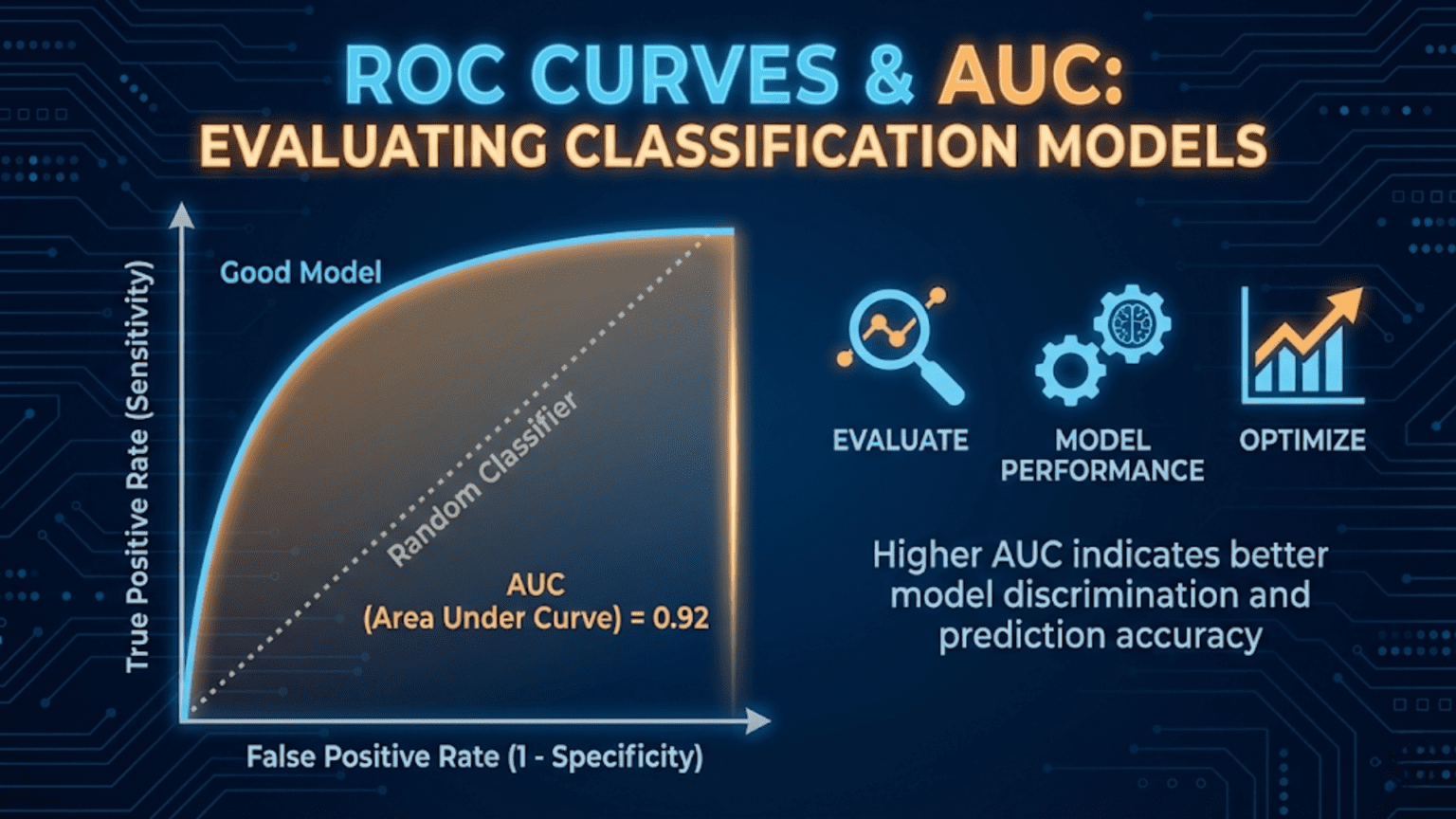
A ROC (Receiver Operating Characteristic) curve is a graph that shows a classification model’s performance across all decision thresholds by plotting the True Positive Rate (sensitivity) against the False Positive Rate (1 – specificity). The AUC (Area Under the Curve) summarizes this into a single number between 0.5 (random classifier) and 1.0 (perfect classifier). AUC is one of the most widely used metrics for comparing classification models because it is threshold-independent and robust to class imbalance.
Introduction
You have trained a logistic regression model to predict whether a patient has a particular disease. You also trained a random forest on the same data. Both produce probability scores between 0 and 1. How do you decide which model is better?
You could pick a single threshold — say 0.5 — and compare precision, recall, and F1 scores. But that comparison is arbitrary: the “better” model changes depending on the threshold you choose. What you really want to know is which model is inherently better at separating the two classes, regardless of any particular threshold setting.
That is exactly what the ROC curve and its summary statistic, the AUC, measure.
In this article we will build ROC curves from scratch, understand every axis and point on the graph, learn how to compute and interpret AUC, compare multiple models visually and numerically, understand when ROC-AUC is the right metric (and when it is not), and implement everything in Python using both manual calculations and scikit-learn.
Background: The Signal Detection Problem
The ROC curve has its origins in World War II radar signal detection. Engineers needed a way to evaluate how well a radar system could distinguish real aircraft (“signal”) from noise (clouds, birds, interference), across different sensitivity settings. Setting the detector too sensitive triggered many false alarms; setting it too conservative missed real aircraft.
The ROC curve was developed to visualize this fundamental tradeoff across all possible sensitivity settings simultaneously — a single plot that captures a system’s entire range of behavior. Decades later, it was adopted by the medical community for evaluating diagnostic tests, and eventually became a cornerstone of machine learning model evaluation.
Understanding this history helps internalize what ROC curves fundamentally represent: the complete diagnostic performance of a classifier across all possible operating points.
The Building Blocks: TPR and FPR
Every point on a ROC curve corresponds to a specific decision threshold. At each threshold, two rates are computed.
True Positive Rate (TPR) — Sensitivity / Recall
TPR answers: “Of all actual positives, what fraction does the model correctly identify at this threshold?”
You already know this as recall or sensitivity. A TPR of 0.9 means the model catches 90% of real positive cases.
False Positive Rate (FPR)
FPR answers: “Of all actual negatives, what fraction does the model incorrectly flag as positive at this threshold?”
FPR is sometimes called the fall-out rate or the Type I error rate. A FPR of 0.1 means that 10% of truly negative cases are incorrectly classified as positive.
Notice the relationship: FPR = 1 − Specificity, where Specificity = TN / (TN + FP).
Why These Two Rates?
The ROC curve plots TPR (y-axis) against FPR (x-axis). This specific pairing is deliberate:
- TPR captures performance on the positive class — how well you find real positives
- FPR captures the cost paid on the negative class — how much you disturb true negatives in the process
Together, they describe the fundamental tradeoff between sensitivity and specificity across all thresholds. Crucially, neither TPR nor FPR is affected by the class ratio (the proportion of positives to negatives), making ROC curves invariant to class imbalance in a specific mathematical sense we will explore later.
Building a ROC Curve Step by Step
Let’s construct a ROC curve manually to understand exactly what it represents.
The Process
- Train a classifier that outputs probability scores (not just binary labels)
- Sort all test samples by their predicted probability, from highest to lowest
- Starting with threshold = 1.0 (predict nothing as positive), gradually lower the threshold
- At each threshold, compute TPR and FPR
- Plot each (FPR, TPR) point
- Connect the points to form the curve
A Tiny Manual Example
Suppose we have 10 test samples — 5 positive (P) and 5 negative (N) — with the following predicted probabilities:
| Sample | True Label | Predicted Probability |
|---|---|---|
| A | P | 0.95 |
| B | P | 0.88 |
| C | N | 0.82 |
| D | P | 0.75 |
| E | N | 0.68 |
| F | P | 0.55 |
| G | N | 0.42 |
| H | N | 0.35 |
| I | P | 0.28 |
| J | N | 0.15 |
We lower the threshold from 1.0 to 0.0 and compute TPR and FPR at each step:
| Threshold | Predicted Positive | TP | FP | FN | TN | TPR | FPR |
|---|---|---|---|---|---|---|---|
| 1.00 | (none) | 0 | 0 | 5 | 5 | 0.00 | 0.00 |
| 0.95 | A | 1 | 0 | 4 | 5 | 0.20 | 0.00 |
| 0.88 | A, B | 2 | 0 | 3 | 5 | 0.40 | 0.00 |
| 0.82 | A, B, C | 2 | 1 | 3 | 4 | 0.40 | 0.20 |
| 0.75 | A, B, C, D | 3 | 1 | 2 | 4 | 0.60 | 0.20 |
| 0.68 | A, B, C, D, E | 3 | 2 | 2 | 3 | 0.60 | 0.40 |
| 0.55 | …F | 4 | 2 | 1 | 3 | 0.80 | 0.40 |
| 0.42 | …G | 4 | 3 | 1 | 2 | 0.80 | 0.60 |
| 0.35 | …H | 4 | 4 | 1 | 1 | 0.80 | 0.80 |
| 0.28 | …I | 5 | 4 | 0 | 1 | 1.00 | 0.80 |
| 0.15 | …J | 5 | 5 | 0 | 0 | 1.00 | 1.00 |
Plotting these (FPR, TPR) coordinate pairs traces the ROC curve. Several patterns emerge immediately:
- When threshold = 1.0, both TPR and FPR are 0 — the model predicts nothing (bottom-left corner)
- When threshold = 0.0, both TPR and FPR are 1 — the model predicts everything (top-right corner)
- A “step right” (FPR increase) happens when a negative sample crosses the threshold
- A “step up” (TPR increase) happens when a positive sample crosses the threshold
- Our model performs well: the early steps are mostly upward, meaning positive samples have higher scores than negative ones
Understanding the ROC Curve Shape
The Three Reference Points
Every ROC curve passes through (or near) three reference points:
Bottom-left (0, 0): Threshold = 1.0. The model predicts nothing as positive. TPR = FPR = 0.
Top-right (1, 1): Threshold = 0.0. The model predicts everything as positive. TPR = FPR = 1.
Top-left (0, 1): The ideal point. TPR = 1, FPR = 0. The model perfectly identifies all positives with zero false alarms. A perfect classifier passes through (or very close to) this corner.
The Diagonal Baseline
The diagonal line from (0,0) to (1,1) represents a random classifier — one that assigns scores completely independent of the true label. A coin-flip classifier would produce a ROC curve along this diagonal, with AUC = 0.5.
Any classifier whose ROC curve lies above the diagonal is doing better than random. Any curve below the diagonal (AUC < 0.5) means the model is somehow anti-correlated with the truth — paradoxically useful if you simply flip all its predictions.
What Shape Tells You
A ROC curve that bulges strongly toward the top-left corner indicates excellent discrimination ability. The model assigns high scores to positives and low scores to negatives with very few mix-ups. A curve that hugs the diagonal indicates a model that struggles to separate the two classes.
The AUC: Summarizing the ROC Curve
Definition
The Area Under the ROC Curve (AUC-ROC) is the integral of the ROC curve — literally the proportion of the unit square that lies beneath the curve.
AUC ranges from 0 to 1:
- AUC = 1.0: Perfect classifier — TPR = 1 at every FPR value
- AUC = 0.5: Random classifier — no better than chance
- AUC < 0.5: Worse than random (flip predictions to get AUC = 1 – AUC)
The Probabilistic Interpretation
AUC has a beautifully intuitive probabilistic meaning:
AUC = the probability that the model ranks a randomly chosen positive example higher than a randomly chosen negative example.
If you pick one positive sample and one negative sample at random, AUC = 0.85 means there is an 85% chance the model assigns a higher probability score to the positive sample than to the negative one. This is a direct measure of the model’s discriminative ability.
This interpretation makes AUC completely independent of the decision threshold — it measures how well the model separates the two classes in its scoring function, regardless of where you draw the line between “positive” and “negative.”
AUC Ranges and What They Mean
| AUC Range | Interpretation | Example Domain Performance |
|---|---|---|
| 0.5 | Random classifier | No discriminative ability |
| 0.5 – 0.6 | Poor | Barely better than random |
| 0.6 – 0.7 | Fair | Some signal, limited usefulness |
| 0.7 – 0.8 | Good | Useful for many applications |
| 0.8 – 0.9 | Very Good | Strong clinical / production performance |
| 0.9 – 0.97 | Excellent | Top-tier performance |
| 0.97 – 1.0 | Outstanding | Suspicious — check for data leakage |
These are rough guidelines. What counts as “good” depends heavily on the domain — an AUC of 0.75 might be excellent for a difficult genomics problem and disappointing for a simple spam filter.
Python Implementation from Scratch
Let’s build everything from the ground up before using library functions.
Manual ROC Curve Construction
import numpy as np
import matplotlib.pyplot as plt

def compute_roc_curve(y_true, y_scores):
    """
    Compute ROC curve points manually.

    Args:
        y_true:   Array of true binary labels (1 = positive, 0 = negative)
        y_scores: Array of predicted probability scores [0, 1]

    Returns:
        fpr_list:    False Positive Rates at each threshold
        tpr_list:    True Positive Rates at each threshold
        thresholds:  The threshold values used
    """
    # Total actual positives and negatives
    n_pos = y_true.sum()
    n_neg = len(y_true) - n_pos

    if n_pos == 0 or n_neg == 0:
        raise ValueError("y_true must contain both positive and negative examples")

    # Sort by predicted score, highest first
    sorted_indices = np.argsort(y_scores)[::-1]
    sorted_labels  = y_true[sorted_indices]
    sorted_scores  = y_scores[sorted_indices]

    # Start at (0, 0): threshold above max score, predicting nothing
    fpr_list = [0.0]
    tpr_list = [0.0]
    thresholds = [sorted_scores[0] + 1e-10]  # Just above max score

    tp = 0
    fp = 0

    for i, label in enumerate(sorted_labels):
        # Lower threshold to include this sample as positive
        if label == 1:
            tp += 1
        else:
            fp += 1

        # Compute rates
        tpr = tp / n_pos
        fpr = fp / n_neg

        fpr_list.append(fpr)
        tpr_list.append(tpr)
        thresholds.append(sorted_scores[i])

    return np.array(fpr_list), np.array(tpr_list), np.array(thresholds)


def compute_auc_trapezoidal(fpr, tpr):
    """
    Compute AUC using the trapezoidal rule.

    The trapezoidal rule approximates the area under the curve
    by summing the areas of trapezoids formed by adjacent points.
    """
    auc = 0.0
    for i in range(1, len(fpr)):
        # Width of trapezoid (change in FPR)
        width = fpr[i] - fpr[i-1]
        # Average height (average TPR)
        avg_height = (tpr[i] + tpr[i-1]) / 2
        auc += width * avg_height
    return auc


# ---- Demo with our 10-sample example ----
y_true_demo = np.array([1, 1, 0, 1, 0, 1, 0, 0, 1, 0])
y_scores_demo = np.array([0.95, 0.88, 0.82, 0.75, 0.68, 0.55, 0.42, 0.35, 0.28, 0.15])

fpr_demo, tpr_demo, thresh_demo = compute_roc_curve(y_true_demo, y_scores_demo)
auc_demo = compute_auc_trapezoidal(fpr_demo, tpr_demo)

print("=== Manual ROC Curve (10-sample example) ===\n")
print(f"{'Threshold':>10} | {'FPR':>6} | {'TPR':>6}")
print("-" * 30)
for t, f, tp_r in zip(thresh_demo[1:], fpr_demo[1:], tpr_demo[1:]):
    print(f"{t:>10.2f} | {f:>6.2f} | {tp_r:>6.2f}")

print(f"\nManual AUC (trapezoidal): {auc_demo:.4f}")

# Plot the ROC curve
plt.figure(figsize=(6, 6))
plt.plot(fpr_demo, tpr_demo, 'b-o', linewidth=2, markersize=8, label=f"Model (AUC={auc_demo:.3f})")
plt.plot([0, 1], [0, 1], 'k--', linewidth=1.5, label="Random Classifier (AUC=0.5)")
plt.plot(0, 1, 'r*', markersize=15, label="Ideal Point (0, 1)")
plt.xlabel("False Positive Rate (FPR)", fontsize=12)
plt.ylabel("True Positive Rate (TPR)", fontsize=12)
plt.title("ROC Curve — Manual Example", fontsize=14)
plt.legend(fontsize=10)
plt.grid(True, alpha=0.3)
plt.tight_layout()
plt.savefig("roc_manual_example.png", dpi=150)
plt.show()
print("Saved: roc_manual_example.png")Using Scikit-learn
In production, always use scikit-learn’s battle-tested implementations:
from sklearn.metrics import roc_curve, roc_auc_score, auc
from sklearn.datasets import make_classification
from sklearn.linear_model import LogisticRegression
from sklearn.ensemble import RandomForestClassifier, GradientBoostingClassifier
from sklearn.model_selection import train_test_split
from sklearn.preprocessing import StandardScaler
import numpy as np
import matplotlib.pyplot as plt

# ---- Generate Dataset ----
np.random.seed(42)
X, y = make_classification(
    n_samples=2000,
    n_features=20,
    n_informative=10,
    n_redundant=4,
    weights=[0.7, 0.3],   # Moderate imbalance: 70% negative, 30% positive
    random_state=42
)

X_train, X_test, y_train, y_test = train_test_split(
    X, y, test_size=0.3, random_state=42, stratify=y
)

# Scale features for logistic regression
scaler = StandardScaler()
X_train_scaled = scaler.fit_transform(X_train)
X_test_scaled  = scaler.transform(X_test)

# ---- Train Multiple Models ----
models = {
    "Logistic Regression": LogisticRegression(random_state=42, max_iter=1000),
    "Random Forest":        RandomForestClassifier(n_estimators=200, random_state=42),
    "Gradient Boosting":   GradientBoostingClassifier(n_estimators=200, random_state=42),
}

# ---- Plot ROC Curves for All Models ----
plt.figure(figsize=(8, 7))
plt.plot([0, 1], [0, 1], 'k--', linewidth=1.5, label="Random Classifier (AUC=0.500)")

colors = ['steelblue', 'coral', 'mediumseagreen']

for (name, model), color in zip(models.items(), colors):
    # Use scaled data for logistic regression, raw for tree-based
    X_tr = X_train_scaled if "Logistic" in name else X_train
    X_te = X_test_scaled  if "Logistic" in name else X_test

    model.fit(X_tr, y_train)
    y_proba = model.predict_proba(X_te)[:, 1]

    # Compute ROC curve
    fpr, tpr, thresholds = roc_curve(y_test, y_proba)
    auc_score = roc_auc_score(y_test, y_proba)

    plt.plot(fpr, tpr, color=color, linewidth=2.5,
             label=f"{name} (AUC={auc_score:.3f})")

    print(f"{name:<25} AUC = {auc_score:.4f}")

plt.xlabel("False Positive Rate (FPR)", fontsize=13)
plt.ylabel("True Positive Rate (TPR)", fontsize=13)
plt.title("ROC Curves: Model Comparison", fontsize=14, fontweight='bold')
plt.legend(fontsize=11, loc='lower right')
plt.grid(True, alpha=0.3)
plt.tight_layout()
plt.savefig("roc_model_comparison.png", dpi=150)
plt.show()
print("\nSaved: roc_model_comparison.png")Reading a ROC Curve: What to Look For
Understanding how to read and interpret ROC curves is a critical skill. Here is what different curve shapes tell you.
The Convex Bulge Toward Top-Left
A curve that bows strongly toward the top-left corner indicates a powerful classifier. It achieves high TPR while maintaining low FPR. This is what you want to see.
The Staircase Pattern
Binary classifiers or classifiers with limited score resolution produce a staircase-shaped curve rather than a smooth arc. This is normal — each step represents one sample crossing the threshold. With enough test samples, the staircase approximates a smooth curve.
The “Elbow” and Optimal Operating Point
Most ROC curves have an elbow — a point of diminishing returns where increasing the threshold further (raising TPR) starts costing disproportionately more in FPR. The elbow often corresponds to the optimal operating point for practical use.
Crossing Curves
Two ROC curves can cross. When they do, one model is better at high-specificity settings (left side of the curve) and the other is better at high-sensitivity settings (right side). AUC alone doesn’t capture this nuance. When curves cross, you must choose based on where your application operates on the curve.
Finding the Optimal Threshold from the ROC Curve
The ROC curve shows all possible operating points, but in practice you need to pick one threshold. Several principled approaches exist.
The Youden Index (Maximum J Statistic)
The Youden Index J finds the threshold that maximizes the sum of sensitivity and specificity:
This is the point on the ROC curve with the greatest vertical distance from the diagonal. It assumes equal importance for sensitivity and specificity.
Geometric Mean
The Geometric Mean (G-Mean) threshold maximizes the geometric mean of TPR and (1 – FPR):
Closest to Top-Left Corner
Minimize the Euclidean distance from each ROC point to the ideal point (0, 1):
Threshold Selection in Python
from sklearn.metrics import roc_curve, roc_auc_score
import numpy as np

# Train a model and get probabilities
lr_model = LogisticRegression(random_state=42, max_iter=1000)
lr_model.fit(X_train_scaled, y_train)
y_proba_lr = lr_model.predict_proba(X_test_scaled)[:, 1]

# Get ROC curve
fpr, tpr, thresholds = roc_curve(y_test, y_proba_lr)

def find_optimal_thresholds(fpr, tpr, thresholds):
    """
    Find optimal classification thresholds using three methods.

    Returns a dictionary of method names and their optimal thresholds.
    """
    results = {}

    # Method 1: Youden Index — maximizes TPR - FPR
    youden_j = tpr - fpr
    best_idx_youden = np.argmax(youden_j)
    results['Youden Index'] = {
        'threshold': thresholds[best_idx_youden],
        'tpr': tpr[best_idx_youden],
        'fpr': fpr[best_idx_youden],
        'j_stat': youden_j[best_idx_youden]
    }

    # Method 2: Geometric Mean — maximizes sqrt(TPR × specificity)
    specificity = 1 - fpr
    gmean = np.sqrt(tpr * specificity)
    best_idx_gmean = np.argmax(gmean)
    results['Geometric Mean'] = {
        'threshold': thresholds[best_idx_gmean],
        'tpr': tpr[best_idx_gmean],
        'fpr': fpr[best_idx_gmean],
        'gmean': gmean[best_idx_gmean]
    }

    # Method 3: Closest to top-left corner (0, 1)
    distances = np.sqrt(fpr**2 + (1 - tpr)**2)
    best_idx_dist = np.argmin(distances)
    results['Top-Left Distance'] = {
        'threshold': thresholds[best_idx_dist],
        'tpr': tpr[best_idx_dist],
        'fpr': fpr[best_idx_dist],
        'distance': distances[best_idx_dist]
    }

    return results

optimal = find_optimal_thresholds(fpr, tpr, thresholds)

print("=== Optimal Threshold Comparison ===\n")
print(f"{'Method':<20} | {'Threshold':>10} | {'TPR':>6} | {'FPR':>6}")
print("-" * 50)
for method, vals in optimal.items():
    print(f"{method:<20} | {vals['threshold']:>10.4f} | {vals['tpr']:>6.4f} | {vals['fpr']:>6.4f}")

# Visualize all three optimal points on the ROC curve
plt.figure(figsize=(8, 7))
plt.plot(fpr, tpr, 'b-', linewidth=2.5, label=f"ROC Curve (AUC={roc_auc_score(y_test, y_proba_lr):.3f})")
plt.plot([0, 1], [0, 1], 'k--', linewidth=1.5, label="Random Classifier")

colors_opt = ['red', 'orange', 'purple']
markers = ['*', 'D', 's']

for (method, vals), color, marker in zip(optimal.items(), colors_opt, markers):
    plt.scatter(vals['fpr'], vals['tpr'], color=color, s=200, marker=marker,
                zorder=5, label=f"{method} (t={vals['threshold']:.3f})")

# Mark the ideal point
plt.scatter(0, 1, color='gold', s=300, marker='★', zorder=6, label='Ideal Point (0,1)')

plt.xlabel("False Positive Rate (FPR)", fontsize=13)
plt.ylabel("True Positive Rate (TPR)", fontsize=13)
plt.title("ROC Curve with Optimal Operating Points", fontsize=14, fontweight='bold')
plt.legend(fontsize=9, loc='lower right')
plt.grid(True, alpha=0.3)
plt.tight_layout()
plt.savefig("roc_optimal_thresholds.png", dpi=150)
plt.show()
print("Saved: roc_optimal_thresholds.png")Statistical Significance: Is One AUC Really Better?
Two models with AUC scores of 0.842 and 0.851 — is the difference meaningful or just noise from the specific test set used? Comparing AUC scores requires statistical testing.
Bootstrap Confidence Intervals
The most practical approach is bootstrap resampling: repeatedly sample the test set with replacement, compute AUC each time, and report the 95% confidence interval.
from sklearn.metrics import roc_auc_score
import numpy as np

def bootstrap_auc_ci(y_true, y_scores, n_bootstrap=1000, ci=0.95, random_state=42):
    """
    Compute bootstrap confidence interval for AUC.

    Args:
        y_true:      True binary labels
        y_scores:    Predicted probability scores
        n_bootstrap: Number of bootstrap samples
        ci:          Confidence interval width (default 0.95 = 95%)
        random_state: Random seed for reproducibility

    Returns:
        Dictionary with AUC, lower bound, upper bound
    """
    rng = np.random.RandomState(random_state)
    n = len(y_true)
    bootstrap_aucs = []

    for _ in range(n_bootstrap):
        # Sample with replacement
        indices = rng.randint(0, n, size=n)
        y_boot = y_true[indices]
        s_boot = y_scores[indices]

        # Need at least one of each class in the bootstrap sample
        if len(np.unique(y_boot)) < 2:
            continue

        auc_boot = roc_auc_score(y_boot, s_boot)
        bootstrap_aucs.append(auc_boot)

    bootstrap_aucs = np.array(bootstrap_aucs)
    alpha = (1 - ci) / 2

    return {
        'auc':   roc_auc_score(y_true, y_scores),
        'lower': np.percentile(bootstrap_aucs, alpha * 100),
        'upper': np.percentile(bootstrap_aucs, (1 - alpha) * 100),
        'n_valid_bootstraps': len(bootstrap_aucs)
    }


# Compare models with confidence intervals
print("=== AUC with 95% Bootstrap Confidence Intervals ===\n")
print(f"{'Model':<25} | {'AUC':>6} | {'95% CI':>16}")
print("-" * 55)

y_true_arr = np.array(y_test)

for name, model in models.items():
    X_te = X_test_scaled if "Logistic" in name else X_test
    y_prob = model.predict_proba(X_te)[:, 1]

    result = bootstrap_auc_ci(y_true_arr, y_prob, n_bootstrap=2000)

    print(f"{name:<25} | {result['auc']:>6.4f} | "
          f"[{result['lower']:.4f}, {result['upper']:.4f}]")

print("\nNote: Overlapping confidence intervals suggest the difference may not be statistically significant.")When two models’ confidence intervals overlap substantially, you cannot conclude that one is truly better than the other — the difference may simply reflect sampling variability in the test set.
Cross-Validated AUC: A More Reliable Estimate
A single train-test split gives one AUC estimate. Cross-validated AUC provides a more stable estimate with uncertainty quantification.
from sklearn.model_selection import StratifiedKFold, cross_val_score
from sklearn.metrics import make_scorer, roc_auc_score
import numpy as np

# Define AUC scorer
roc_auc_scorer = make_scorer(roc_auc_score, needs_proba=True)

# Stratified 5-fold cross-validation
skf = StratifiedKFold(n_splits=5, shuffle=True, random_state=42)

print("=== 5-Fold Cross-Validated AUC Comparison ===\n")
print(f"{'Model':<25} | {'Mean AUC':>9} | {'Std Dev':>8} | {'95% CI':>20}")
print("-" * 70)

for name, model in models.items():
    X_data = X_train_scaled if "Logistic" in name else X_train

    cv_aucs = cross_val_score(model, X_data, y_train,
                               cv=skf, scoring=roc_auc_scorer)

    mean_auc = cv_aucs.mean()
    std_auc  = cv_aucs.std()
    ci_lower = mean_auc - 1.96 * std_auc
    ci_upper = mean_auc + 1.96 * std_auc

    print(f"{name:<25} | {mean_auc:>9.4f} | {std_auc:>8.4f} | "
f"[{ci_lower:.4f}, {ci_upper:.4f}]")ROC-AUC vs. Precision-Recall AUC: Which to Use?
This is one of the most important practical decisions in model evaluation, and it is frequently misunderstood.
The Key Difference
ROC-AUC and PR-AUC answer different questions:
- ROC-AUC asks: “How well does the model separate positive from negative examples in terms of sensitivity and specificity?”
- PR-AUC (Average Precision) asks: “How well does the model perform at finding positives while maintaining precision?”
The critical technical difference is that ROC-AUC includes true negatives (through the FPR term, which uses TN in its denominator), while PR-AUC does not.
When This Matters: Severe Class Imbalance
When the negative class is overwhelming (99% or more of samples), TN is extremely large and easy to accumulate. The FPR = FP / (FP + TN) stays artificially small even when a model generates many false positives in absolute terms, because those false positives are diluted by the enormous TN count.
This makes ROC-AUC look more optimistic than it should be on severely imbalanced datasets. The model appears to maintain a low FPR even while generating hundreds of false positives in absolute terms.
PR-AUC doesn’t use TN at all, so it is immune to this effect. When you need high precision on a rare class, PR-AUC gives a more honest picture.
Decision Framework
| Situation | Recommended Metric |
|---|---|
| Balanced or mildly imbalanced dataset (>20% positive) | ROC-AUC |
| Moderately imbalanced (5–20% positive) | Either; report both |
| Severely imbalanced (<5% positive) | PR-AUC (Average Precision) |
| Comparing models across different datasets | ROC-AUC (more standard) |
| Focus on high-precision retrieval | PR-AUC |
| Clinical diagnosis with strict sensitivity requirements | ROC-AUC with specific operating point |
from sklearn.metrics import average_precision_score, roc_auc_score
import numpy as np

# Compare ROC-AUC and PR-AUC on different imbalance levels
print("=== ROC-AUC vs PR-AUC Under Different Imbalance Levels ===\n")
print(f"{'Imbalance':>12} | {'Pos %':>6} | {'ROC-AUC':>8} | {'PR-AUC':>7} | {'Difference':>11}")
print("-" * 55)

for pos_weight in [0.5, 0.3, 0.2, 0.1, 0.05, 0.02, 0.01]:
    X_imb, y_imb = make_classification(
        n_samples=5000,
        n_features=15,
        n_informative=8,
        weights=[1 - pos_weight, pos_weight],
        random_state=42
    )

    X_tr_i, X_te_i, y_tr_i, y_te_i = train_test_split(
        X_imb, y_imb, test_size=0.3, random_state=42, stratify=y_imb
    )

    clf = GradientBoostingClassifier(n_estimators=100, random_state=42)
    clf.fit(X_tr_i, y_tr_i)
    y_prob_i = clf.predict_proba(X_te_i)[:, 1]

    roc = roc_auc_score(y_te_i, y_prob_i)
    pr  = average_precision_score(y_te_i, y_prob_i)

    ratio_str = f"{round(1/pos_weight - 1):.0f}:1" if pos_weight < 0.5 else "1:1"
    print(f"{ratio_str:>12} | {pos_weight*100:>5.0f}% | {roc:>8.4f} | {pr:>7.4f} | {roc-pr:>+11.4f}")

print("\nObservation: ROC-AUC and PR-AUC diverge increasingly as imbalance grows.")
print("PR-AUC gives a more pessimistic (more honest) picture under severe imbalance.")Multiclass ROC Curves
Binary ROC curves extend naturally to multiclass problems through two main approaches.
One-vs-Rest (OvR)
For each class, treat it as the “positive” class and all other classes as “negative.” Compute one ROC curve per class and report macro or weighted average AUC.
One-vs-One (OvO)
For each pair of classes, compute a binary ROC curve. Average across all pairs. More computationally expensive but can reveal more nuanced class-level relationships.
from sklearn.multiclass import OneVsRestClassifier
from sklearn.preprocessing import label_binarize
from sklearn.metrics import roc_curve, auc
import numpy as np
import matplotlib.pyplot as plt

# Generate 3-class dataset
from sklearn.datasets import make_classification
X_multi, y_multi = make_classification(
    n_samples=3000, n_features=20, n_informative=12,
    n_classes=3, n_clusters_per_class=1, random_state=42
)

X_tr_m, X_te_m, y_tr_m, y_te_m = train_test_split(
    X_multi, y_multi, test_size=0.3, random_state=42, stratify=y_multi
)

# Binarize labels: shape (n_samples, n_classes)
y_test_bin = label_binarize(y_te_m, classes=[0, 1, 2])
n_classes = 3

# Train One-vs-Rest classifier
ovr_clf = OneVsRestClassifier(
    GradientBoostingClassifier(n_estimators=100, random_state=42)
)
ovr_clf.fit(X_tr_m, y_tr_m)
y_score_multi = ovr_clf.predict_proba(X_te_m)

# Compute ROC curve and AUC for each class
fig, ax = plt.subplots(figsize=(8, 7))
ax.plot([0, 1], [0, 1], 'k--', linewidth=1.5, label='Random Classifier')

class_colors = ['steelblue', 'coral', 'mediumseagreen']
all_auc = []

for i in range(n_classes):
    fpr_i, tpr_i, _ = roc_curve(y_test_bin[:, i], y_score_multi[:, i])
    auc_i = auc(fpr_i, tpr_i)
    all_auc.append(auc_i)
    ax.plot(fpr_i, tpr_i, color=class_colors[i], linewidth=2.5,
            label=f"Class {i} vs Rest (AUC={auc_i:.3f})")

# Macro average AUC
macro_auc = np.mean(all_auc)
print(f"\nPer-class AUC: {[f'{a:.4f}' for a in all_auc]}")
print(f"Macro-average AUC: {macro_auc:.4f}")

# Sklearn's built-in multi-class AUC
from sklearn.metrics import roc_auc_score as ras
macro_auc_sklearn = ras(y_te_m, y_score_multi, multi_class='ovr', average='macro')
weighted_auc_sklearn = ras(y_te_m, y_score_multi, multi_class='ovr', average='weighted')
print(f"Sklearn Macro AUC (OvR):    {macro_auc_sklearn:.4f}")
print(f"Sklearn Weighted AUC (OvR): {weighted_auc_sklearn:.4f}")

ax.set_xlabel("False Positive Rate", fontsize=13)
ax.set_ylabel("True Positive Rate", fontsize=13)
ax.set_title(f"Multiclass ROC Curves (OvR)\nMacro-AUC = {macro_auc:.3f}",
             fontsize=14, fontweight='bold')
ax.legend(fontsize=10, loc='lower right')
ax.grid(True, alpha=0.3)
plt.tight_layout()
plt.savefig("roc_multiclass.png", dpi=150)
plt.show()
print("Saved: roc_multiclass.png")Practical Considerations and Common Pitfalls
Pitfall 1: Trusting AUC Alone Without Looking at the Curve
Two models can have identical AUC scores but very different curve shapes — one might be better at the high-specificity end (left side), the other at the high-sensitivity end (right side). Always plot the curves; never rely on AUC alone.
# Demonstrate two models with same AUC but different operating behaviors
np.random.seed(42)
n = 200

# Model A: Better at high specificity (left side of ROC)
scores_A_pos = np.random.beta(5, 2, n // 2)  # High scores for positives
scores_A_neg = np.random.beta(2, 5, n // 2)  # Low scores for negatives

# Model B: Better at high sensitivity (right side of ROC)
scores_B_pos = np.random.beta(3, 2, n // 2)
scores_B_neg = np.random.beta(2, 3, n // 2)

y_labels = np.array([1] * (n // 2) + [0] * (n // 2))
scores_A = np.concatenate([scores_A_pos, scores_A_neg])
scores_B = np.concatenate([scores_B_pos, scores_B_neg])

fpr_A, tpr_A, _ = roc_curve(y_labels, scores_A)
fpr_B, tpr_B, _ = roc_curve(y_labels, scores_B)
auc_A = roc_auc_score(y_labels, scores_A)
auc_B = roc_auc_score(y_labels, scores_B)

print(f"Model A AUC: {auc_A:.4f}")
print(f"Model B AUC: {auc_B:.4f}")
print("Despite similar AUC, curves differ at specific operating points!")Pitfall 2: ROC-AUC on Severely Imbalanced Data
As discussed earlier, ROC-AUC can be misleadingly optimistic when negative samples vastly outnumber positives. An AUC of 0.95 on a dataset with 0.1% positive rate might correspond to a precision of under 5% at the optimal threshold — practically useless for many applications.
Fix: Always report PR-AUC alongside ROC-AUC for datasets with less than 5% positive rate.
Pitfall 3: Computing AUC on Training Data
AUC computed on training data is almost always artificially inflated due to overfitting — especially for powerful models like deep neural networks and gradient boosting. This looks impressive but tells you nothing about real-world performance.
Fix: Always compute AUC on held-out test data or via cross-validation.
Pitfall 4: Using Predict Instead of Predict_proba
The function model.predict() returns binary labels (0 or 1). ROC curves require continuous probability scores. Using binary predictions for a ROC curve produces a degenerate curve with only three points: (0,0), one intermediate point, and (1,1).
# WRONG: Using binary predictions
y_pred_binary = lr_model.predict(X_test_scaled)
fpr_wrong, tpr_wrong, _ = roc_curve(y_test, y_pred_binary)
print(f"WRONG: Only {len(fpr_wrong)} points on ROC curve (degenerate!)")

# CORRECT: Using probability scores
y_pred_proba = lr_model.predict_proba(X_test_scaled)[:, 1]
fpr_correct, tpr_correct, _ = roc_curve(y_test, y_pred_proba)
print(f"CORRECT: {len(fpr_correct)} points on ROC curve (smooth)")Pitfall 5: Ignoring the Positive Class Column
predict_proba returns a two-column array: column 0 is the probability of class 0 (negative), column 1 is the probability of class 1 (positive). Always use [:, 1] for binary classification ROC curves.
# The two columns sum to 1.0 for each row
y_proba_both_cols = lr_model.predict_proba(X_test_scaled)
print(f"Shape: {y_proba_both_cols.shape}")  # (n_samples, 2)
print(f"Column sums to 1: {np.allclose(y_proba_both_cols.sum(axis=1), 1.0)}")  # True

# Always use [:, 1] for the positive class
y_proba_positive_class = y_proba_both_cols[:, 1]  # Correct
y_proba_negative_class = y_proba_both_cols[:, 0] # Would produce mirrored (wrong) curvePitfall 6: Not Stratifying Splits for Small Datasets
On small datasets with few positive samples, an unstratified random split can accidentally put all positives in one split. This causes AUC computation to fail (requires both classes present) or gives misleading estimates.
Fix: Always use stratify=y in train_test_split and StratifiedKFold in cross-validation.
A Complete Model Evaluation Dashboard
Let’s build a professional evaluation dashboard combining ROC curves, AUC, calibration, and a complete summary table.
import numpy as np
import matplotlib.pyplot as plt
import matplotlib.gridspec as gridspec
from sklearn.metrics import (
    roc_curve, roc_auc_score, average_precision_score,
    precision_recall_curve, f1_score, precision_score, recall_score,
    accuracy_score, brier_score_loss
)
from sklearn.calibration import calibration_curve

def model_evaluation_dashboard(models_dict, X_test, y_test,
                                 model_needs_scaling=None):
    """
    Create a comprehensive model evaluation dashboard showing:
    1. ROC curves for all models
    2. Precision-Recall curves for all models
    3. Summary metrics table

    Args:
        models_dict: Dict of {name: (fitted_model, X_test_appropriate)}
        y_test: True labels
    """
    fig = plt.figure(figsize=(16, 6))
    gs = gridspec.GridSpec(1, 2, figure=fig, wspace=0.35)

    ax_roc = fig.add_subplot(gs[0])
    ax_pr  = fig.add_subplot(gs[1])

    # Reference lines
    ax_roc.plot([0, 1], [0, 1], 'k--', lw=1.5, label='Random (AUC=0.500)')

    colors = ['steelblue', 'coral', 'mediumseagreen', 'mediumpurple']
    summary_rows = []

    for (name, (model, X_te)), color in zip(models_dict.items(), colors):
        y_prob = model.predict_proba(X_te)[:, 1]
        y_pred = (y_prob >= 0.5).astype(int)

        # ROC
        fpr, tpr, _ = roc_curve(y_test, y_prob)
        auc_roc = roc_auc_score(y_test, y_prob)
        ax_roc.plot(fpr, tpr, color=color, lw=2.5,
                    label=f"{name} ({auc_roc:.3f})")

        # PR
        prec, rec, _ = precision_recall_curve(y_test, y_prob)
        auc_pr = average_precision_score(y_test, y_prob)
        ax_pr.plot(rec, prec, color=color, lw=2.5,
                   label=f"{name} ({auc_pr:.3f})")

        # Summary metrics
        summary_rows.append({
            'Model': name,
            'AUC-ROC': f"{auc_roc:.4f}",
            'AUC-PR':  f"{auc_pr:.4f}",
            'F1':      f"{f1_score(y_test, y_pred, zero_division=0):.4f}",
            'Precision': f"{precision_score(y_test, y_pred, zero_division=0):.4f}",
            'Recall':  f"{recall_score(y_test, y_pred, zero_division=0):.4f}",
            'Accuracy': f"{accuracy_score(y_test, y_pred):.4f}",
        })

    # Format ROC plot
    ax_roc.set_xlabel("False Positive Rate", fontsize=12)
    ax_roc.set_ylabel("True Positive Rate", fontsize=12)
    ax_roc.set_title("ROC Curves", fontsize=13, fontweight='bold')
    ax_roc.legend(fontsize=9, loc='lower right', title='Model (AUC)')
    ax_roc.grid(True, alpha=0.3)

    # Format PR plot
    baseline = y_test.mean()
    ax_pr.axhline(y=baseline, color='k', linestyle='--', lw=1.5,
                  label=f'Random ({baseline:.3f})')
    ax_pr.set_xlabel("Recall", fontsize=12)
    ax_pr.set_ylabel("Precision", fontsize=12)
    ax_pr.set_title("Precision-Recall Curves", fontsize=13, fontweight='bold')
    ax_pr.legend(fontsize=9, loc='upper right', title='Model (AUC-PR)')
    ax_pr.grid(True, alpha=0.3)

    plt.suptitle("Model Evaluation Dashboard", fontsize=15, fontweight='bold', y=1.02)
    plt.tight_layout()
    plt.savefig("model_evaluation_dashboard.png", dpi=150, bbox_inches='tight')
    plt.show()

    # Print summary table
    print("\n=== Summary Metrics at Default Threshold (0.5) ===\n")
    print(f"{'Model':<25} | {'AUC-ROC':>8} | {'AUC-PR':>7} | {'F1':>7} | "
          f"{'Precision':>10} | {'Recall':>7} | {'Accuracy':>9}")
    print("-" * 85)
    for row in summary_rows:
        print(f"{row['Model']:<25} | {row['AUC-ROC']:>8} | {row['AUC-PR']:>7} | "
              f"{row['F1']:>7} | {row['Precision']:>10} | {row['Recall']:>7} | "
              f"{row['Accuracy']:>9}")

    print("\nSaved: model_evaluation_dashboard.png")
    return summary_rows


# Prepare models dict for our dataset
fitted_models = {}
for name, model in models.items():
    X_te = X_test_scaled if "Logistic" in name else X_test
    fitted_models[name] = (model, X_te)

summary = model_evaluation_dashboard(fitted_models, X_test, y_test)Real-World Applications of ROC Curves
Medical Diagnostics
ROC curves originated in medical testing and remain central to clinical validation. Regulatory bodies like the FDA require AUC reporting for AI-based medical devices. A diagnostic test is typically considered:
- Clinically acceptable at AUC > 0.70
- Good at AUC > 0.80
- Excellent at AUC > 0.90
The choice of operating threshold in clinical settings involves explicit tradeoffs between sensitivity (catching all sick patients) and specificity (not alarming healthy ones), guided by the downstream consequences and costs of each error type.
Credit Scoring
Banks use ROC-AUC to evaluate credit scoring models. Historically, models have been classified using the Gini coefficient (Gini = 2 × AUC − 1), which scales AUC from the [0.5, 1.0] range to [0, 1]. A model with AUC = 0.75 has a Gini of 0.5, considered acceptable for retail lending.
Information Retrieval and Search
In search engines, ROC curves evaluate ranking quality at the document-retrieval level. However, because search queries typically have very few relevant documents among many irrelevant ones (extreme imbalance), precision-recall curves are usually preferred for search evaluation.
Bioinformatics
Gene expression classification, protein function prediction, and drug-target interaction prediction all rely heavily on ROC-AUC because biological datasets frequently have extreme class imbalance and the cost of missing true positives (a relevant gene, a druggable target) must be weighed carefully against false discovery rates.
Summary
The ROC curve and AUC are among the most powerful and widely-used tools in the machine learning evaluation toolkit. The curve plots every possible operating point of your classifier simultaneously, letting you see the complete picture of model performance rather than a single snapshot at one threshold. The AUC condenses this into one interpretable number with a beautiful probabilistic meaning: the probability that your model ranks a random positive higher than a random negative.
The key takeaways from this article are these. AUC is threshold-independent and measures discriminative ability directly — two properties that make it ideal for model comparison. The diagonal represents a random classifier with AUC = 0.5, and any useful model must lie above it. For severely imbalanced datasets (less than 5% positive rate), complement ROC-AUC with PR-AUC to avoid the optimism bias introduced by the large number of true negatives. Always plot the curves alongside reporting AUC, since curves with identical AUC can have very different shapes. Use bootstrap confidence intervals and cross-validated AUC to determine whether performance differences between models are statistically meaningful.
Understanding ROC curves deeply — not just computing the AUC number — equips you to make better decisions about which model to deploy, at what threshold, under what conditions. That nuance is what separates a practitioner who truly understands model evaluation from one who simply reports metrics.