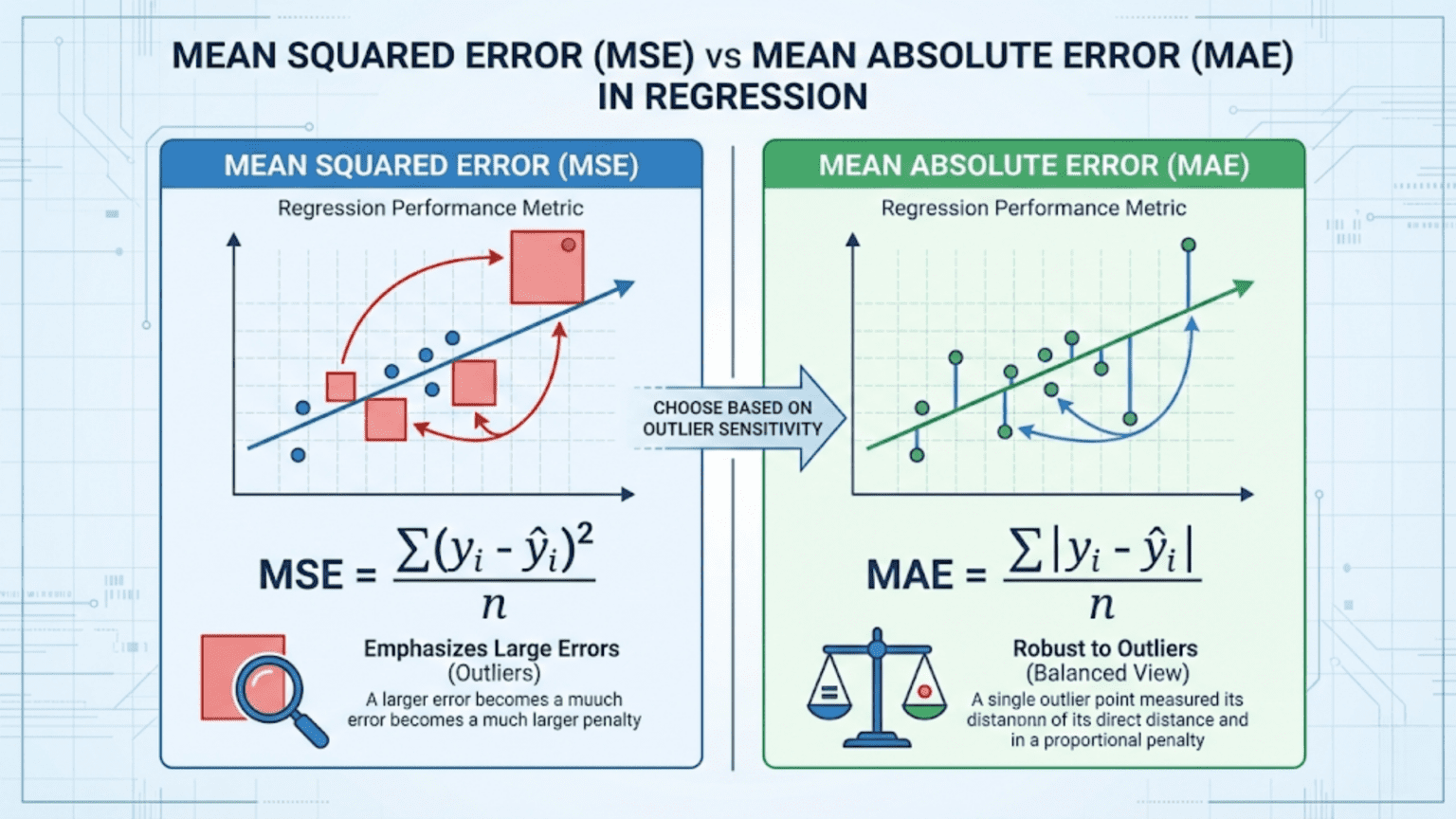
Mean Squared Error (MSE) and Mean Absolute Error (MAE) are the two most fundamental metrics for evaluating regression models. MSE averages the squared differences between predicted and actual values, heavily penalizing large errors, while MAE averages the absolute differences, treating all errors proportionally. Choose MSE when large errors are especially costly; choose MAE when you want a metric that is robust to outliers and easy to interpret in the original units.
Introduction
Every supervised machine learning model makes predictions. For classification models, those predictions are class labels and we evaluate them with metrics like accuracy, precision, and F1. But what about models that predict continuous numbers — house prices, temperature forecasts, sales figures, patient blood glucose levels?
For these regression problems, we need different evaluation metrics. The two workhorses of regression evaluation are Mean Squared Error (MSE) and Mean Absolute Error (MAE). At first glance they seem almost identical — both measure the average “wrongness” of predictions. But the mathematical difference between squaring an error and taking its absolute value has deep practical consequences for model training, evaluation, and selection.
This article covers both metrics from first principles: the mathematics, the geometric intuition, Python implementations, the critical differences in how they handle outliers, when to use each, and the variants you will encounter in real-world projects. We also cover RMSE (Root Mean Squared Error) and MAPE (Mean Absolute Percentage Error) and place all four in context.
Regression: A Quick Refresher
Before defining the metrics, let’s clarify what regression is and what we are measuring.
In a regression problem, you have:
- Features X: the input variables (square footage, number of rooms, neighborhood)
- Target y: the continuous outcome you want to predict (house price)
- Predictions ŷ (y-hat): what your model outputs
The residual (or error) for a single prediction is simply the difference between the actual value and the predicted value:
A positive residual means you under-predicted. A negative residual means you over-predicted. The magnitude tells you how far off you were.
Error metrics aggregate these individual residuals across your entire test set into a single summary number that characterizes how well (or poorly) your model performs overall.
Mean Absolute Error (MAE)
Definition
MAE is the average of the absolute values of all residuals:
Where:
- n is the number of samples
- y_i is the actual value for sample i
- ŷ_i is the predicted value for sample i
The absolute value bars ensure that positive and negative errors don’t cancel each other out. Without them, a model that over-predicts by 100 on half the samples and under-predicts by 100 on the other half would appear to have zero error — clearly wrong.
A Concrete Example
Suppose you built a model to predict apartment rental prices (in dollars per month). Here are five test samples:
| Sample | Actual Price ($) | Predicted Price ($) | Error | Absolute Error |
|---|---|---|---|---|
| 1 | 1,200 | 1,150 | -50 | 50 |
| 2 | 2,500 | 2,600 | +100 | 100 |
| 3 | 800 | 780 | -20 | 20 |
| 4 | 3,200 | 3,100 | -100 | 100 |
| 5 | 1,500 | 1,580 | +80 | 80 |
The model is off by an average of $70 per month. This is immediately interpretable — it’s in the same units as the original target variable (dollars).
Properties of MAE
Interpretability: MAE is in the same units as the target variable. If you are predicting house prices in thousands of dollars, an MAE of 25 means you’re off by $25,000 on average. No mental conversion required.
Linear penalty: Each unit of error contributes equally to the MAE regardless of whether the error is small or large. A $100 error counts exactly twice as much as a $50 error — no more, no less.
Robust to outliers: Because errors are not squared, a single massive prediction error has a limited effect on MAE. One outlier sample with an error of $10,000 affects the MAE by $10,000/n — spread evenly across all samples.
Non-differentiable at zero: The absolute value function has a kink (a corner) at zero, which means it is not differentiable at exactly y_i = ŷ_i. This creates a minor complication for gradient-based optimization, typically handled using the “subgradient” (a generalization of the derivative) or by adding a small smoothing term.
Mean Squared Error (MSE)
Definition
MSE is the average of the squared residuals:
A Concrete Example
Using the same apartment rental data:
| Sample | Actual ($) | Predicted ($) | Error | Squared Error |
|---|---|---|---|---|
| 1 | 1,200 | 1,150 | -50 | 2,500 |
| 2 | 2,500 | 2,600 | +100 | 10,000 |
| 3 | 800 | 780 | -20 | 400 |
| 4 | 3,200 | 3,100 | -100 | 10,000 |
| 5 | 1,500 | 1,580 | +80 | 6,400 |
The MSE is 5,860 squared dollars — a unit that has no intuitive meaning. This is the primary reason RMSE (Root Mean Squared Error) is often reported instead of raw MSE.
Properties of MSE
Differentiable everywhere: Unlike MAE, MSE has a smooth, continuous derivative at every point. This makes it mathematically ideal for gradient-based optimization algorithms like gradient descent, which is one reason MSE was the dominant loss function in classical statistics and early neural networks.
Quadratic penalty: Squaring errors means large errors are penalized disproportionately. An error of 10 contributes 100 to MSE; an error of 100 contributes 10,000 — one hundred times more despite the error being only ten times larger. This property makes MSE very sensitive to outliers.
Unintuitive units: MSE is in squared units of the target variable. If predicting dollars, MSE is in dollars-squared. If predicting temperatures in Celsius, MSE is in Celsius-squared. This makes raw MSE values difficult to interpret directly.
Unique minimum: The convex nature of the squared loss means there is exactly one MSE-minimizing prediction for any set of observations — the mean. This statistical property (MSE is minimized by the mean) is important for understanding what MSE-trained models learn to predict.
Root Mean Squared Error (RMSE)
RMSE is simply the square root of MSE:
From our example: RMSE = √5860 ≈ $76.55
RMSE is far more commonly reported than raw MSE in practice because taking the square root brings the metric back to the same units as the target variable, making it interpretable. An RMSE of $76.55 means “the typical prediction error is roughly $76.55,” which is meaningful in context.
RMSE retains the key property of MSE — outlier sensitivity from squaring — while being directly comparable to MAE.
MAE vs RMSE: The Interpretability Comparison
Both MAE and RMSE are now in the same units. For our example: MAE = $70, RMSE = $76.55.
The fact that RMSE > MAE (which is always true unless all errors are identical) reveals something important: our model has some errors that are larger than the typical error. The gap between RMSE and MAE tells you about the variance of the error distribution — a large gap indicates a few large errors are dragging up the RMSE.
The Critical Difference: Outlier Sensitivity
This is the most important practical distinction between MAE and MSE/RMSE. Let’s demonstrate it dramatically.
Imagine you add a sixth sample to our apartment dataset — a luxury penthouse that rents for $15,000/month, but your model predicts only $5,000 (an error of $10,000):
| Metric | Without Outlier | With Outlier | Change |
|---|---|---|---|
| MAE | $70 | $70 × (5/6) + 10000/6 ≈ $1,725 | +2,364% |
| RMSE | $76.55 | ≈ $4,085 | +5,233% |
The RMSE increases more than twice as much as the MAE because of the squaring effect. One extreme prediction error utterly dominates the RMSE, while MAE’s damage is more contained.
This has direct implications for model training and selection:
- A model trained to minimize MSE will trade many small errors to eliminate a few large ones. It will “work hard” to get outlier predictions right, at the cost of slightly worse predictions everywhere else.
- A model trained to minimize MAE cares equally about all errors. It will not sacrifice accuracy on typical samples just to avoid occasional large misses on outlier data points.
Python Implementation
Computing Metrics from Scratch
import numpy as np
import matplotlib.pyplot as plt
import seaborn as sns

def compute_regression_metrics(y_true, y_pred):
    """
    Compute MAE, MSE, RMSE and their breakdown.

    Args:
        y_true: Array of actual values
        y_pred: Array of predicted values

    Returns:
        Dictionary of all metrics with intermediate values
    """
    y_true = np.array(y_true)
    y_pred = np.array(y_pred)

    # Residuals
    residuals = y_true - y_pred
    abs_residuals = np.abs(residuals)
    sq_residuals  = residuals ** 2

    # Core metrics
    mae  = np.mean(abs_residuals)
    mse  = np.mean(sq_residuals)
    rmse = np.sqrt(mse)

    # Additional context
    max_error = np.max(abs_residuals)
    median_ae = np.median(abs_residuals)

    return {
        "MAE":          mae,
        "MSE":          mse,
        "RMSE":         rmse,
        "Max Error":    max_error,
        "Median AE":    median_ae,
        "RMSE/MAE ratio": rmse / mae  # > 1 indicates outliers; closer to 1 = uniform errors
    }

# ------ Example 1: Apartment Rent Prediction ------
y_actual = np.array([1200, 2500, 800, 3200, 1500])
y_pred   = np.array([1150, 2600, 780, 3100, 1580])

print("=== Apartment Rent Prediction ===\n")
metrics = compute_regression_metrics(y_actual, y_pred)
for k, v in metrics.items():
    unit = " dollars²" if k == "MSE" else " dollars" if "Error" in k or "MAE" in k or "RMSE" in k or "AE" in k else ""
    print(f"  {k:<18}: {v:.4f}{unit}")

# ------ Example 2: Impact of a Single Outlier ------
y_actual_with_outlier = np.append(y_actual, 15000)
y_pred_with_outlier   = np.append(y_pred, 5000)

print("\n=== Same Dataset + One Extreme Outlier ===\n")
metrics_outlier = compute_regression_metrics(y_actual_with_outlier, y_pred_with_outlier)
for k, v in metrics_outlier.items():
    unit = " dollars"
    print(f"  {k:<18}: {v:.4f}")

print(f"\n=== Effect of the Outlier ===")
print(f"  MAE increase:  {metrics_outlier['MAE'] - metrics['MAE']:.2f} ({(metrics_outlier['MAE']/metrics['MAE'] - 1)*100:.1f}%)")
print(f"  RMSE increase: {metrics_outlier['RMSE'] - metrics['RMSE']:.2f} ({(metrics_outlier['RMSE']/metrics['RMSE'] - 1)*100:.1f}%)")
print(f"\n  RMSE/MAE ratio without outlier: {metrics['RMSE/MAE ratio']:.3f}")
print(f"  RMSE/MAE ratio with outlier:    {metrics_outlier['RMSE/MAE ratio']:.3f}")
print(" (Higher ratio = greater outlier influence)")Using Scikit-learn
from sklearn.metrics import mean_absolute_error, mean_squared_error
from sklearn.datasets import fetch_california_housing
from sklearn.linear_model import LinearRegression, HuberRegressor
from sklearn.ensemble import RandomForestRegressor, GradientBoostingRegressor
from sklearn.model_selection import train_test_split
from sklearn.preprocessing import StandardScaler
import numpy as np

# Load a real regression dataset
housing = fetch_california_housing()
X, y = housing.data, housing.target  # Target: median house value (hundreds of thousands $)

X_train, X_test, y_train, y_test = train_test_split(
    X, y, test_size=0.2, random_state=42
)

# Scale features
scaler = StandardScaler()
X_train_scaled = scaler.fit_transform(X_train)
X_test_scaled  = scaler.transform(X_test)

# Train multiple regression models
models = {
    "Linear Regression":    LinearRegression(),
    "Huber Regression":     HuberRegressor(epsilon=1.35, max_iter=500),  # Robust to outliers
    "Random Forest":        RandomForestRegressor(n_estimators=200, random_state=42, n_jobs=-1),
    "Gradient Boosting":    GradientBoostingRegressor(n_estimators=200, random_state=42),
}

print("=== California Housing Price Prediction ===")
print(f"Target units: hundreds of thousands of dollars\n")
print(f"{'Model':<25} | {'MAE':>8} | {'RMSE':>8} | {'RMSE/MAE':>9} | {'MSE':>12}")
print("-" * 75)

results = {}
for name, model in models.items():
    X_tr = X_train_scaled if "Linear" in name or "Huber" in name else X_train
    X_te = X_test_scaled  if "Linear" in name or "Huber" in name else X_test

    model.fit(X_tr, y_train)
    y_pred = model.predict(X_te)

    mae  = mean_absolute_error(y_test, y_pred)
    mse  = mean_squared_error(y_test, y_pred)
    rmse = np.sqrt(mse)
    ratio = rmse / mae

    results[name] = {"mae": mae, "mse": mse, "rmse": rmse, "ratio": ratio}
    print(f"{name:<25} | {mae:>8.4f} | {rmse:>8.4f} | {ratio:>9.4f} | {mse:>12.4f}")

print("\nNote: Values in units of $100,000 (0.5 MAE = $50,000 average error)")Visualizing the Difference Between MAE and MSE
Visualization helps build intuition for how the two metrics behave differently.
import numpy as np
import matplotlib.pyplot as plt
import matplotlib.gridspec as gridspec

def visualize_mae_vs_mse():
    """
    Four-panel visualization showing:
    1. The loss function shapes (absolute vs squared)
    2. Error contribution as a function of error magnitude
    3. How an outlier moves each metric
    4. Error distribution analysis
    """
    fig = plt.figure(figsize=(16, 12))
    gs = gridspec.GridSpec(2, 2, figure=fig, hspace=0.45, wspace=0.35)

    # ---- Panel 1: Loss Function Shapes ----
    ax1 = fig.add_subplot(gs[0, 0])
    errors = np.linspace(-4, 4, 300)
    mae_loss = np.abs(errors)
    mse_loss = errors ** 2

    ax1.plot(errors, mae_loss, 'b-', linewidth=2.5, label='MAE (|error|)')
    ax1.plot(errors, mse_loss, 'r-', linewidth=2.5, label='MSE (error²)')
    ax1.axvline(x=0, color='gray', linestyle='--', alpha=0.5)
    ax1.axhline(y=0, color='gray', linestyle='--', alpha=0.5)
    ax1.set_xlabel("Prediction Error", fontsize=12)
    ax1.set_ylabel("Loss Value", fontsize=12)
    ax1.set_title("Loss Function Shapes", fontsize=13, fontweight='bold')
    ax1.legend(fontsize=11)
    ax1.set_ylim(-0.5, 16)
    ax1.set_xlim(-4, 4)
    ax1.grid(True, alpha=0.3)
    ax1.annotate("MAE grows linearly\n(constant slope)",
                 xy=(2.5, 2.5), fontsize=9, color='blue',
                 ha='center', style='italic')
    ax1.annotate("MSE grows quadratically\n(slope increases)",
                 xy=(2.8, 12), fontsize=9, color='red',
                 ha='center', style='italic')

    # ---- Panel 2: Relative Penalty at Different Error Sizes ----
    ax2 = fig.add_subplot(gs[0, 1])
    error_sizes = np.array([1, 2, 3, 5, 10, 20, 50, 100])
    mae_penalties = error_sizes          # Linear
    mse_penalties = error_sizes ** 2     # Quadratic (normalized to error=1)

    # Show how MSE penalty grows relative to MAE
    relative_penalty = mse_penalties / mae_penalties  # = error_sizes

    ax2.bar(range(len(error_sizes)), relative_penalty, color=['steelblue']*len(error_sizes))
    ax2.set_xticks(range(len(error_sizes)))
    ax2.set_xticklabels([str(e) for e in error_sizes])
    ax2.set_xlabel("Error Magnitude (units)", fontsize=12)
    ax2.set_ylabel("MSE penalty / MAE penalty", fontsize=12)
    ax2.set_title("How MSE Over-Penalizes Large Errors\n(Relative to MAE)",
                  fontsize=13, fontweight='bold')
    ax2.grid(True, alpha=0.3, axis='y')
    ax2.annotate("Error=10 receives\n10× the relative penalty\nas Error=1",
                 xy=(4, 8), fontsize=9, ha='center',
                 arrowprops=dict(arrowstyle='->', color='red'),
                 xytext=(5.5, 40), color='red')

    # ---- Panel 3: Outlier Impact Comparison ----
    ax3 = fig.add_subplot(gs[1, 0])

    # Base predictions: 10 samples with errors between -3 and 3
    np.random.seed(42)
    base_errors = np.random.uniform(-3, 3, 10)

    # Add increasingly large outliers
    outlier_magnitudes = [0, 5, 10, 20, 50, 100]
    mae_values  = []
    rmse_values = []

    for out_mag in outlier_magnitudes:
        errors_with_outlier = np.append(base_errors, out_mag)
        mae_values.append(np.mean(np.abs(errors_with_outlier)))
        rmse_values.append(np.sqrt(np.mean(errors_with_outlier**2)))

    x = range(len(outlier_magnitudes))
    ax3.plot(x, mae_values, 'b-o', linewidth=2.5, markersize=8, label='MAE')
    ax3.plot(x, rmse_values, 'r-s', linewidth=2.5, markersize=8, label='RMSE')
    ax3.set_xticks(x)
    ax3.set_xticklabels([str(m) for m in outlier_magnitudes])
    ax3.set_xlabel("Magnitude of Outlier Added", fontsize=12)
    ax3.set_ylabel("Metric Value", fontsize=12)
    ax3.set_title("Outlier Sensitivity:\nMAE vs RMSE", fontsize=13, fontweight='bold')
    ax3.legend(fontsize=11)
    ax3.grid(True, alpha=0.3)

    # ---- Panel 4: When RMSE/MAE Ratio Reveals Outliers ----
    ax4 = fig.add_subplot(gs[1, 1])

    # Generate datasets with different error distributions
    np.random.seed(42)
    n = 500

    # Normal errors
    errors_normal = np.random.normal(0, 1, n)
    # Heavy-tailed errors (some outliers)
    errors_heavy  = np.random.standard_t(df=2, size=n)
    # Outlier-contaminated
    errors_outlier = np.concatenate([np.random.normal(0, 1, int(n*0.95)),
                                     np.random.normal(0, 10, int(n*0.05))])

    datasets = {
        "Normal Errors": errors_normal,
        "Heavy-Tailed":  errors_heavy,
        "5% Outliers":   errors_outlier
    }

    colors = ['steelblue', 'coral', 'mediumseagreen']
    for (label, errs), color in zip(datasets.items(), colors):
        mae_v  = np.mean(np.abs(errs))
        rmse_v = np.sqrt(np.mean(errs**2))
        ratio  = rmse_v / mae_v

        # Plot error histogram
        ax4.hist(np.clip(errs, -10, 10), bins=50, alpha=0.4, color=color,
                 label=f"{label}\nRMSE/MAE={ratio:.2f}", density=True)

    ax4.set_xlabel("Error Value (clipped at ±10)", fontsize=12)
    ax4.set_ylabel("Density", fontsize=12)
    ax4.set_title("RMSE/MAE Ratio as Outlier Indicator\n(Higher ratio = more outliers)",
                  fontsize=13, fontweight='bold')
    ax4.legend(fontsize=9)
    ax4.grid(True, alpha=0.3)

    plt.suptitle("MAE vs MSE/RMSE: Key Differences Visualized",
                 fontsize=15, fontweight='bold', y=1.01)
    plt.savefig("mae_vs_mse_visualization.png", dpi=150, bbox_inches='tight')
    plt.show()
    print("Saved: mae_vs_mse_visualization.png")

visualize_mae_vs_mse()Mathematical Connection: Mean vs Median
Here is one of the most elegant and important properties of these two metrics, rarely explained in introductory courses:
MSE is minimized by the mean (average) of the data. MAE is minimized by the median of the data.
Why This Matters for Model Training
When you train a model using MSE as the loss function, you are implicitly asking it to predict the conditional mean of the target — the average y value given the input features. When you train with MAE, you are asking it to predict the conditional median.
These are different quantities when the target distribution is skewed or contains outliers. The mean is pulled toward extreme values (outliers), while the median is not.
import numpy as np
import matplotlib.pyplot as plt

def demonstrate_mean_vs_median_property():
    """
    Show that the constant minimizing MSE is the mean,
    while the constant minimizing MAE is the median.
    This mirrors what happens when models are trained with each loss.
    """
    # Skewed data with outlier
    np.random.seed(42)
    y = np.array([1, 2, 2, 3, 3, 3, 4, 4, 5, 50])  # Last value is outlier

    data_mean   = np.mean(y)
    data_median = np.median(y)

    # Try different constant predictions c and compute MAE/MSE
    c_values = np.linspace(0, 55, 1000)
    mse_values = [np.mean((y - c)**2) for c in c_values]
    mae_values = [np.mean(np.abs(y - c)) for c in c_values]

    # Find minima
    mse_min_c = c_values[np.argmin(mse_values)]
    mae_min_c = c_values[np.argmin(mae_values)]

    print("=== Mean vs Median: Which Constant Minimizes Each Loss? ===\n")
    print(f"  Data: {y.tolist()}")
    print(f"  Data mean:   {data_mean:.2f}  ← MSE-minimizing prediction")
    print(f"  Data median: {data_median:.2f}  ← MAE-minimizing prediction")
    print(f"")
    print(f"  MSE is minimized at c = {mse_min_c:.2f}  (≈ mean = {data_mean:.2f})")
    print(f"  MAE is minimized at c = {mae_min_c:.2f}  (≈ median = {data_median:.2f})")

    # Plot both loss curves
    fig, axes = plt.subplots(1, 2, figsize=(14, 5))

    for ax, loss_vals, loss_name, min_c, ref_val, ref_name, color in [
        (axes[0], mse_values, "MSE", mse_min_c, data_mean, "Mean", 'red'),
        (axes[1], mae_values, "MAE", mae_min_c, data_median, "Median", 'blue')
    ]:
        ax.plot(c_values, loss_vals, color=color, linewidth=2.5)
        ax.axvline(x=min_c, color='darkred', linestyle='--', linewidth=2,
                   label=f'Min at c={min_c:.1f}')
        ax.axvline(x=ref_val, color='green', linestyle=':', linewidth=2,
                   label=f'{ref_name}={ref_val:.1f}')
        ax.set_xlabel("Constant Prediction (c)", fontsize=12)
        ax.set_ylabel(f"{loss_name} Value", fontsize=12)
        ax.set_title(f"{loss_name} vs Constant Prediction\n"
                     f"(minimized by the {ref_name})", fontsize=12, fontweight='bold')
        ax.legend(fontsize=10)
        ax.grid(True, alpha=0.3)

    plt.tight_layout()
    plt.savefig("mean_vs_median_property.png", dpi=150)
    plt.show()
    print("\nSaved: mean_vs_median_property.png")

demonstrate_mean_vs_median_property()This deep connection explains outlier behavior perfectly. The mean is pulled up toward the $50 outlier (it’s 7.7 instead of the 3.0 you’d expect without the outlier). The median stays at 3.5, unaffected. MSE-trained models therefore “chase” outliers while MAE-trained models ignore them.
Training with MAE vs MSE as Loss Functions
In scikit-learn, many regressors let you choose your loss function. The choice directly changes the model’s optimization target.
from sklearn.ensemble import GradientBoostingRegressor, HistGradientBoostingRegressor
from sklearn.linear_model import HuberRegressor
from sklearn.datasets import make_regression
from sklearn.metrics import mean_absolute_error, mean_squared_error
from sklearn.model_selection import train_test_split
import numpy as np

# Create a dataset with 10% outliers
np.random.seed(42)
X, y = make_regression(n_samples=1000, n_features=10, noise=20, random_state=42)

# Inject outliers: 10% of targets become extreme values
outlier_mask = np.random.random(len(y)) < 0.10
y[outlier_mask] += np.random.choice([-500, 500], size=outlier_mask.sum())

X_train, X_test, y_train, y_test = train_test_split(X, y, test_size=0.2, random_state=42)

# Compare loss functions
models = {
    "GBM (loss=squared_error / MSE)": GradientBoostingRegressor(
        loss='squared_error', n_estimators=200, random_state=42
    ),
    "GBM (loss=absolute_error / MAE)": GradientBoostingRegressor(
        loss='absolute_error', n_estimators=200, random_state=42
    ),
    "GBM (loss=huber / Hybrid)": GradientBoostingRegressor(
        loss='huber', alpha=0.9, n_estimators=200, random_state=42
    ),
    "Huber Regressor": HuberRegressor(epsilon=1.35, max_iter=300),
}

print("=== Effect of Loss Function Choice on Outlier-Contaminated Data ===\n")
print(f"{'Model':<45} | {'MAE':>8} | {'RMSE':>8}")
print("-" * 67)

for name, model in models.items():
    from sklearn.preprocessing import StandardScaler
    if "Huber Regressor" in name:
        scaler = StandardScaler()
        X_tr_s = scaler.fit_transform(X_train)
        X_te_s = scaler.transform(X_test)
        model.fit(X_tr_s, y_train)
        y_pred = model.predict(X_te_s)
    else:
        model.fit(X_train, y_train)
        y_pred = model.predict(X_test)

    mae  = mean_absolute_error(y_test, y_pred)
    rmse = np.sqrt(mean_squared_error(y_test, y_pred))

    print(f"{name:<45} | {mae:>8.2f} | {rmse:>8.2f}")

print("\nObservation:")
print("  MSE-trained model: lower MAE is possible but RMSE is often higher")
print("  (the model chases outliers at the cost of typical predictions)")
print("  MAE-trained model: better MAE, RMSE reflects outlier difficulty")
print(" Huber: best of both worlds on contaminated data")Huber Loss: The Best of Both Worlds
When you can’t decide between MSE and MAE — because you want to penalize large errors more than MAE does, but not be dominated by outliers like MSE — Huber Loss offers a principled compromise.
Definition
Huber loss switches between squared and absolute loss based on a threshold δ (delta):
For small errors (within δ of zero), Huber loss behaves like MSE — smooth, differentiable, good for gradient descent. For large errors (beyond δ), it behaves like MAE — linear growth, resistant to outlier domination.
The parameter δ controls the boundary between the two regimes. A common default is δ = 1.0. Larger δ means more errors are treated as “small” and handled with squared loss; smaller δ means fewer errors receive the quadratic treatment.
import numpy as np
import matplotlib.pyplot as plt

def huber_loss(error, delta=1.0):
    """Compute Huber loss for a given error and delta."""
    abs_error = np.abs(error)
    return np.where(
        abs_error <= delta,
        0.5 * error**2,
        delta * abs_error - 0.5 * delta**2
    )

errors = np.linspace(-5, 5, 1000)

plt.figure(figsize=(10, 5))
plt.plot(errors, np.abs(errors), 'b--', linewidth=2, label='MAE (|error|)', alpha=0.8)
plt.plot(errors, 0.5 * errors**2, 'r--', linewidth=2, label='MSE (0.5 × error²)', alpha=0.8)

for delta, color in [(0.5, 'purple'), (1.0, 'green'), (2.0, 'orange')]:
    plt.plot(errors, huber_loss(errors, delta), linewidth=2.5,
             label=f'Huber (δ={delta})', color=color)

plt.xlabel("Prediction Error", fontsize=12)
plt.ylabel("Loss Value", fontsize=12)
plt.title("Huber Loss: Bridging MAE and MSE", fontsize=14, fontweight='bold')
plt.legend(fontsize=10, loc='upper center')
plt.ylim(-0.3, 10)
plt.grid(True, alpha=0.3)
plt.tight_layout()
plt.savefig("huber_loss.png", dpi=150)
plt.show()
print("Saved: huber_loss.png")Mean Absolute Percentage Error (MAPE)
A common variant you will encounter in business applications is MAPE, which expresses errors as percentages of the actual values:
When MAPE Is Useful
MAPE is particularly common in forecasting and business analytics because it produces scale-independent results. An MAPE of 8% means you’re off by 8% on average — the same interpretation regardless of whether you’re forecasting sales of $1,000 or $1,000,000.
This makes MAPE especially useful for comparing model performance across different products, time series, or business units that operate at very different scales.
Limitations of MAPE
MAPE has several important limitations that must be understood:
Undefined when y = 0: Division by the actual value fails when any actual value is exactly zero.
Asymmetry: MAPE penalizes over-predictions more than under-predictions by the same percentage. If the actual value is 100, a prediction of 50 yields a 50% error; but a prediction of 150 also yields a 50% error. However, if the scale is unlimited in both directions, the under-prediction can never exceed 100% while the over-prediction can be arbitrarily large — this creates asymmetric gradients.
Biased toward under-forecasting: Because MAPE penalizes over-predictions asymmetrically, models trained to minimize MAPE systematically learn to under-forecast.
Poor behavior on small actual values: A single actual value of 1 with a prediction of 3 contributes 200% error to MAPE, potentially dominating the entire metric.
from sklearn.metrics import mean_absolute_percentage_error
import numpy as np

y_true_mape = np.array([100, 200, 500, 1000, 50])
y_pred_mape = np.array([110, 185, 480, 1050, 60])

# Manual MAPE calculation
mape_manual = np.mean(np.abs((y_true_mape - y_pred_mape) / y_true_mape)) * 100

# Sklearn version (returns decimal, not percentage)
mape_sklearn = mean_absolute_percentage_error(y_true_mape, y_pred_mape) * 100

print(f"Manual MAPE:  {mape_manual:.2f}%")
print(f"Sklearn MAPE: {mape_sklearn:.2f}%")

# Demonstrate MAPE failure when actual value is near zero
y_near_zero = np.array([0.001, 100, 200])
y_pred_zero = np.array([0.01,  105, 195])

try:
    mape_zero = mean_absolute_percentage_error(y_near_zero, y_pred_zero) * 100
    print(f"\nMAPE with tiny actual value: {mape_zero:.1f}%")
    print("  (Dominated by the first sample: 900% error!)")
except:
print("MAPE undefined with zero actuals")Comprehensive Metric Comparison Table
| Metric | Formula | Units | Outlier Sensitivity | Interpretability | Best For |
|---|---|---|---|---|---|
| MAE | mean|y – ŷ| | Same as target | Low (robust) | High — same units as target | Robust evaluation, practical reporting |
| MSE | mean(y – ŷ)² | Target² | High | Low — squared units | Loss function in optimization |
| RMSE | √MSE | Same as target | High | Medium — same units, but inflated by outliers | Standard reporting when outliers matter |
| MAPE | mean|y-ŷ|/|y| × 100% | Percentage | Medium | Very high — scale-free % | Cross-scale comparison, business forecasting |
| Huber | Hybrid MSE/MAE | Depends | Medium | Low | Loss function, outlier-prone datasets |
| MedAE | median|y – ŷ| | Same as target | Very Low | High | Highly outlier-contaminated data |
When to Use Each Metric: A Decision Guide
Choosing between MAE and MSE/RMSE is not a matter of convention — it reflects your actual business problem.
Use MAE When:
Large errors are not catastrophically worse than small ones. If predicting house prices within $100,000 is roughly 10× worse than being off by $10,000, MAE captures this linear relationship correctly.
The target has genuine outliers. Luxury penthouses and distressed properties genuinely exist in real estate data. They are real observations, not data quality issues. You don’t want your model’s performance on $500/month apartments to be dominated by a single $50,000/month penthouse.
You need to explain the metric to non-technical stakeholders. “Our model’s average prediction error is $12,500” is immediately understandable. “Our model’s RMSE is $15,200” requires more explanation of what RMSE means.
You are doing demand forecasting or supply chain planning. Consistent moderate errors often cause fewer operational headaches than occasional catastrophic ones.
Use MSE/RMSE When:
Large errors are disproportionately costly. If a prediction error of $200,000 is not just twice as bad as a $100,000 error but ten or twenty times worse in terms of business impact, the quadratic penalty of MSE better reflects your true loss function.
Errors follow a Gaussian distribution. The mathematical theory of linear regression (Ordinary Least Squares) assumes normally distributed errors, and MSE is the maximum likelihood estimator under this assumption. When the Gaussian assumption holds, MSE is theoretically optimal.
You are comparing models across literature or baselines. RMSE is the more commonly reported metric in academic ML benchmarks, making it easier to compare against published results.
You want to penalize large misses in engineering or safety applications. Structural engineering, aviation, autonomous vehicles — any application where a single large error has catastrophic consequences should use squared-error metrics or even higher-order polynomial penalties.
Use MAPE When:
Scale independence is important. You are forecasting multiple products or time series at very different scales and need a fair comparison.
Your audience thinks in percentages. Business and finance stakeholders often find “8% average error” more intuitive than “RMSE = 12,500 units.”
Avoid MAPE when actual values can be zero or very small, or when systematic under-forecasting is a concern.
Complete Real-World Example: Predicting Energy Consumption
Let’s put it all together with a realistic scenario where the choice of metric genuinely matters.
import numpy as np
import pandas as pd
import matplotlib.pyplot as plt
from sklearn.datasets import make_regression
from sklearn.linear_model import LinearRegression, HuberRegressor
from sklearn.ensemble import RandomForestRegressor, GradientBoostingRegressor
from sklearn.model_selection import train_test_split, cross_val_score
from sklearn.metrics import mean_absolute_error, mean_squared_error, make_scorer
from sklearn.preprocessing import StandardScaler
import warnings
warnings.filterwarnings('ignore')

# --------------------------------------------------------
# Simulate energy consumption prediction problem
# Features: time of day, temperature, occupancy, season
# Target: energy consumption in kWh
# Real-world challenge: occasional demand spikes (outliers)
# --------------------------------------------------------
np.random.seed(42)
n_samples = 2000

# Generate synthetic features
temperature = np.random.normal(20, 8, n_samples)      # °C
occupancy   = np.random.randint(0, 100, n_samples)    # people
hour        = np.random.randint(0, 24, n_samples)     # hour of day
is_weekday  = np.random.binomial(1, 0.71, n_samples)  # 71% weekdays

# Generate realistic energy consumption
base_consumption = (
    50                                         # Base load
    + 0.8 * temperature                        # HVAC
    + 0.3 * occupancy                          # Lighting/equipment
    + 15 * is_weekday                          # Business hours
    + 10 * np.sin(2 * np.pi * hour / 24)       # Daily cycle
    + np.random.normal(0, 10, n_samples)       # Random noise
)

# Inject 5% demand spikes (special events, equipment failures)
spike_mask = np.random.random(n_samples) < 0.05
base_consumption[spike_mask] += np.random.uniform(200, 500, spike_mask.sum())

y = np.clip(base_consumption, 0, None)

X = np.column_stack([temperature, occupancy, hour, is_weekday])
feature_names = ['Temperature', 'Occupancy', 'Hour', 'IsWeekday']

print("=== Energy Consumption Dataset ===")
print(f"  Samples:          {n_samples}")
print(f"  Target mean:      {y.mean():.1f} kWh")
print(f"  Target std:       {y.std():.1f} kWh")
print(f"  Demand spikes:    {spike_mask.sum()} samples ({spike_mask.mean()*100:.1f}%)")
print(f"  Max consumption:  {y.max():.1f} kWh (spike event)")

# Split data
X_train, X_test, y_train, y_test = train_test_split(
    X, y, test_size=0.2, random_state=42
)

# Scale for linear models
scaler = StandardScaler()
X_train_s = scaler.fit_transform(X_train)
X_test_s  = scaler.transform(X_test)

# --------------------------------------------------------
# Train models with different loss functions
# --------------------------------------------------------
models = {
    "Linear Regression (OLS/MSE)": (LinearRegression(), True),
    "Huber Regression (robust)":   (HuberRegressor(epsilon=1.35, max_iter=500), True),
    "Random Forest (MSE)":         (RandomForestRegressor(200, random_state=42, n_jobs=-1), False),
    "GBM (MAE loss)": (GradientBoostingRegressor(
        loss='absolute_error', n_estimators=200, random_state=42), False),
    "GBM (MSE loss)": (GradientBoostingRegressor(
        loss='squared_error', n_estimators=200, random_state=42), False),
}

print(f"\n{'Model':<38} | {'MAE':>7} | {'RMSE':>7} | {'MAPE%':>7} | {'R/M ratio':>10}")
print("-" * 80)

model_results = {}
for name, (model, needs_scaling) in models.items():
    X_tr = X_train_s if needs_scaling else X_train
    X_te = X_test_s  if needs_scaling else X_test

    model.fit(X_tr, y_train)
    y_pred = model.predict(X_te)

    mae  = mean_absolute_error(y_test, y_pred)
    mse  = mean_squared_error(y_test, y_pred)
    rmse = np.sqrt(mse)
    mape = np.mean(np.abs((y_test - y_pred) / np.clip(y_test, 1, None))) * 100
    ratio = rmse / mae

    model_results[name] = {"mae": mae, "rmse": rmse, "mape": mape, "ratio": ratio}
    print(f"{name:<38} | {mae:>7.2f} | {rmse:>7.2f} | {mape:>6.1f}% | {ratio:>10.3f}")

print(f"\nMetrics in kWh (MAE, RMSE) or % (MAPE)")
print(f"RMSE/MAE ratio: closer to 1.0 = more uniform errors; higher = outlier influence")

# --------------------------------------------------------
# Context-specific recommendation
# --------------------------------------------------------
print("\n=== Which Model to Choose? ===\n")
print("Scenario A: Grid operator — large demand spikes cause blackouts")
print("  → Minimize RMSE (GBM MSE or Random Forest)")
print("  → Large errors are catastrophic; quadratic penalty is appropriate")

print("\nScenario B: Efficiency consultant — reporting to building management")
print("  → Minimize MAE (GBM MAE or Huber)")
print("  → Consistent, interpretable average error; outlier spikes are not our problem")

print("\nScenario C: Forecasting multiple buildings for comparison")
print("  → Minimize MAPE")
print("  → Scale-independent % allows fair comparison across different-sized buildings")

# --------------------------------------------------------
# Visual comparison of prediction errors
# --------------------------------------------------------
best_mae_model_name  = min(model_results, key=lambda k: model_results[k]["mae"])
best_rmse_model_name = min(model_results, key=lambda k: model_results[k]["rmse"])

# Get predictions from the two best models
best_mae_model  = models[best_mae_model_name][0]
best_rmse_model = models[best_rmse_model_name][0]

mae_needs_s  = models[best_mae_model_name][1]
rmse_needs_s = models[best_rmse_model_name][1]

y_pred_mae  = best_mae_model.predict(X_test_s if mae_needs_s else X_test)
y_pred_rmse = best_rmse_model.predict(X_test_s if rmse_needs_s else X_test)

fig, axes = plt.subplots(1, 2, figsize=(14, 5))

for ax, y_pred, title, color in [
    (axes[0], y_pred_mae,  f"Best MAE Model\n({best_mae_model_name})", 'steelblue'),
    (axes[1], y_pred_rmse, f"Best RMSE Model\n({best_rmse_model_name})", 'coral')
]:
    errors = y_test - y_pred
    ax.scatter(y_test, y_pred, alpha=0.3, s=15, color=color)
    max_val = max(y_test.max(), y_pred.max())
    ax.plot([0, max_val], [0, max_val], 'k--', lw=1.5, label='Perfect prediction')

    mae_v  = mean_absolute_error(y_test, y_pred)
    rmse_v = np.sqrt(mean_squared_error(y_test, y_pred))

    ax.set_xlabel("Actual Consumption (kWh)", fontsize=12)
    ax.set_ylabel("Predicted Consumption (kWh)", fontsize=12)
    ax.set_title(title, fontsize=12, fontweight='bold')
    ax.text(0.05, 0.92, f"MAE={mae_v:.1f}  RMSE={rmse_v:.1f}",
            transform=ax.transAxes, fontsize=10,
            bbox=dict(boxstyle='round', facecolor='wheat', alpha=0.8))
    ax.grid(True, alpha=0.3)

plt.suptitle("Actual vs Predicted Energy Consumption", fontsize=14, fontweight='bold')
plt.tight_layout()
plt.savefig("energy_prediction_comparison.png", dpi=150, bbox_inches='tight')
plt.show()
print("\nSaved: energy_prediction_comparison.png")Common Mistakes to Avoid
Mistake 1: Reporting MSE instead of RMSE Raw MSE is in squared units and nearly impossible to interpret directly. Always take the square root and report RMSE when communicating results to any audience.
Mistake 2: Picking a metric after seeing results If you train a model and then choose the metric that makes it look best, you are “metric shopping” — a form of overfitting your presentation to your results. Define your primary metric before training, based on business requirements.
Mistake 3: Using MAPE when actual values are near zero A single actual value of 0.1 with a prediction of 0.5 contributes 400% error to MAPE. Always check the distribution of actual values before using MAPE, and consider alternatives like SMAPE (Symmetric MAPE) or MASE (Mean Absolute Scaled Error) when zeros are possible.
Mistake 4: Forgetting that training loss and evaluation metric can differ You train a neural network with MSE loss. You want to report MAE. These are different — and that’s fine. Train with one loss function and evaluate with whatever metric your business cares about. Just be consistent about separating the two.
Mistake 5: Comparing MAE and RMSE directly as if they are equivalent They are both in the same units, but a model with lower MAE might have higher RMSE and vice versa. They measure different things. Lower RMSE means fewer large errors; lower MAE means better average performance. Both can be “best” depending on the context.
Mistake 6: Ignoring the RMSE/MAE ratio The ratio of RMSE to MAE is a simple diagnostic. For perfectly uniform errors (all the same size), RMSE = MAE and the ratio is 1.0. As the ratio grows, the distribution of errors becomes increasingly heavy-tailed. A ratio above 1.5 should prompt investigation into which samples are generating the largest errors.
Summary
MSE and MAE are both valid, widely-used regression metrics — but they are not interchangeable. The core distinction comes down to one question: how should your metric treat large errors relative to small ones?
MAE says all errors are equal in proportion: a $100 error is ten times as bad as a $10 error. This makes MAE robust to outliers and highly interpretable. It is the right choice when large errors are not disproportionately dangerous and when you need a metric that stakeholders can immediately understand.
MSE (and its square root, RMSE) says large errors are disproportionately bad: a $100 error is a hundred times as bad as a $10 error. This sensitivity to outliers is a feature when large prediction failures are genuinely catastrophic, and is the standard choice when errors are expected to be Gaussian. RMSE is the most widely reported metric in regression literature, making it the practical default for benchmark comparisons.
The RMSE/MAE ratio gives you a free diagnostic: when it climbs well above 1.0, your model has a tail of large errors that deserve investigation. When it is close to 1.0, your errors are well-distributed across the test set.
For business applications needing scale-independence, MAPE offers percentage-based evaluation at the cost of asymmetric penalties and undefined behavior near zero. When outliers are both real and problematic, Huber loss offers a principled hybrid approach.
Understanding all four metrics — and the situations where each excels — gives you the full toolkit for honest, informative regression model evaluation.