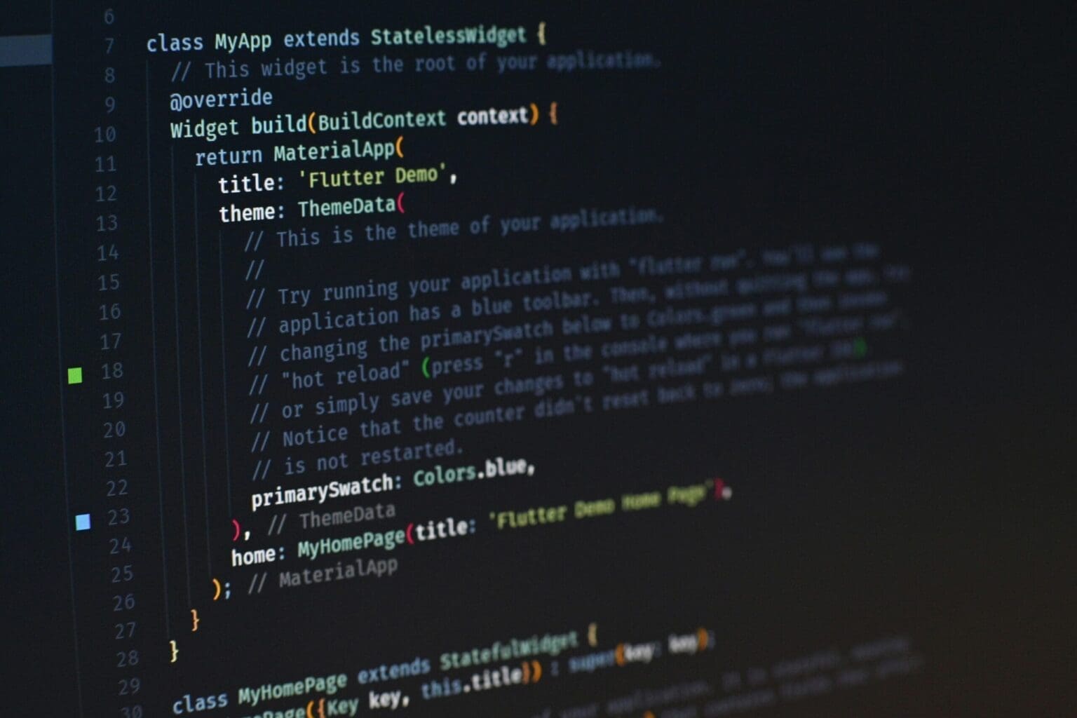
One of the core principles of Flutter is that everything is a widget. Widgets are the building blocks of a Flutter application, responsible for creating user interfaces, managing layout, handling user interaction, and defining navigation structures. Understanding Flutter’s widget architecture is crucial for developers who want to create efficient, scalable, and interactive apps for mobile, web, or desktop platforms.
In Flutter, widgets are classified into two main categories: Stateless Widgets and Stateful Widgets. The distinction between these two types of widgets lies in their relationship with state, which refers to data that can change during the lifecycle of the widget. Widgets in Flutter form a hierarchy or tree, known as the widget tree, and they work together to create the visual structure of an app. By mastering how Stateless and Stateful widgets function, you’ll be able to create highly interactive and dynamic user interfaces.
In this article, we will explore the concept of widgets in Flutter, the differences between Stateless and Stateful widgets, and provide practical examples to help you get started with building and managing widgets effectively.
What Are Widgets?
A widget in Flutter is essentially a blueprint for a part of the user interface. It can be anything from a button, text, image, or container to more complex UI elements like forms, layouts, and animations. Flutter widgets are designed to be composable, which means you can combine simple widgets to create complex user interfaces.
Widgets are responsible for:
- Rendering: Displaying elements on the screen.
- Handling Layout: Arranging elements in relation to other widgets.
- Managing State: Tracking changes in data and updating the UI accordingly.
- Event Handling: Reacting to user interactions like taps, gestures, and inputs.
Every Flutter app is built using a hierarchy of widgets. At the root of every Flutter app is typically the MaterialApp or CupertinoApp widget, which provides the overall app structure and design. From there, various widgets are added to create screens, layouts, and content.
Stateless Widgets: A Static User Interface
A StatelessWidget is the simplest type of widget in Flutter. As the name implies, stateless widgets do not have any mutable state. Once created, their appearance and behavior do not change unless they are rebuilt. This makes StatelessWidget ideal for static content or UI elements that do not depend on dynamic data, such as text labels, icons, and static images.
Characteristics of Stateless Widgets:
- Immutable: Stateless widgets do not store any state information that changes over time. Their properties are fixed once they are created.
- Rebuild on Input Change: If the parent widget or app state changes, a stateless widget can be rebuilt with new data passed from the parent. However, the widget itself cannot manage any changes.
- Efficient for Static UI: Stateless widgets are lightweight and efficient for building static parts of the user interface.
Example of a Stateless Widget
Let’s create a simple Flutter app that displays a text message using a StatelessWidget. This example will demonstrate how to define a stateless widget and render static content on the screen:
import 'package:flutter/material.dart';

void main() {
  runApp(MyApp());
}

class MyApp extends StatelessWidget {
  @override
  Widget build(BuildContext context) {
    return MaterialApp(
      home: Scaffold(
        appBar: AppBar(
          title: Text('Stateless Widget Example'),
        ),
        body: Center(
          child: Text(
            'Hello, Flutter!',
            style: TextStyle(fontSize: 24),
          ),
        ),
      ),
    );
  }
}In this example:
- MyApp is a StatelessWidget, meaning it does not hold any state that can change after the widget is built.
- Text is used to display a static message on the screen, “Hello, Flutter!”.
- Center positions the text widget in the center of the screen, and TextStyle is used to customize the font size.
When to Use Stateless Widgets
Stateless widgets are ideal for use cases where the UI does not change based on user interaction or other dynamic inputs. Some common examples include:
- Displaying static content like headers, labels, and icons.
- Presenting static layouts such as grids, cards, or lists that do not require frequent updates.
- Creating reusable UI components that take input data but do not manage changes internally.
For instance, if you are creating a form label, a button with static text, or an image gallery that doesn’t need to update its content, a StatelessWidget is the right choice.
Stateful Widgets: Managing Dynamic State
While stateless widgets are useful for displaying static content, most real-world applications require dynamic content that can change based on user input, network data, or other events. This is where StatefulWidget comes into play.
A StatefulWidget is a widget that can change its appearance in response to events triggered during the lifecycle of the widget. Unlike stateless widgets, which are immutable, a stateful widget maintains a mutable state that can change over time. This allows for dynamic UI updates, such as form inputs, button presses, or real-time data changes.
Characteristics of Stateful Widgets:
- Mutable State: Stateful widgets manage and store state, which can change throughout the widget’s lifecycle.
- setState(): The setState() method is used to update the widget’s state, causing it to rebuild and reflect changes in the UI.
- Lifecycle Management: Stateful widgets have a lifecycle with methods like initState(), build(), and dispose(), allowing developers to manage state creation, updates, and cleanup efficiently.
Example of a Stateful Widget
Let’s modify the previous example to create a button that changes the displayed message when pressed. We’ll use a StatefulWidget to manage the changing message:
import 'package:flutter/material.dart';

void main() {
  runApp(MyApp());
}

class MyApp extends StatefulWidget {
  @override
  _MyAppState createState() => _MyAppState();
}

class _MyAppState extends State<MyApp> {
  String message = 'Hello, Flutter!';

  void updateMessage() {
    setState(() {
      message = 'You pressed the button!';
    });
  }

  @override
  Widget build(BuildContext context) {
    return MaterialApp(
      home: Scaffold(
        appBar: AppBar(
          title: Text('Stateful Widget Example'),
        ),
        body: Center(
          child: Column(
            mainAxisAlignment: MainAxisAlignment.center,
            children: <Widget>[
              Text(
                message,
                style: TextStyle(fontSize: 24),
              ),
              SizedBox(height: 20),
              ElevatedButton(
                onPressed: updateMessage,
                child: Text('Press Me'),
              ),
            ],
          ),
        ),
      ),
    );
  }
}In this example:
- MyApp is now a StatefulWidget because it manages a mutable state (the message that changes when the button is pressed).
- _MyAppState is the state class where the state and logic reside.
- setState() is called when the button is pressed, which updates the
messagevariable and triggers a UI rebuild to reflect the change.
When to Use Stateful Widgets
Stateful widgets are essential for scenarios where the UI needs to update dynamically based on:
- User Input: Handling forms, buttons, or gestures where user actions result in UI changes.
- Real-Time Updates: Displaying content that changes over time, such as live data from an API, timers, or animations.
- Interactive Components: Implementing components like sliders, switches, or toggles that alter the state of the widget.
For example, if you are building a form where the input fields change based on user input, or a dynamic app that fetches data from the internet and displays it in real time, StatefulWidget is the ideal choice.
The Lifecycle of Stateful Widgets
Understanding the lifecycle of Stateful Widgets is essential for building more complex and dynamic Flutter applications. Stateful widgets not only handle dynamic content but also have a defined lifecycle that gives developers control over how and when a widget’s state is created, updated, and destroyed. This lifecycle allows you to manage resources efficiently, respond to changes in the app state, and optimize performance.
The lifecycle of a StatefulWidget consists of several key methods that are triggered at different stages in the widget’s existence. Let’s break down these methods and understand when and how to use them effectively.
Key Lifecycle Methods of a Stateful Widget
1. initState():
- This method is called once when the widget is first created. It is the ideal place to initialize any data that the widget needs to function, such as setting up event listeners or fetching data from an API.
- Usage: Use
initState()for any initialization logic that should only occur once in the widget’s lifecycle. - Example:
@override
void initState() {
  super.initState();
  // Initialization code here
  print('Widget initialized');
}2. build():
- The
build()method is the core of any widget. It defines how the widget looks and behaves by returning a tree of other widgets that define the user interface. Every time the widget’s state changes (viasetState()), thebuild()method is called to refresh the UI. - Usage: Use
build()to describe how the widget should be displayed on the screen. - Example:
@override
Widget build(BuildContext context) {
  return Text('This is the build method');
}3. didUpdateWidget():
- This method is called when the parent widget re-builds and passes updated properties to the stateful widget. It allows the widget to react to changes in its configuration.
- Usage: Use
didUpdateWidget()when you need to update the state of the widget based on changes in external data or properties. - Example:
@override
void didUpdateWidget(covariant MyApp oldWidget) {
  super.didUpdateWidget(oldWidget);
  print('Widget updated');
}4. setState():
- This method is used to notify Flutter that the internal state of the widget has changed and needs to be re-built. When you call
setState(), Flutter schedules a rebuild of the widget by calling thebuild()method. - Usage: Use
setState()to update the state variables of the widget and trigger a UI update. - Example:
void changeState() {
  setState(() {
    // Change state here
  });
}5. dispose():
- This method is called when the widget is removed from the widget tree permanently. It is the place to release any resources, such as closing streams, canceling timers, or disposing of animation controllers.
- Usage: Use
dispose()to clean up resources and avoid memory leaks. - Example:
@override
void dispose() {
  // Cleanup code here
  print('Widget disposed');
  super.dispose();
}Full Lifecycle Example
To see how these lifecycle methods work in practice, let’s create a simple StatefulWidget that tracks when the widget is created, updated, and disposed of:
import 'package:flutter/material.dart';

void main() {
  runApp(MyApp());
}

class MyApp extends StatefulWidget {
  @override
  _MyAppState createState() => _MyAppState();
}

class _MyAppState extends State<MyApp> {
  String message = 'Initial State';

  @override
  void initState() {
    super.initState();
    print('initState called');
  }

  @override
  void didUpdateWidget(MyApp oldWidget) {
    super.didUpdateWidget(oldWidget);
    print('didUpdateWidget called');
  }

  @override
  void dispose() {
    print('dispose called');
    super.dispose();
  }

  void updateMessage() {
    setState(() {
      message = 'State Updated';
    });
  }

  @override
  Widget build(BuildContext context) {
    print('build called');
    return MaterialApp(
      home: Scaffold(
        appBar: AppBar(
          title: Text('Stateful Widget Lifecycle'),
        ),
        body: Center(
          child: Column(
            mainAxisAlignment: MainAxisAlignment.center,
            children: <Widget>[
              Text(
                message,
                style: TextStyle(fontSize: 24),
              ),
              SizedBox(height: 20),
              ElevatedButton(
                onPressed: updateMessage,
                child: Text('Update State'),
              ),
            ],
          ),
        ),
      ),
    );
  }
}In this example:
initState()is called once when the widget is created.build()is called whenever the widget needs to be re-rendered (e.g., after callingsetState()).dispose()is called when the widget is permanently removed from the widget tree.
As you interact with this widget, you can track how the lifecycle methods are invoked, providing valuable insight into how state is managed over time.
Widget Composition and Common Widget Combinations
In Flutter, building complex user interfaces involves combining simple widgets into more intricate layouts. Flutter encourages a compositional approach to UI design, meaning that you can create reusable widgets that encapsulate logic and styling. By composing widgets, you can build a clean, scalable, and maintainable UI.
Commonly Used Widgets in Combination
1. Container and Padding: The Container widget is one of the most commonly used widgets in Flutter for creating visual boundaries, adding padding, margins, and backgrounds. Pairing it with Padding allows you to control spacing and layout.Example:
Container(
  padding: EdgeInsets.all(16.0),
  margin: EdgeInsets.symmetric(vertical: 10),
  decoration: BoxDecoration(
    color: Colors.blueAccent,
    borderRadius: BorderRadius.circular(10),
  ),
  child: Text('Hello, World!', style: TextStyle(color: Colors.white)),
);2. Row and Column: The Row and Column widgets are essential for laying out multiple widgets horizontally or vertically, respectively. They are flexible and allow you to arrange child widgets in a variety of ways using properties like mainAxisAlignment and crossAxisAlignment.
Example:
Column(
  mainAxisAlignment: MainAxisAlignment.center,
  children: <Widget>[
    Text('Item 1'),
    Text('Item 2'),
    Text('Item 3'),
  ],
);3. ListView and ListTile: The ListView widget is perfect for creating scrollable lists of items. Inside a ListView, you can use ListTile to create structured, interactive list items with titles, subtitles, icons, and more.
Example:
ListView(
  children: <Widget>[
    ListTile(
      leading: Icon(Icons.map),
      title: Text('Map'),
    ),
    ListTile(
      leading: Icon(Icons.photo_album),
      title: Text('Album'),
    ),
    ListTile(
      leading: Icon(Icons.phone),
      title: Text('Phone'),
    ),
  ],
);4. Stack and Positioned: The Stack widget allows you to overlay widgets on top of one another. Using Positioned within a Stack, you can precisely position child widgets.
Example:
Stack(
  children: <Widget>[
    Container(
      width: 200,
      height: 200,
      color: Colors.blue,
    ),
    Positioned(
      top: 50,
      left: 50,
      child: Container(
        width: 100,
        height: 100,
        color: Colors.red,
      ),
    ),
  ],
);Optimizing Widget Performance
While Flutter is optimized for high-performance rendering, there are strategies to ensure your app remains smooth, even with complex UIs and large widget trees.
Key Optimization Techniques
1. Avoid Unnecessary setState() Calls: Minimize the scope of setState() to update only the part of the widget tree that needs rebuilding. Calling setState() in large widgets can cause unnecessary rebuilds of child widgets.
Example:
setState(() {
  // Only update variables that affect the UI
  _counter++;
});2. Use const Widgets: Whenever possible, mark widgets as const. Constant widgets are not rebuilt unnecessarily, leading to better performance.
Example:
const Text('Hello, World!');3. Use ListView.builder() for Large Lists: Instead of creating all the list items at once, ListView.builder() creates list items on demand as they scroll into view, improving memory efficiency.
Example:
ListView.builder(
  itemCount: 1000,
  itemBuilder: (context, index) {
    return ListTile(
      title: Text('Item $index'),
    );
  },
);4. Use RepaintBoundary: For complex UIs, Flutter offers the RepaintBoundary widget, which reduces the impact of rendering changes by isolating widgets that need frequent redrawing from the rest of the tree.
Example:
RepaintBoundary(
  child: Container(
    color: Colors.blue,
    child: Text('This is a RepaintBoundary'),
  ),
);Advanced Widget Manipulation: Animations and Custom Widgets in Flutter
As you progress in your Flutter development journey, the need to create more interactive and engaging user interfaces becomes essential. Flutter’s flexibility and rich widget system offer a variety of advanced tools that enable developers to build custom widgets and add animations, enhancing the user experience. In this section, we’ll dive into advanced widget manipulation by exploring animations, creating custom widgets, and applying advanced layout techniques.
By mastering these concepts, you will be able to craft fluid, high-performance, and visually engaging applications that stand out in terms of user experience.
Adding Animations to Widgets
Animations are a key part of creating fluid and interactive user experiences in modern applications. Flutter makes it easy to implement animations with its powerful animation library. Whether it’s simple fading effects or complex custom animations, Flutter provides tools like AnimatedBuilder, Tween, and AnimationController to control animation flow and dynamics.
Simple Animation Example: AnimatedContainer
Flutter provides a set of built-in animated widgets, such as AnimatedContainer, AnimatedOpacity, and AnimatedAlign. These widgets automatically handle transitions when properties change.
Let’s start by adding a simple animation to a widget using AnimatedContainer. This widget allows you to animate changes in properties like size, color, and padding smoothly over a defined duration.
Here’s an example where tapping a button changes the size and color of a container:
import 'package:flutter/material.dart';

void main() {
  runApp(MyApp());
}

class MyApp extends StatefulWidget {
  @override
  _MyAppState createState() => _MyAppState();
}

class _MyAppState extends State<MyApp> {
  double _width = 100;
  double _height = 100;
  Color _color = Colors.blue;

  void _changeProperties() {
    setState(() {
      _width = _width == 100 ? 200 : 100;
      _height = _height == 100 ? 200 : 100;
      _color = _color == Colors.blue ? Colors.red : Colors.blue;
    });
  }

  @override
  Widget build(BuildContext context) {
    return MaterialApp(
      home: Scaffold(
        appBar: AppBar(title: Text('AnimatedContainer Example')),
        body: Center(
          child: Column(
            mainAxisAlignment: MainAxisAlignment.center,
            children: <Widget>[
              AnimatedContainer(
                width: _width,
                height: _height,
                color: _color,
                duration: Duration(seconds: 1),
                curve: Curves.easeInOut,
              ),
              SizedBox(height: 20),
              ElevatedButton(
                onPressed: _changeProperties,
                child: Text('Animate'),
              ),
            ],
          ),
        ),
      ),
    );
  }
}In this example:
- AnimatedContainer animates changes in width, height, and color over a 1-second duration.
- Curves.easeInOut is used to smooth the animation transitions.
Advanced Animations: Using AnimationController and Tween
For more control over animations, Flutter provides the AnimationController and Tween classes. The AnimationController drives the animation, while a Tween defines the range of values for the animation.
Let’s create a simple example where a container scales and fades in/out using a combination of AnimationController and Tween:
import 'package:flutter/material.dart';

void main() {
  runApp(MyApp());
}

class MyApp extends StatefulWidget {
  @override
  _MyAppState createState() => _MyAppState();
}

class _MyAppState extends State<MyApp> with SingleTickerProviderStateMixin {
  late AnimationController _controller;
  late Animation<double> _scaleAnimation;
  late Animation<double> _fadeAnimation;

  @override
  void initState() {
    super.initState();

    // Initialize the animation controller
    _controller = AnimationController(
      duration: const Duration(seconds: 2),
      vsync: this,
    );

    // Define the scaling animation (size from 0.5x to 1.5x)
    _scaleAnimation = Tween<double>(begin: 0.5, end: 1.5).animate(
      CurvedAnimation(parent: _controller, curve: Curves.easeInOut),
    );

    // Define the fade animation (opacity from 0 to 1)
    _fadeAnimation = Tween<double>(begin: 0, end: 1).animate(
      CurvedAnimation(parent: _controller, curve: Curves.easeInOut),
    );
  }

  @override
  void dispose() {
    _controller.dispose();
    super.dispose();
  }

  void _startAnimation() {
    _controller.forward();
  }

  @override
  Widget build(BuildContext context) {
    return MaterialApp(
      home: Scaffold(
        appBar: AppBar(title: Text('Custom Animation Example')),
        body: Center(
          child: Column(
            mainAxisAlignment: MainAxisAlignment.center,
            children: <Widget>[
              ScaleTransition(
                scale: _scaleAnimation,
                child: FadeTransition(
                  opacity: _fadeAnimation,
                  child: Container(
                    width: 100,
                    height: 100,
                    color: Colors.blue,
                  ),
                ),
              ),
              SizedBox(height: 20),
              ElevatedButton(
                onPressed: _startAnimation,
                child: Text('Start Animation'),
              ),
            ],
          ),
        ),
      ),
    );
  }
}In this example:
- AnimationController controls the duration and progress of the animation.
- Tween defines the range of values for the scale and opacity.
- ScaleTransition and FadeTransition are used to apply the scale and opacity animations to the widget.
Creating Custom Widgets
Flutter’s core strength is its ability to create custom widgets that encapsulate specific functionality or UI designs, allowing for reusability and separation of concerns. When building larger applications, breaking down complex UIs into smaller, reusable custom widgets makes your code more manageable and scalable.
Custom Widget Example
Let’s create a custom widget that represents a reusable button with a label and icon. This widget can be used across different parts of the app:
import 'package:flutter/material.dart';

void main() {
  runApp(MyApp());
}

class MyApp extends StatelessWidget {
  @override
  Widget build(BuildContext context) {
    return MaterialApp(
      home: Scaffold(
        appBar: AppBar(title: Text('Custom Widget Example')),
        body: Center(
          child: CustomIconButton(
            icon: Icons.favorite,
            label: 'Like',
            onPressed: () {
              print('Button Pressed');
            },
          ),
        ),
      ),
    );
  }
}

class CustomIconButton extends StatelessWidget {
  final IconData icon;
  final String label;
  final VoidCallback onPressed;

  const CustomIconButton({
    required this.icon,
    required this.label,
    required this.onPressed,
  });

  @override
  Widget build(BuildContext context) {
    return ElevatedButton.icon(
      onPressed: onPressed,
      icon: Icon(icon),
      label: Text(label),
      style: ElevatedButton.styleFrom(primary: Colors.teal),
    );
  }
}In this example:
- CustomIconButton is a custom widget that takes in an icon, label, and
onPressedcallback function. It’s a reusable button component that can be used throughout the app with different icons and labels. - This design pattern helps in maintaining cleaner code and improving modularity in larger projects.
Advanced Layout Techniques
In complex applications, managing layout efficiently becomes critical for responsive design and ensuring a consistent user experience across different devices. Flutter provides several advanced layout techniques to help developers create responsive and adaptive UIs.
Flex and Expanded
The Flex layout (along with Row and Column) allows child widgets to occupy available space flexibly. By using the Expanded or Flexible widgets inside a Row or Column, you can control how much space each widget should take in relation to others.
Example using Expanded to distribute space between widgets:
import 'package:flutter/material.dart';

void main() {
  runApp(MyApp());
}

class MyApp extends StatelessWidget {
  @override
  Widget build(BuildContext context) {
    return MaterialApp(
      home: Scaffold(
        appBar: AppBar(title: Text('Expanded Example')),
        body: Column(
          children: <Widget>[
            Expanded(
              child: Container(
                color: Colors.red,
                child: Center(child: Text('Item 1')),
              ),
            ),
            Expanded(
              child: Container(
                color: Colors.blue,
                child: Center(child: Text('Item 2')),
              ),
            ),
            Expanded(
              child: Container(
                color: Colors.green,
                child: Center(child: Text('Item 3')),
              ),
            ),
          ],
        ),
      ),
    );
  }
}In this example:
- Expanded is used to make each container take an equal portion of the available vertical space.
- This technique is particularly useful for creating layouts that adapt to different screen sizes and orientations.
Using MediaQuery for Responsive Design
To build truly responsive apps, it’s important to account for different screen sizes and orientations. Flutter’s MediaQuery widget provides information about the size and orientation of the current device, allowing you to adjust the layout accordingly.
Example using MediaQuery for responsive layout:
import 'package:flutter/material.dart';

void main() {
  runApp(MyApp());
}

class MyApp extends StatelessWidget {
  @override
  Widget build(BuildContext context) {
    return MaterialApp(
      home: Scaffold(
        appBar: AppBar(title: Text('Responsive Layout Example')),
        body: LayoutBuilder(
          builder: (context, constraints) {
            if (constraints.maxWidth > 600) {
              return Row(
                children: <Widget>[
                  Expanded(child: Container(color: Colors.red)),
                  Expanded(child: Container(color: Colors.blue)),
                ],
              );
            } else {
              return Column(
                children: <Widget>[
                  Expanded(child: Container(color: Colors.red)),
                  Expanded(child: Container(color: Colors.blue)),
                ],
              );
            }
          },
        ),
      ),
    );
  }
}In this example:
- LayoutBuilder is used to determine the screen size, and depending on the width, the layout switches between a row and a column.
- This method ensures that your app adjusts its layout dynamically based on the available screen space.
Elevating Your Flutter UI with Widgets
With a deeper understanding of advanced widget manipulation, including animations, custom widgets, and responsive layouts, you are now equipped to build complex, engaging Flutter apps. These tools and techniques allow you to create not only functional but also visually appealing applications with smooth transitions, interactivity, and efficient layouts.
As you continue developing in Flutter, you can further explore topics like state management solutions (e.g., Provider, Bloc), advanced navigation patterns, and working with external data sources to enhance the performance and scalability of your applications.

